Embracing Nordic Beauty through Natural Cosmetics
SKILLS
Brand Identity
Logo Design
Packaging Design
Typography
Brand Identity
Logo Design
Packaging Design
Typography
CATEGORY
Beauty/Natural Cosmetics
CONTEXT
BØE ØYEN, a brand hailing from the scenic landscapes of Scandinavia, is dedicated to providing consumers with natural cosmetics that prioritize non-toxic ingredients. With an increasing focus on conscious beauty choices, BØE ØYEN's mission is to offer products that encapsulate the essence of Nordic nature. The brand takes inspiration from the region's breathtaking coastlines, deep forests, mountains, and meadows, infusing its products with the beauty of local ingredients.
CHALLENGE
The challenge lay in creating a brand identity that not only resonates with consumers' demand for non-toxic cosmetics but also captures the purity and authenticity of Nordic nature. The goal was to design a brand that embodies the unique beauty of the region and empowers women to feel protected and beautiful every day.
SOLUTION
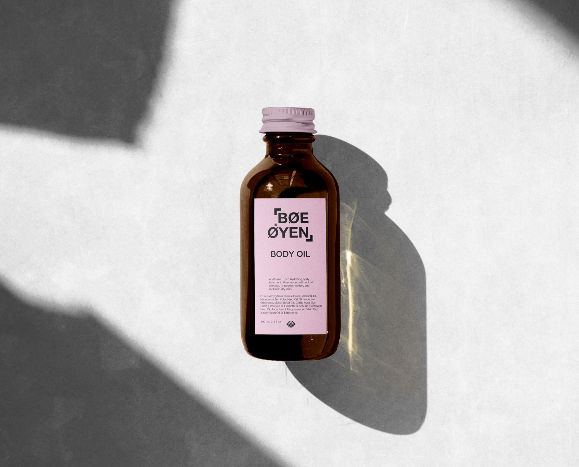
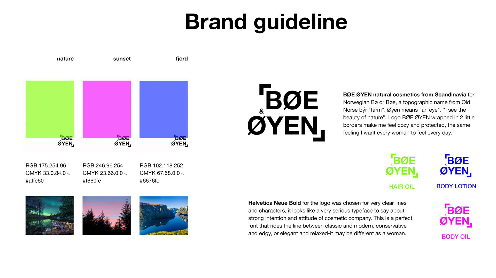
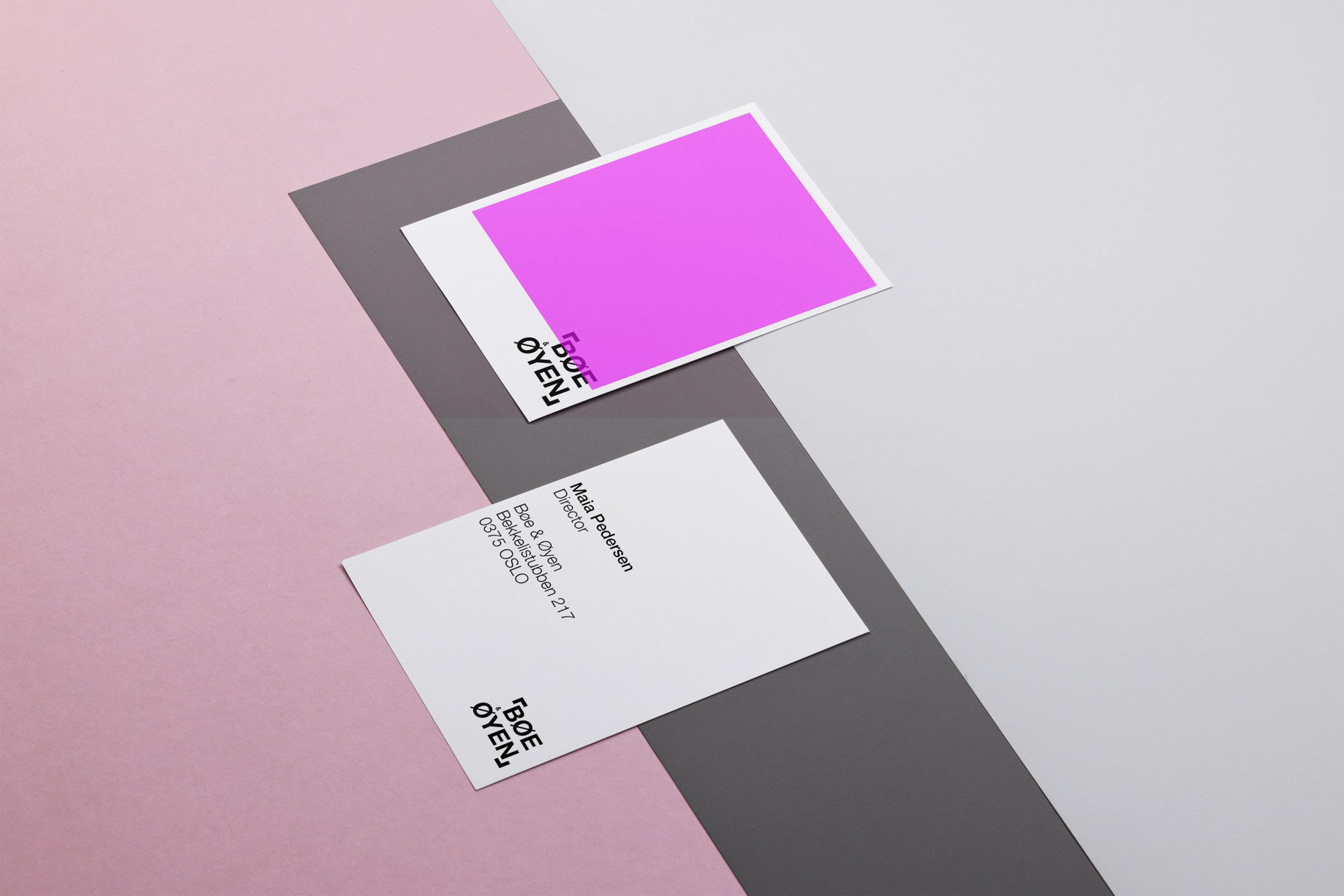
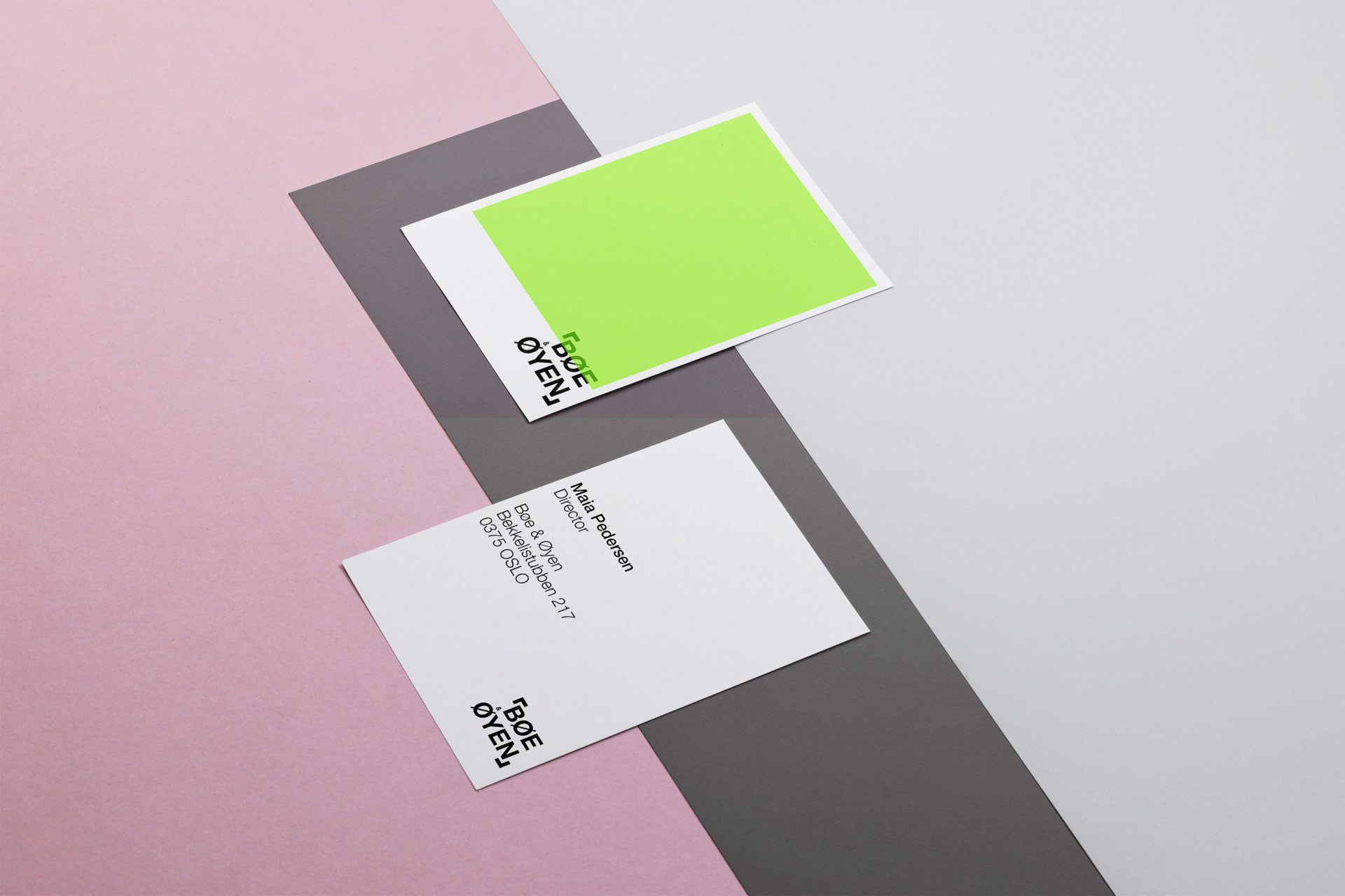
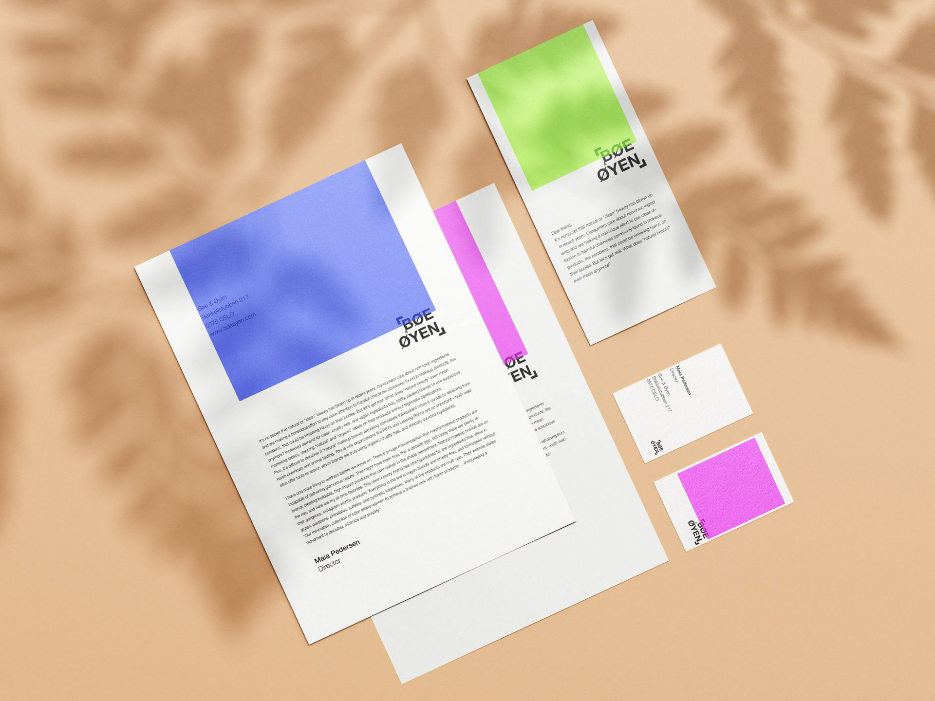
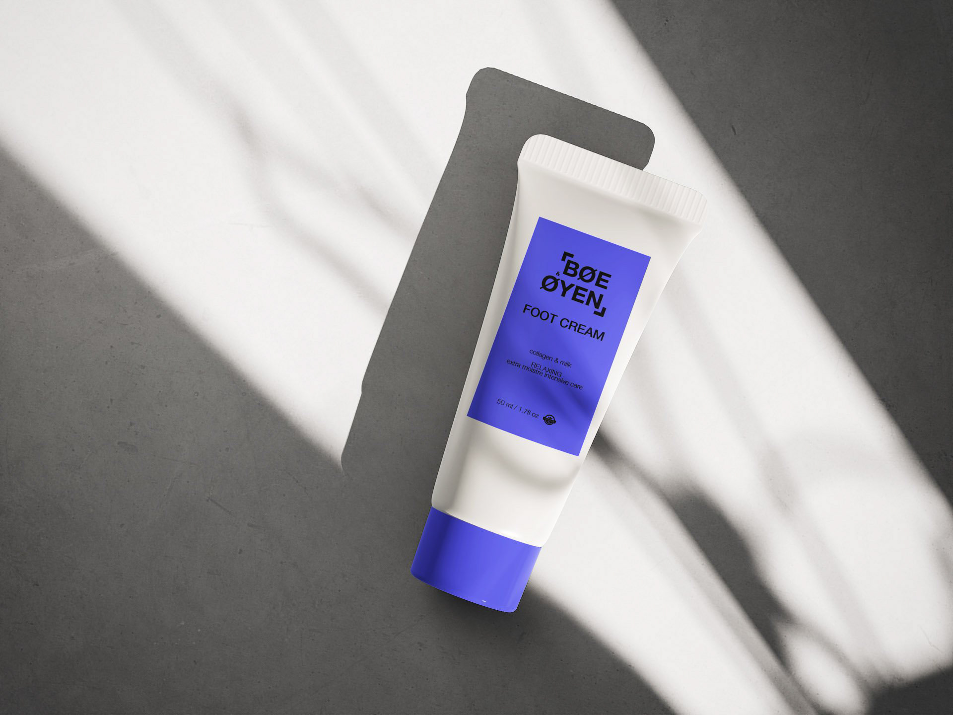
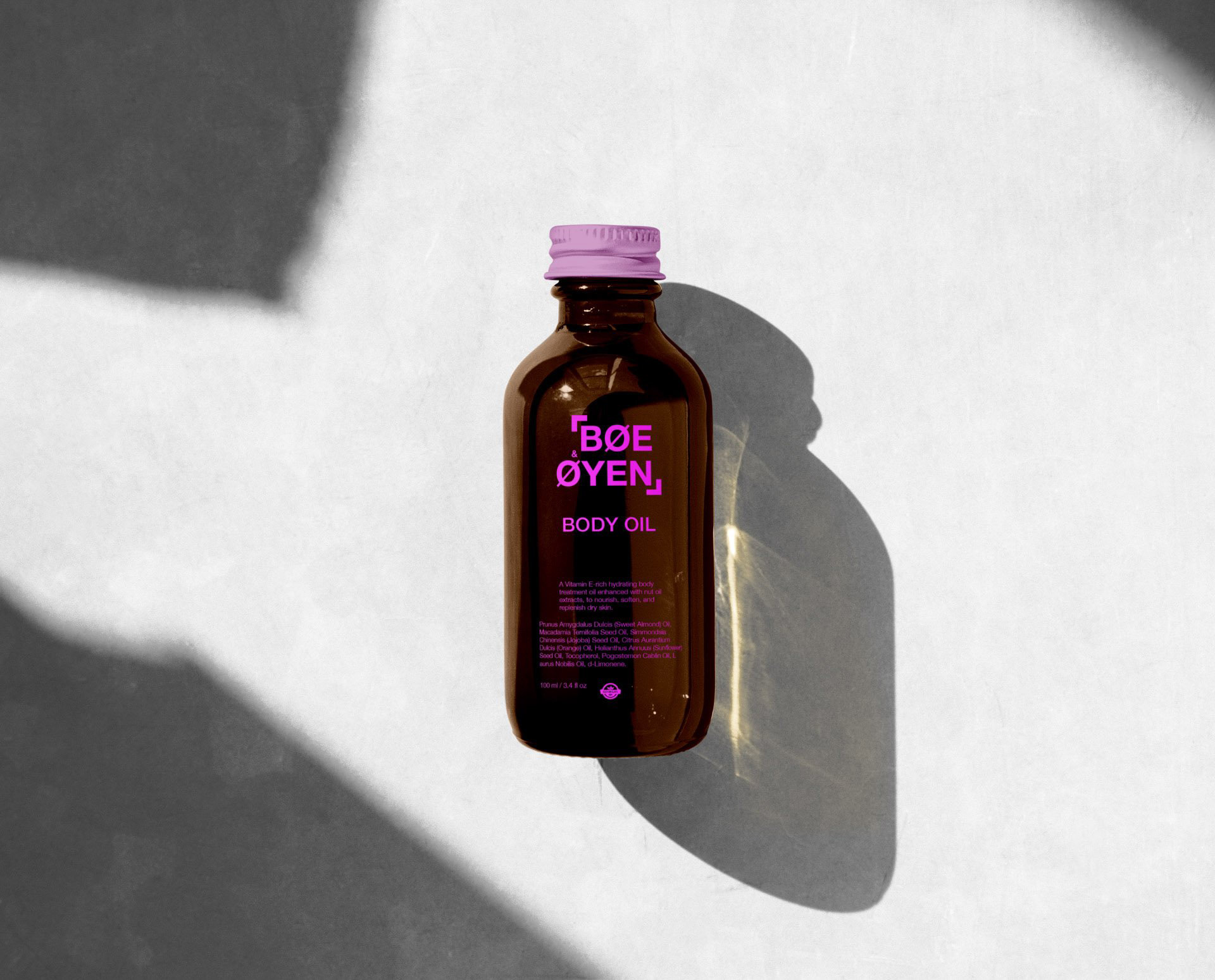
The logo of BØE ØYEN brand, enclosed by delicate borders, reflects comfort and nature. Its name, signifying "appreciating nature's beauty," is represented by connected lines in the logo, capturing the brand's link to nature. The color palette draws from Nordic landscapes with blue, pink, and green tones, bringing authenticity. Minimalist packaging design emphasizes Nordic beauty and simplicity while connecting to nature and farms through the term "Bøe" in the brand name.
BØE ØYEN, a brand hailing from the scenic landscapes of Scandinavia, is dedicated to providing consumers with natural cosmetics that prioritize non-toxic ingredients. With an increasing focus on conscious beauty choices, BØE ØYEN's mission is to offer products that encapsulate the essence of Nordic nature. The brand takes inspiration from the region's breathtaking coastlines, deep forests, mountains, and meadows, infusing its products with the beauty of local ingredients.
CHALLENGE
The challenge lay in creating a brand identity that not only resonates with consumers' demand for non-toxic cosmetics but also captures the purity and authenticity of Nordic nature. The goal was to design a brand that embodies the unique beauty of the region and empowers women to feel protected and beautiful every day.
SOLUTION
The logo of BØE ØYEN brand, enclosed by delicate borders, reflects comfort and nature. Its name, signifying "appreciating nature's beauty," is represented by connected lines in the logo, capturing the brand's link to nature. The color palette draws from Nordic landscapes with blue, pink, and green tones, bringing authenticity. Minimalist packaging design emphasizes Nordic beauty and simplicity while connecting to nature and farms through the term "Bøe" in the brand name.
Logo & Branding
The logo, BØE ØYEN, wrapped in two delicate borders, exudes a sense of coziness and protection. This encapsulates the emotion that the brand wishes to evoke in its users. The brand name's meaning, "I see the beauty of nature," is reflected in the interplay of lines within the logo, symbolizing the interconnection between nature and the brand.
The logo, BØE ØYEN, wrapped in two delicate borders, exudes a sense of coziness and protection. This encapsulates the emotion that the brand wishes to evoke in its users. The brand name's meaning, "I see the beauty of nature," is reflected in the interplay of lines within the logo, symbolizing the interconnection between nature and the brand.
Color Palette
The color palette draws inspiration from the Nordic landscape. Blue represents the tranquil fjords, pink symbolizes the enchanting sunsets, and green captures the essence of lush nature. These colors infuse the brand with integrity, authenticity, and harmony while allowing users of all ages to find their perfect shade.
The color palette draws inspiration from the Nordic landscape. Blue represents the tranquil fjords, pink symbolizes the enchanting sunsets, and green captures the essence of lush nature. These colors infuse the brand with integrity, authenticity, and harmony while allowing users of all ages to find their perfect shade.


Typography
The choice of Helvetica Neue font for the logo perfectly encapsulates the blend of classic and modern, catering to a diverse audience. This font mirrors the versatility and timelessness of the brand's cosmetics, making them suitable for women of all ages.
The choice of Helvetica Neue font for the logo perfectly encapsulates the blend of classic and modern, catering to a diverse audience. This font mirrors the versatility and timelessness of the brand's cosmetics, making them suitable for women of all ages.
Packaging Design
The minimalistic collection of three colors not only represents the beauty of Nordic nature but also encourages a movement towards minimalism in beauty routines. The packaging design embraces the lines in the middle of the word Bøe, symbolizing the interconnection with nature and farms.
The minimalistic collection of three colors not only represents the beauty of Nordic nature but also encourages a movement towards minimalism in beauty routines. The packaging design embraces the lines in the middle of the word Bøe, symbolizing the interconnection with nature and farms.


Conclusion
The minimalistic collection of three colors not only represents the beauty of Nordic nature but also encourages a movement towards minimalism in beauty routines. The packaging design embraces the lines in the middle of the word Bøe, symbolizing the interconnection with nature and farms.
The minimalistic collection of three colors not only represents the beauty of Nordic nature but also encourages a movement towards minimalism in beauty routines. The packaging design embraces the lines in the middle of the word Bøe, symbolizing the interconnection with nature and farms.