Crafting a Flavorful Brand Identity

SKILLS
Brand Identity
Logo Design
Art Direction
Typography
CATEGORY
Food & Beverage/Coffee
Brand Identity
Logo Design
Art Direction
Typography
CATEGORY
Food & Beverage/Coffee
CONTEXT
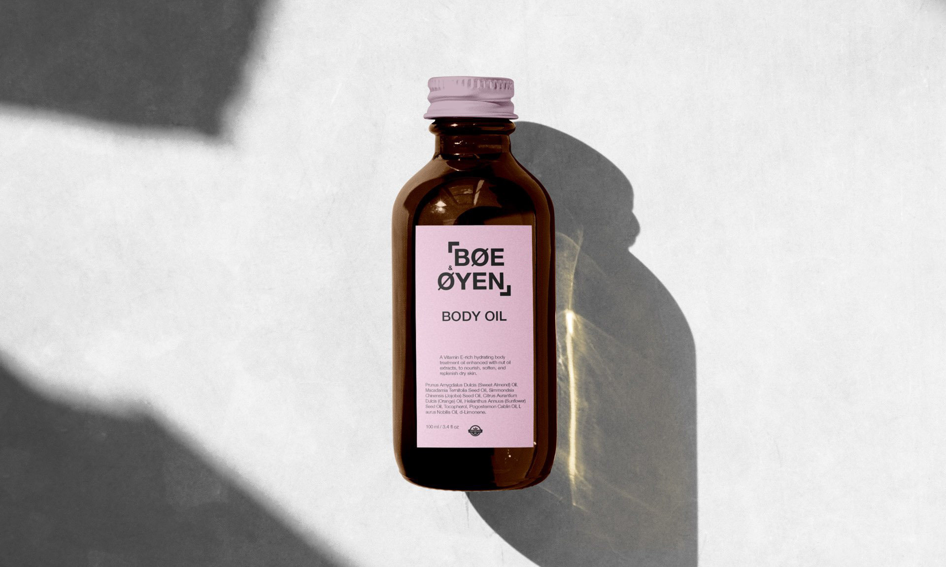
Rurukuna Coffee, born in a coastal oasis, embodies the essence of an amazing cup of coffee that awakens the senses just like the sunrise over the ocean. The project centers around creating a brand identity that captures the cozy and desired experience of sipping the perfect morning coffee. The logo and visual elements reflect the connection between the coffee bean and the morning sun, with a deep appreciation for the Quechua Indigenous people and their language.
CHALLENGE
The challenge was to encapsulate the rich cultural and geographical influences in Rurukuna Coffee's brand identity. The goal was to convey the sensory experience of savoring a cup of coffee while honoring the indigenous roots of the name "Rurukuna." The challenge also included selecting a color palette and typography that harmoniously blended these cultural and sensory elements.
SOLUTION
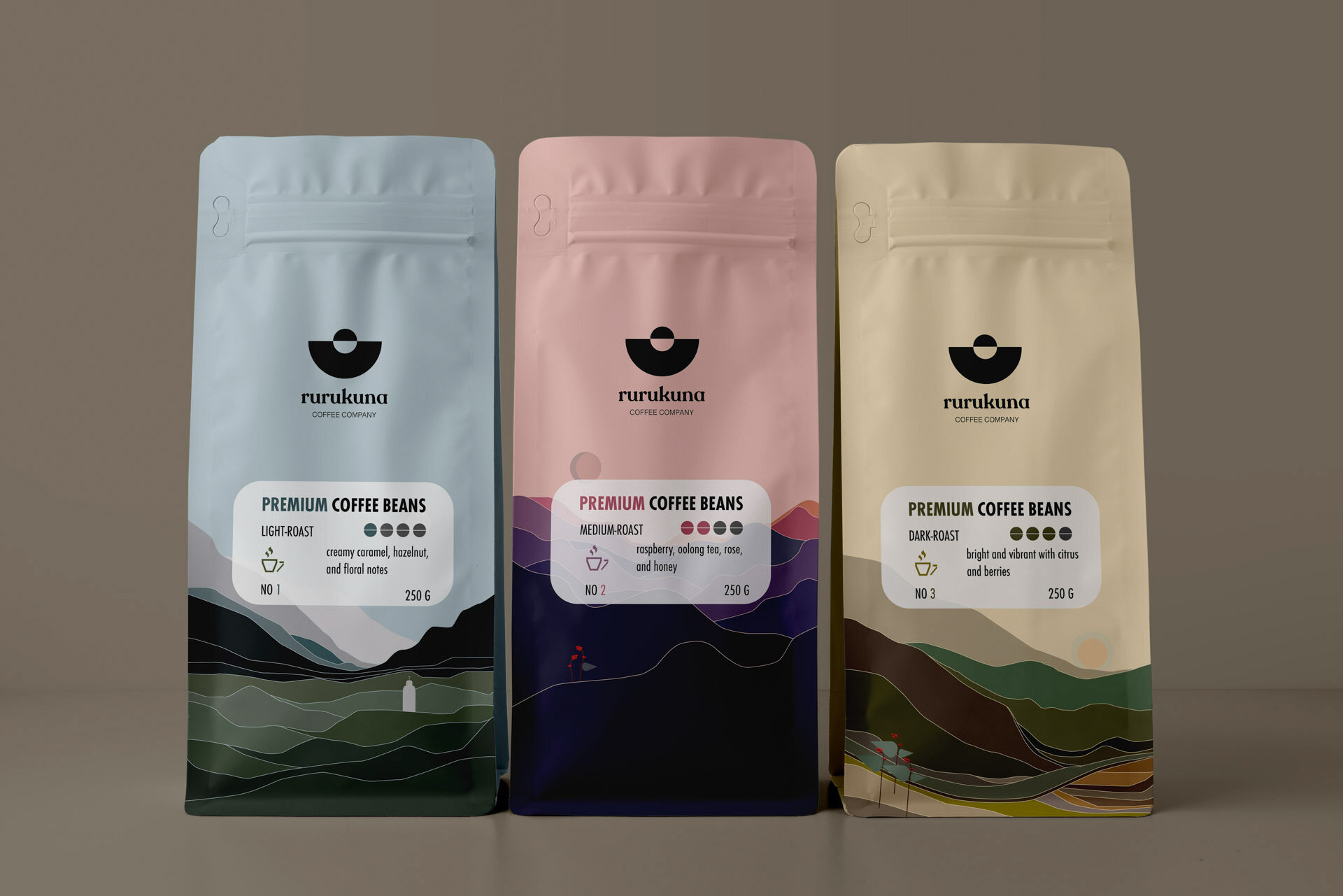
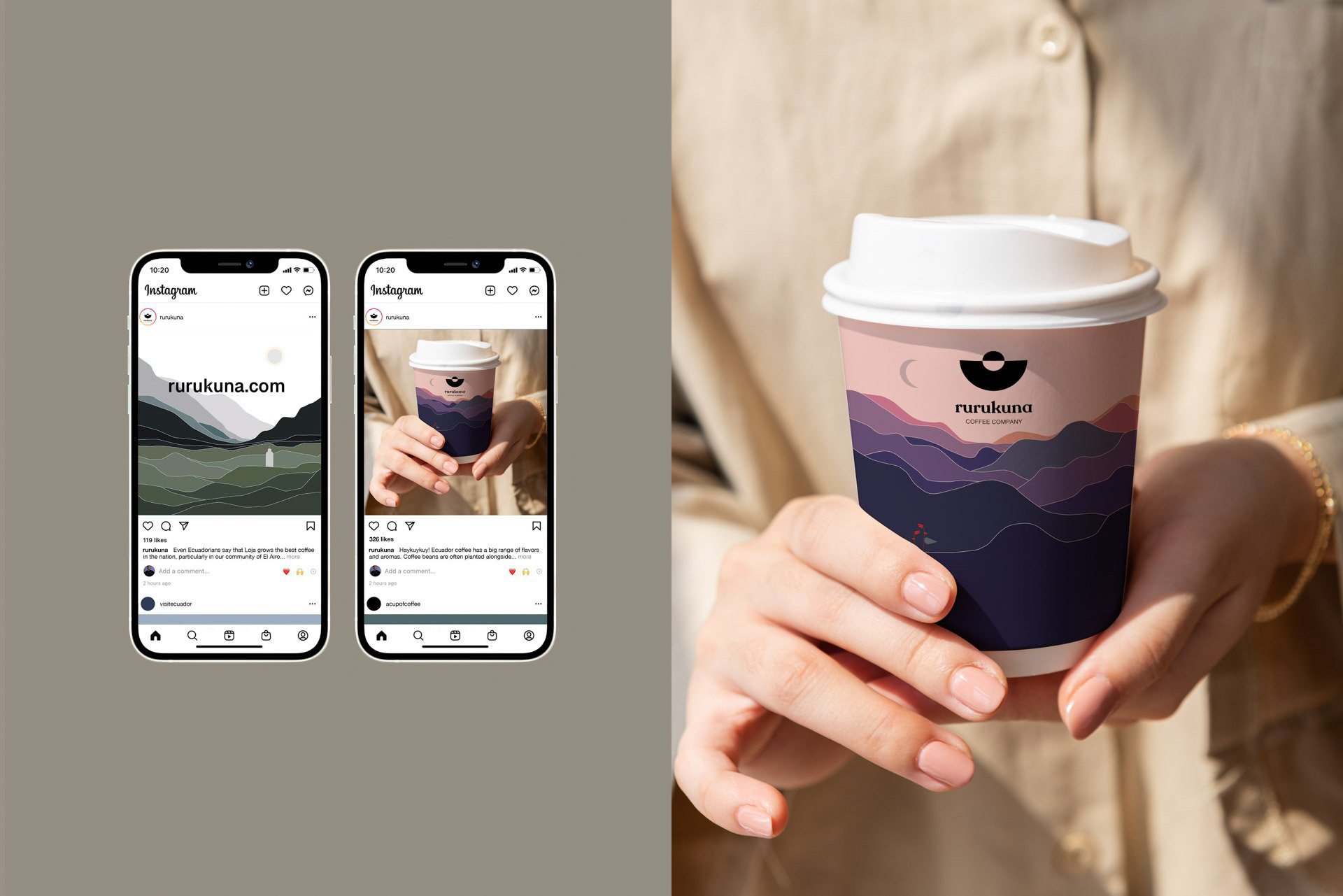
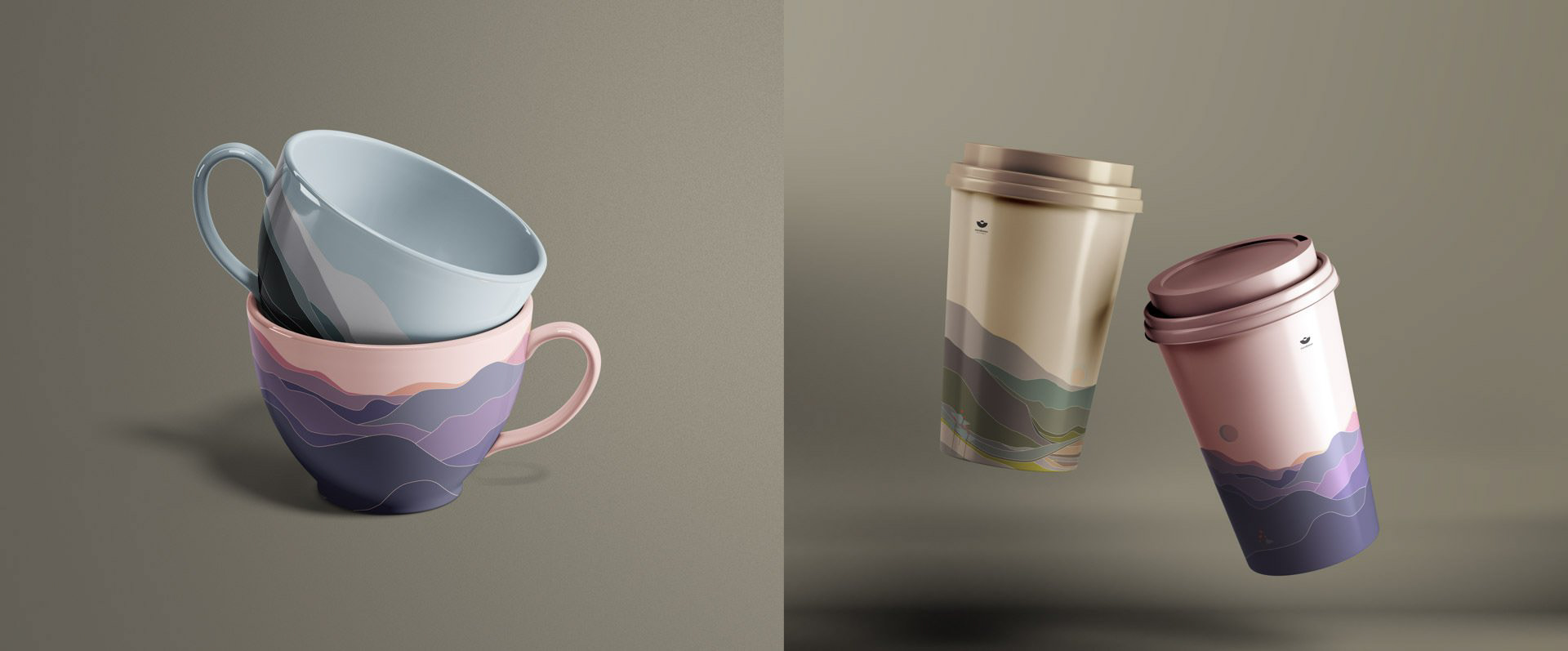
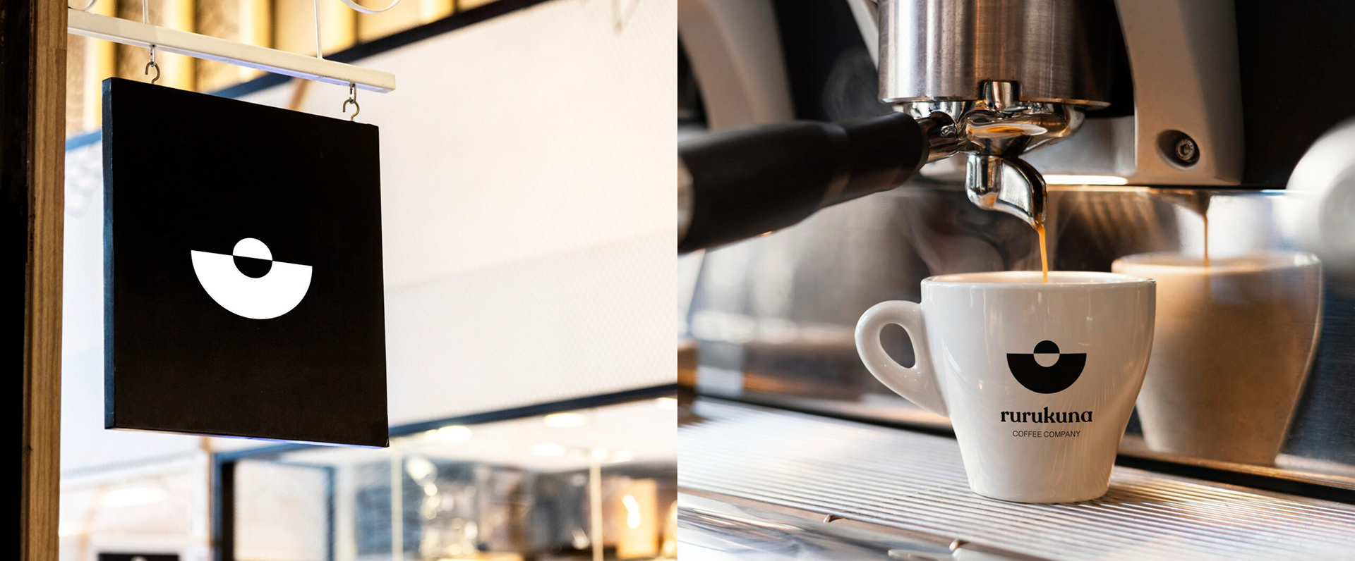
Rurukuna Coffee's logo blends a coffee bean with a rising sun, symbolizing the coffee experience and new beginnings. The name "RURUKUNA" comes from Quechua, reflecting the brand's ethos. The color palette represents Ecuador's identity, and traditional patterns add cultural authenticity. Typography choices convey energy and harmony.
Rurukuna Coffee, born in a coastal oasis, embodies the essence of an amazing cup of coffee that awakens the senses just like the sunrise over the ocean. The project centers around creating a brand identity that captures the cozy and desired experience of sipping the perfect morning coffee. The logo and visual elements reflect the connection between the coffee bean and the morning sun, with a deep appreciation for the Quechua Indigenous people and their language.
CHALLENGE
The challenge was to encapsulate the rich cultural and geographical influences in Rurukuna Coffee's brand identity. The goal was to convey the sensory experience of savoring a cup of coffee while honoring the indigenous roots of the name "Rurukuna." The challenge also included selecting a color palette and typography that harmoniously blended these cultural and sensory elements.
SOLUTION
Rurukuna Coffee's logo blends a coffee bean with a rising sun, symbolizing the coffee experience and new beginnings. The name "RURUKUNA" comes from Quechua, reflecting the brand's ethos. The color palette represents Ecuador's identity, and traditional patterns add cultural authenticity. Typography choices convey energy and harmony.
Quechua Influence
The name "RURUKUNA," a Quechua word that means "fruit, seed, grain," ties into the brand's ethos, reflecting a profound worldview. The Kichwa dialect, spoken by the Quechua Indigenous people of South America, inspired the coffee's name, creating a link to the roots of the culture that Rurukuna Coffee celebrates.
The name "RURUKUNA," a Quechua word that means "fruit, seed, grain," ties into the brand's ethos, reflecting a profound worldview. The Kichwa dialect, spoken by the Quechua Indigenous people of South America, inspired the coffee's name, creating a link to the roots of the culture that Rurukuna Coffee celebrates.

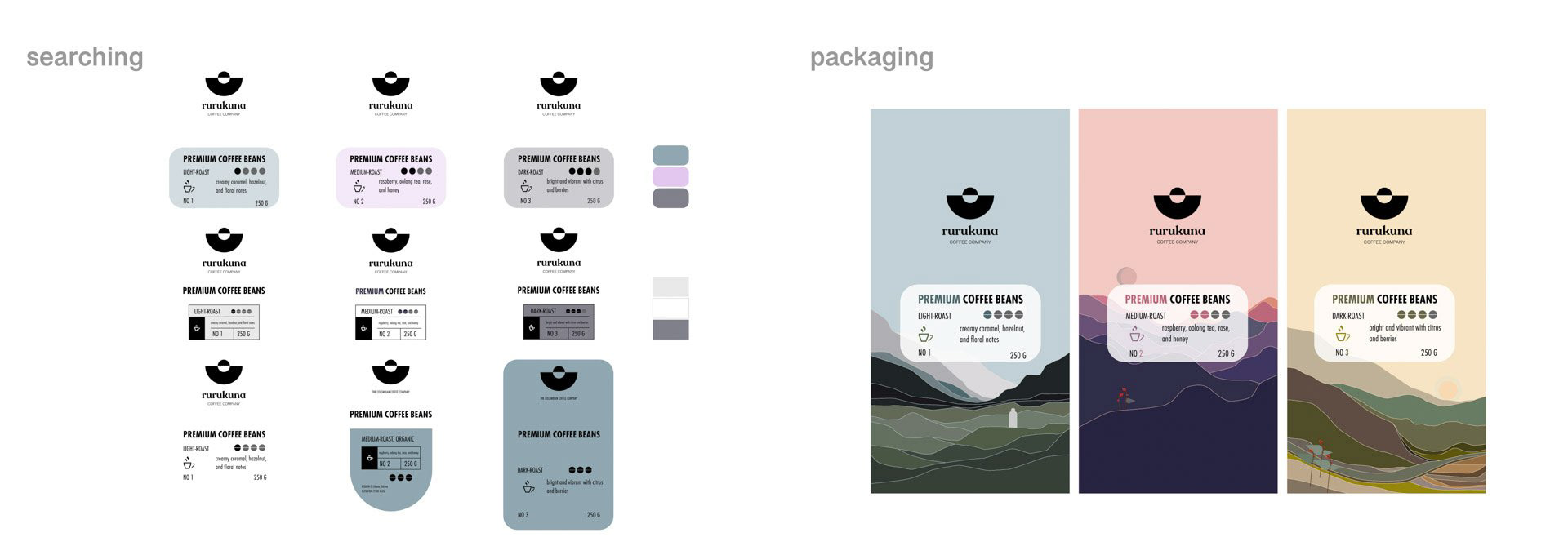
Logo & Visual Identity
The logo seamlessly combines a coffee bean and the rising sun, symbolizing the union of the coffee experience and the awakening of a new day. This combination logo mark reflects the essence of Rurukuna Coffee while serving as a powerful representation of the brand's identity.
The logo seamlessly combines a coffee bean and the rising sun, symbolizing the union of the coffee experience and the awakening of a new day. This combination logo mark reflects the essence of Rurukuna Coffee while serving as a powerful representation of the brand's identity.

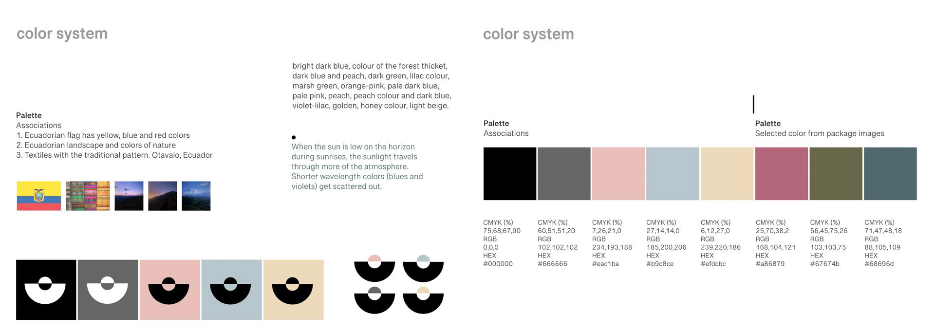
Color Palette
The color palette draws from the Ecuadorian flag's yellow, blue, and red colors, representing both national identity and natural landscapes. Traditional patterns from Otavalo, Ecuador, as seen in textiles, infuse the brand's visual identity with cultural authenticity.
The color palette draws from the Ecuadorian flag's yellow, blue, and red colors, representing both national identity and natural landscapes. Traditional patterns from Otavalo, Ecuador, as seen in textiles, infuse the brand's visual identity with cultural authenticity.
Typography
The typography selection is meticulous in conveying the brand's energy and essence. The Recoleta font represents the cheerful and kind people, while the Tamil Sangam MN font complements the logo, creating a harmonious and balanced branding logotype.
The typography selection is meticulous in conveying the brand's energy and essence. The Recoleta font represents the cheerful and kind people, while the Tamil Sangam MN font complements the logo, creating a harmonious and balanced branding logotype.


Conclusion
Rurukuna Coffee's brand identity elegantly captures the sensory experience of sipping a delightful cup of coffee while paying homage to the cultural roots and geographic surroundings that define the brand. Through a combination logo mark, carefully selected color palette, and typography choices, Rurukuna Coffee's visual identity not only celebrates its Quechua heritage but also evokes the warmth and comfort of mornings spent with a cup of amazing coffee. The result is a cohesive and authentic brand identity that resonates with coffee enthusiasts and culture enthusiasts alike.
Rurukuna Coffee's brand identity elegantly captures the sensory experience of sipping a delightful cup of coffee while paying homage to the cultural roots and geographic surroundings that define the brand. Through a combination logo mark, carefully selected color palette, and typography choices, Rurukuna Coffee's visual identity not only celebrates its Quechua heritage but also evokes the warmth and comfort of mornings spent with a cup of amazing coffee. The result is a cohesive and authentic brand identity that resonates with coffee enthusiasts and culture enthusiasts alike.