Online Time Tracking and Absence Management
Save time, boost productivity, and keep everything running smoothly!
SKILLS
Web Design
User Interface (UI)
User Experience (UX)
Branding Enhancement
Visual Storytelling
Research & Project Management
Art Direction
Product Design System
Web Design
User Interface (UI)
User Experience (UX)
Branding Enhancement
Visual Storytelling
Research & Project Management
Art Direction
Product Design System
CATEGORY
Tool | SaaS
Tool | SaaS
TIME
+16 weeks
(The process involves discovery, design, development, and testing, with delays often caused by content preparation and client feedback)
Website
+16 weeks
(The process involves discovery, design, development, and testing, with delays often caused by content preparation and client feedback)
Website
CONTEXT
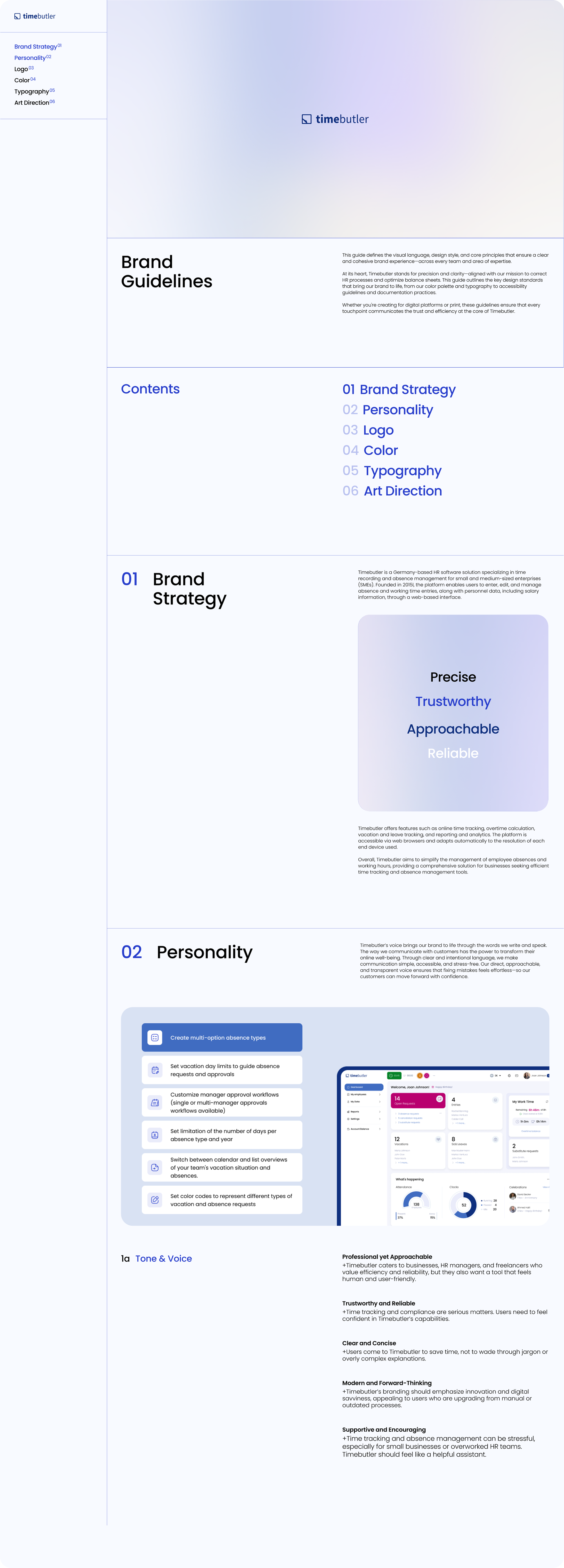
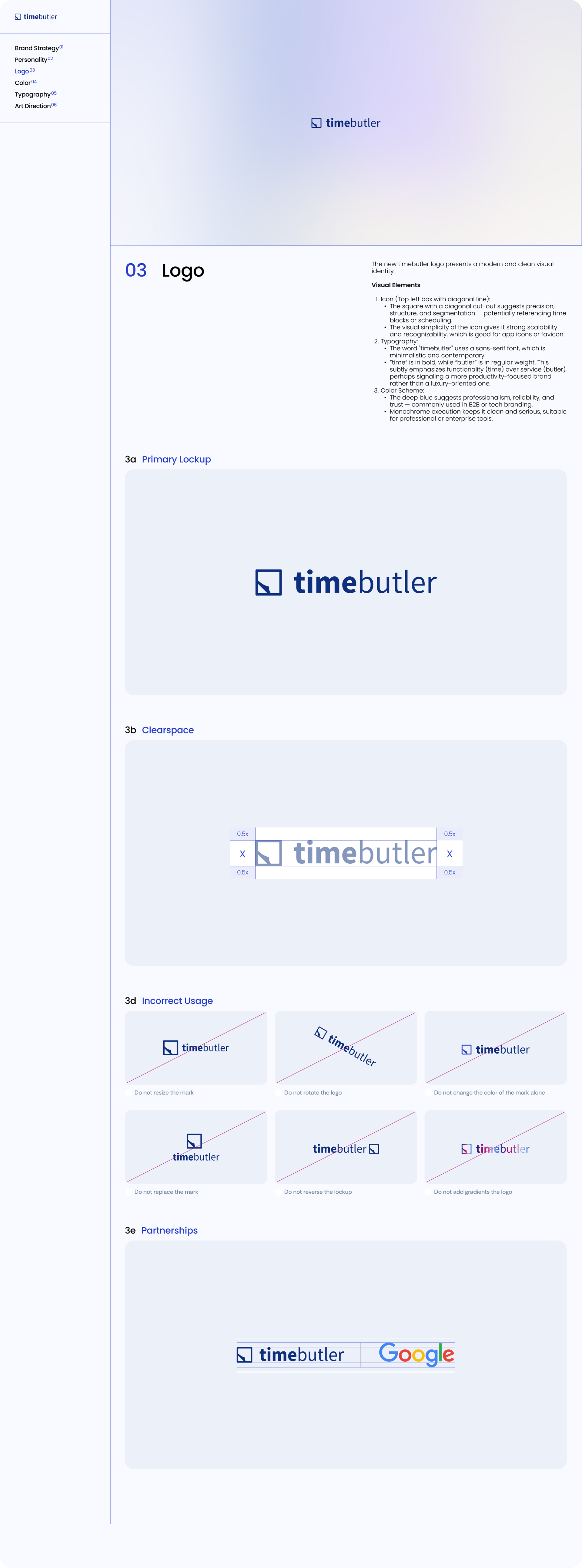
At its heart, Timebutler stands for precision and clarity-aligned with our mission to correct HR processes and optimize balance sheets. This guide outlines the key design standards that bring our brand to life, from our color palette and typography to accessibility guidelines and documentation practices.
CHALLENGE
- Outdated User Interfaces & Navigation Patterns:
The navigation may be hidden, overly nested, or not sticky. Users can't find key features or information quickly.
- Information Overload & UX:
Cluttered dashboards, too many elements competing for attention. Cognitive load increases; users feel overwhelmed or lost. Outdated or clunky form fields, lack of inline validation, unclear errors. Key functionalities simply don't work for modern users.
- Inconsistent Branding & UI:
Old colors & layout techniques (e.g., gradients from the 2000s, shadows, skeuomorphism). Users may not trust the product; it feels outdated and potentially insecure.
- Non-Responsive Design:
The site doesn’t adapt to modern devices (phones, tablets, high-res monitors. Users on mobile devices struggle to navigate, zoom, and interact with content.
- Lack of Accessibility:
Low contrast, no keyboard navigation, missing alt text, etc.
- A product design system created in isolation from branding and without clear personas risks becoming visually neutral and experientially generic; it must be grounded in brand expression and persona needs to be truly effective.
ORIGINAL Website
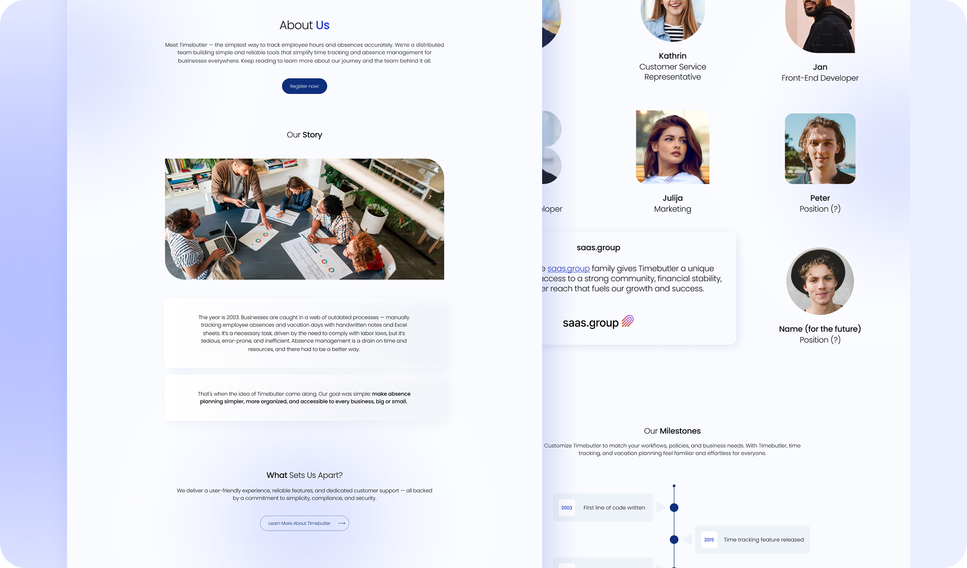
The old Timebutler website suffers from several common UI/UX issues. It's not responsive, making it difficult to use on mobile devices. The navigation is outdated and unintuitive, leading to user frustration. Visually, the design feels cluttered and lacks clear hierarchy, while the overall style appears dated, which can diminish user trust. Accessibility is poor, with low contrast and limited keyboard or screen reader support. Performance is slow due to legacy code and unoptimized assets. Forms are user-unfriendly, often lacking clear validation or error feedback. Additionally, some features rely on outdated or deprecated technologies that no longer function properly in reality of AI. Overall, the user experience feels frustrating, outdated, and inefficient based on user's feedback. The acquisition of Timebutler by saas.group, announced on September 10, 2024, marked saas.group’s 22nd successful acquisition and its 17th in the DACH region.
The old Timebutler website suffers from several common UI/UX issues. It's not responsive, making it difficult to use on mobile devices. The navigation is outdated and unintuitive, leading to user frustration. Visually, the design feels cluttered and lacks clear hierarchy, while the overall style appears dated, which can diminish user trust. Accessibility is poor, with low contrast and limited keyboard or screen reader support. Performance is slow due to legacy code and unoptimized assets. Forms are user-unfriendly, often lacking clear validation or error feedback. Additionally, some features rely on outdated or deprecated technologies that no longer function properly in reality of AI. Overall, the user experience feels frustrating, outdated, and inefficient based on user's feedback. The acquisition of Timebutler by saas.group, announced on September 10, 2024, marked saas.group’s 22nd successful acquisition and its 17th in the DACH region.
This creates a timely opportunity for Timebutler to realign with its competitive set and undertake a strategic rebrand.

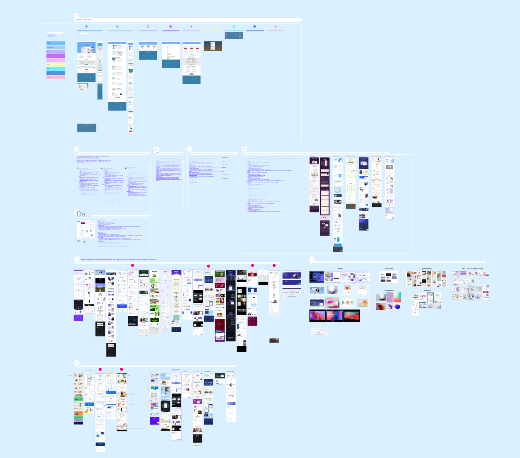
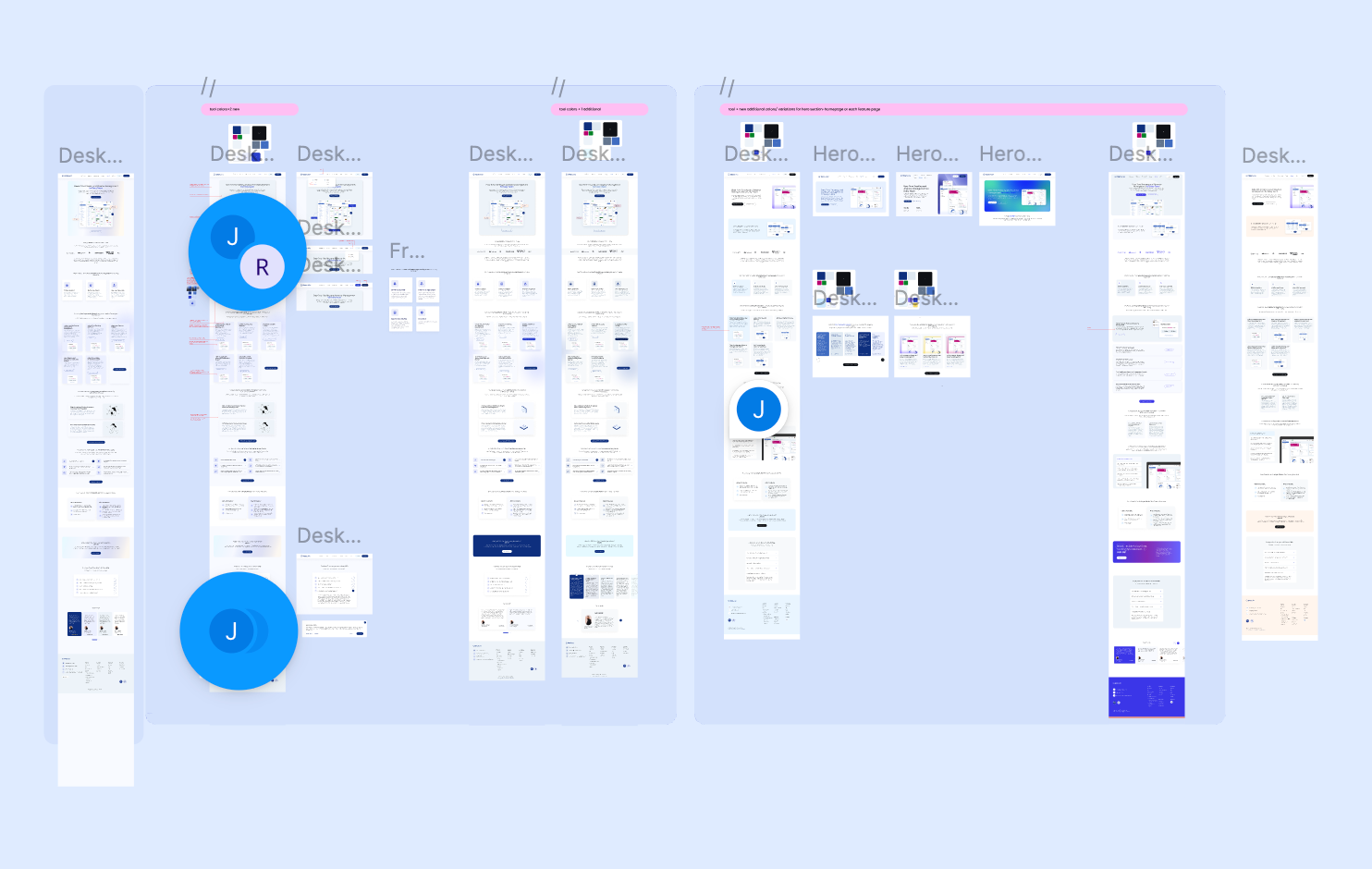
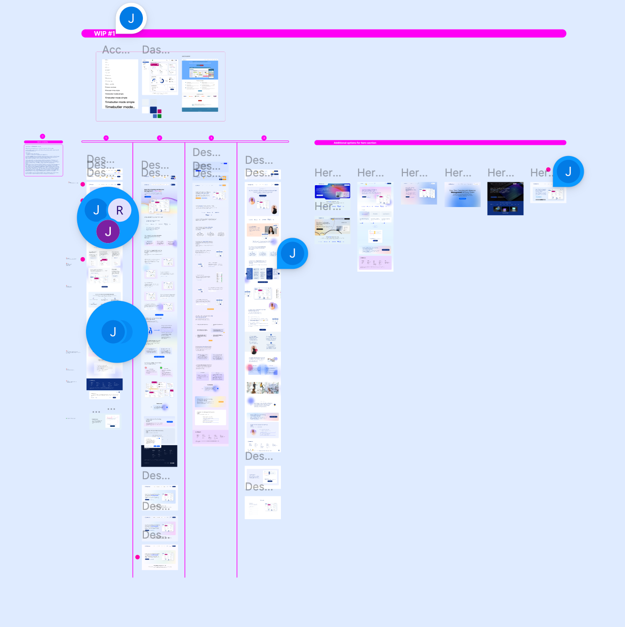
THE PROCESS
Redefining voice and distinction: Comprehensive competitor/best-practice research (UX benchmarks, web architecture) established web-friendly, scalable typography for web/marketing-delivering 15% faster page loads, 28% hero dwell time uplift, 22% conversion gains post-launch, and cohesive perception across 5+ collateral pieces. Full ownership with cross-functional collaboration (CMO, product designer, stakeholders) to sync voice, align with design system, and stand out.
Redefining voice and distinction: Comprehensive competitor/best-practice research (UX benchmarks, web architecture) established web-friendly, scalable typography for web/marketing-delivering 15% faster page loads, 28% hero dwell time uplift, 22% conversion gains post-launch, and cohesive perception across 5+ collateral pieces. Full ownership with cross-functional collaboration (CMO, product designer, stakeholders) to sync voice, align with design system, and stand out.
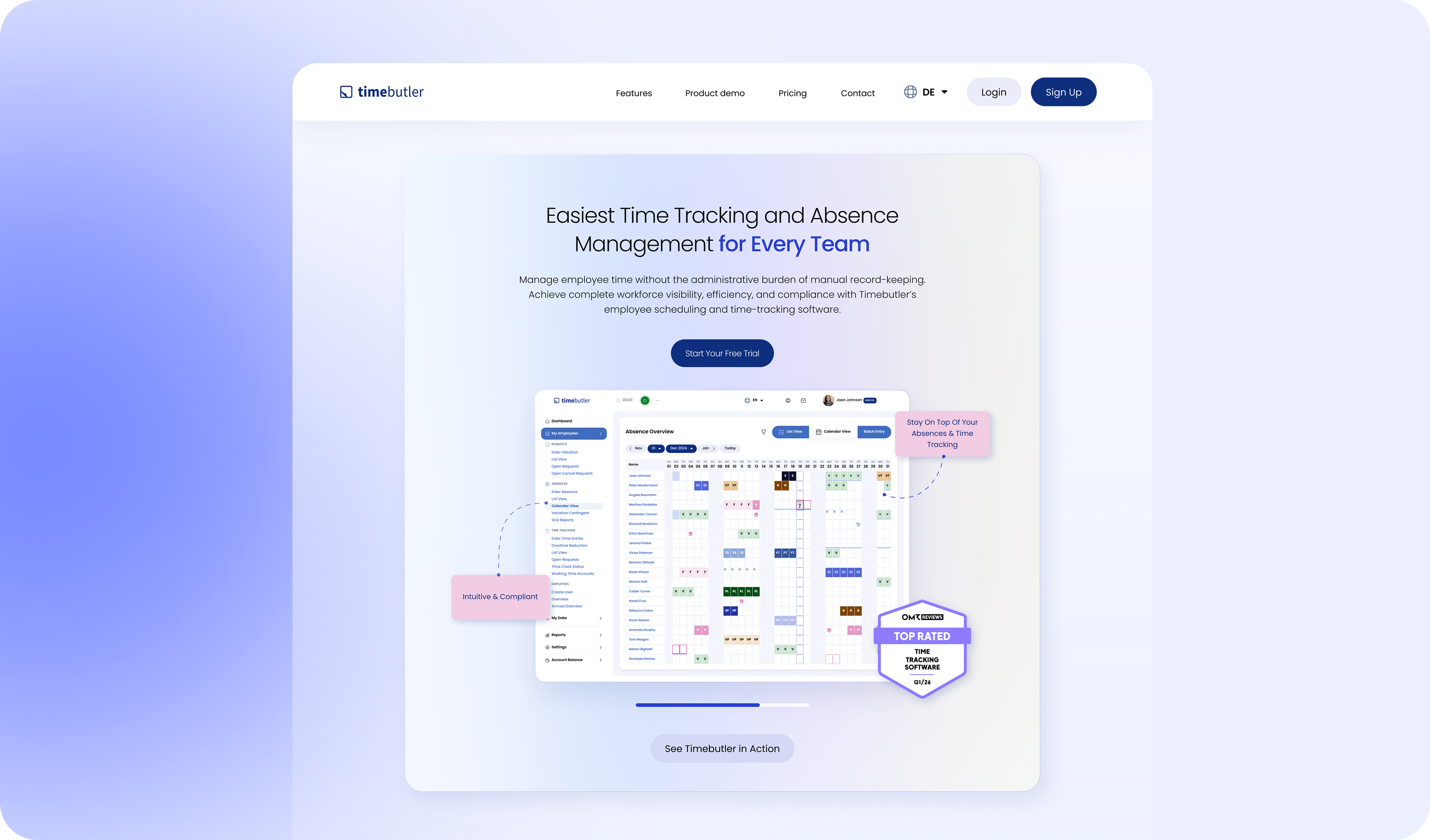
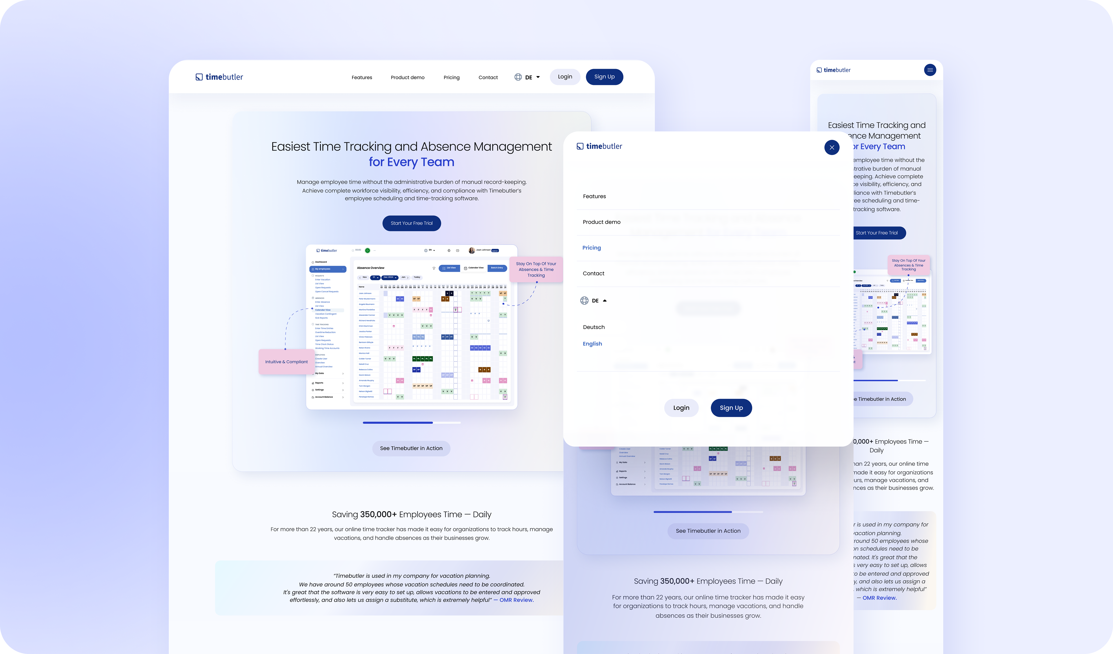
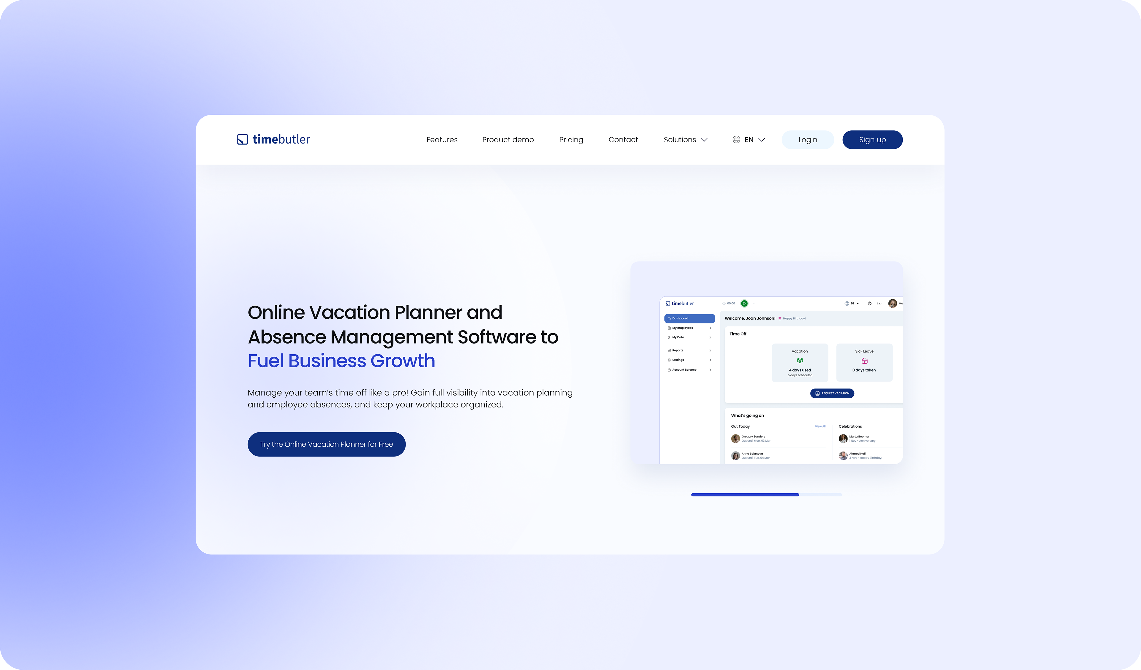
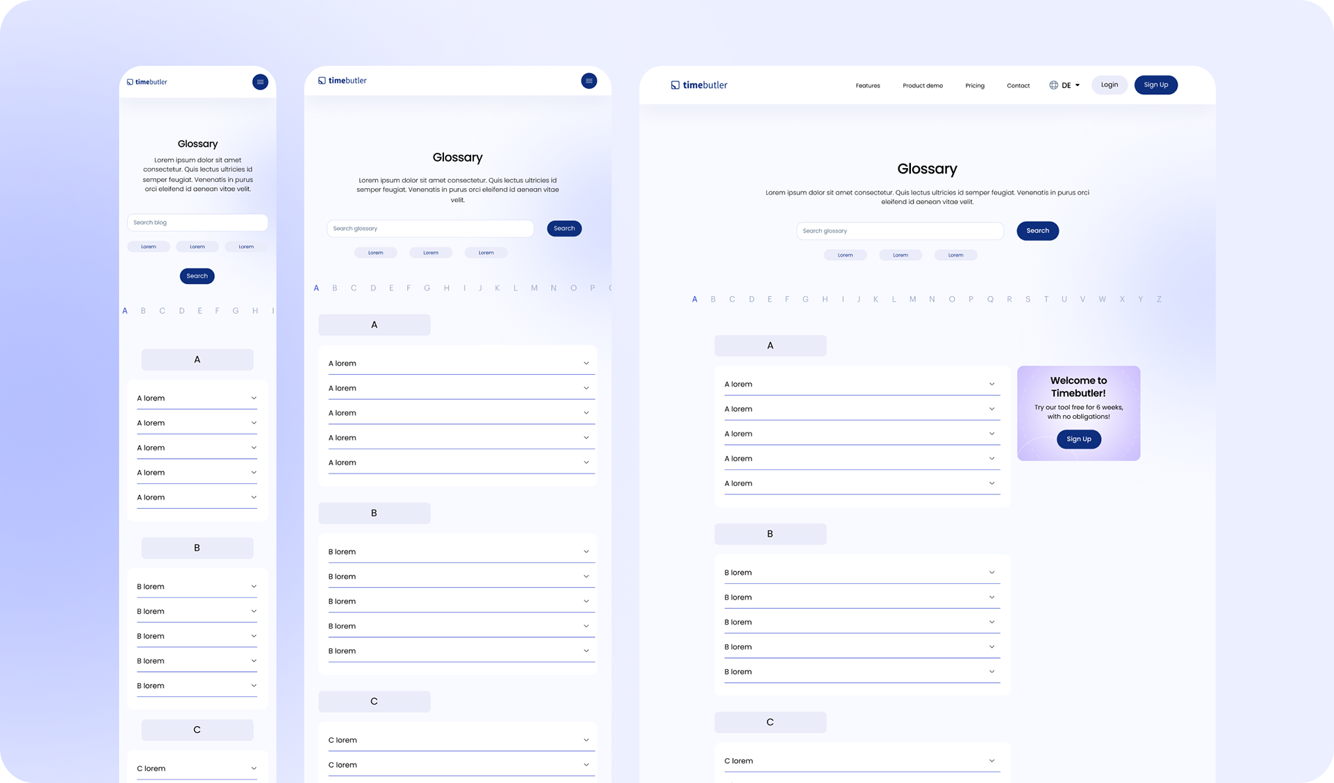
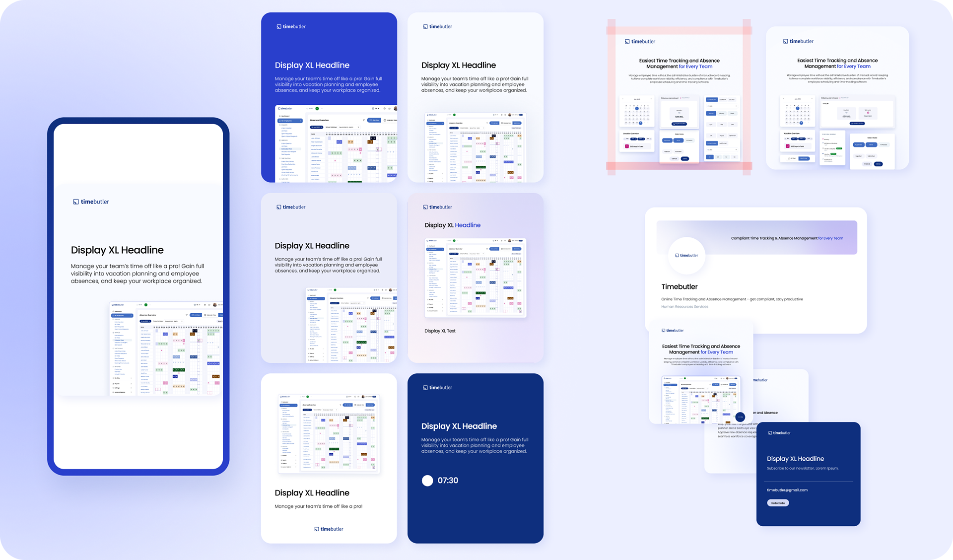
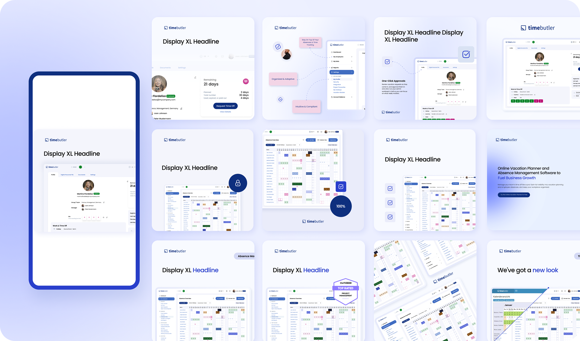
REDESIGNED VERSION
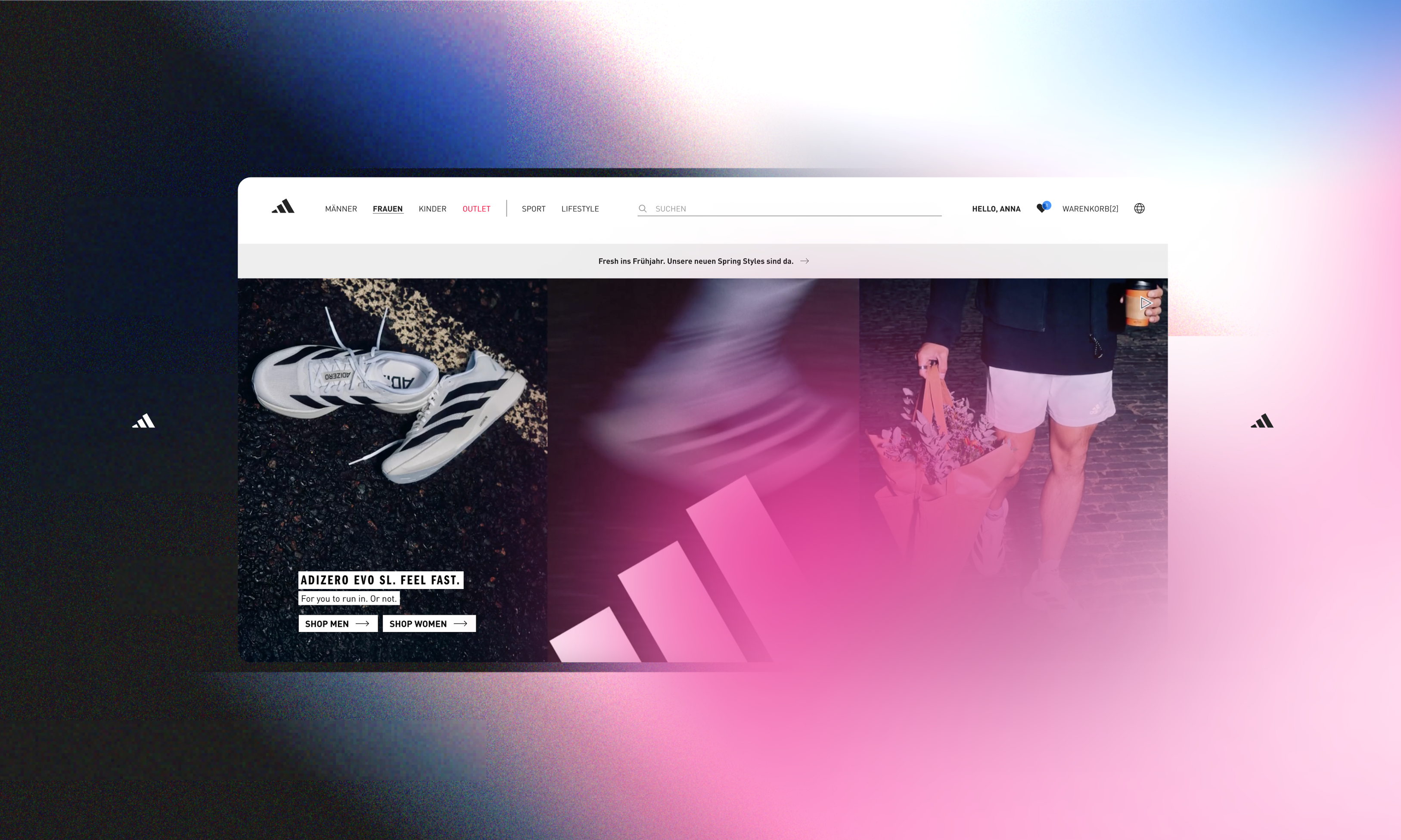
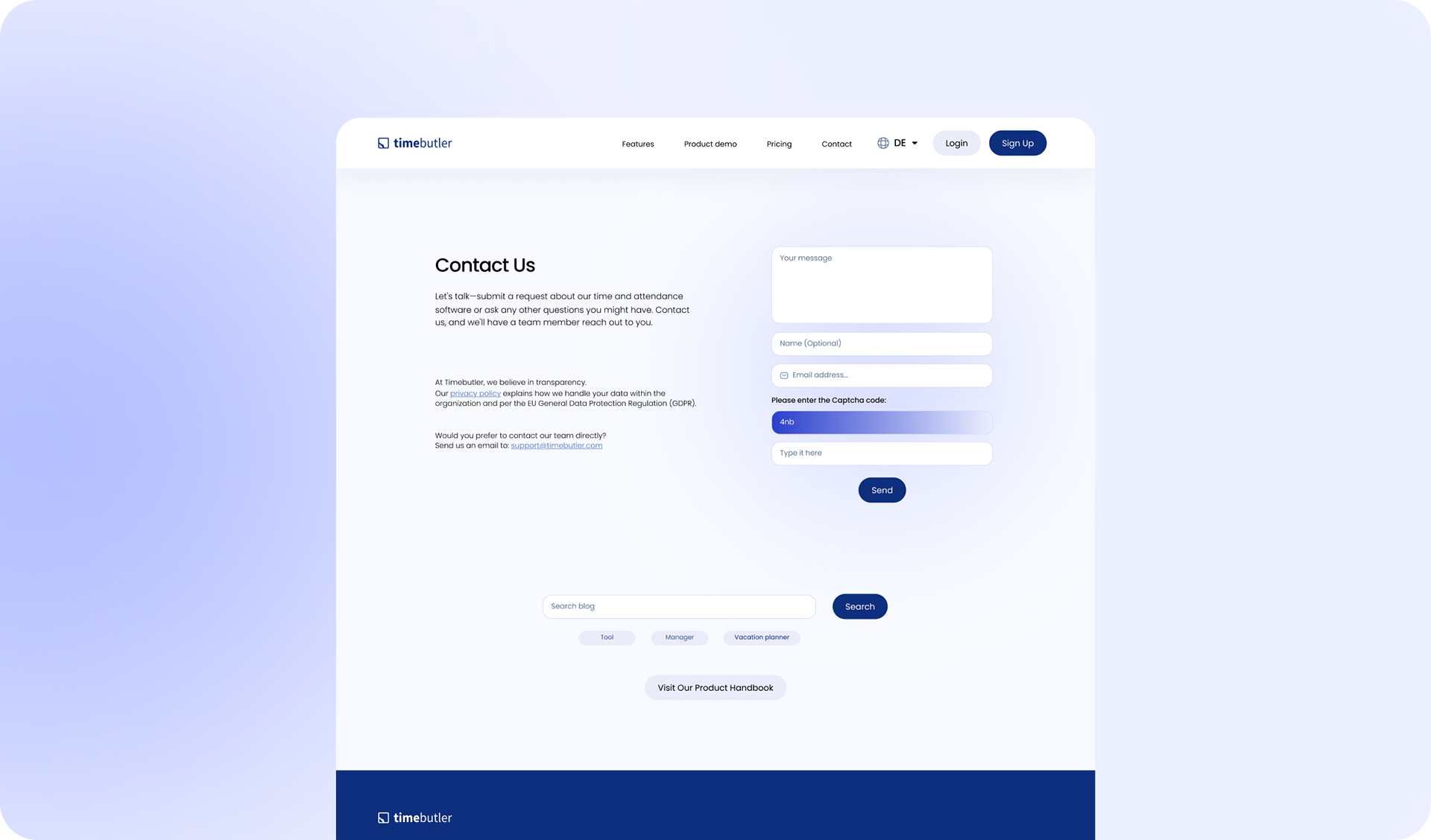
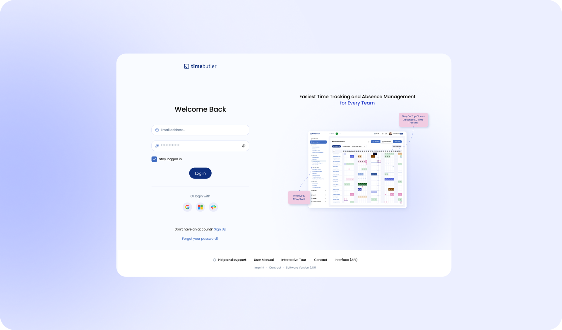
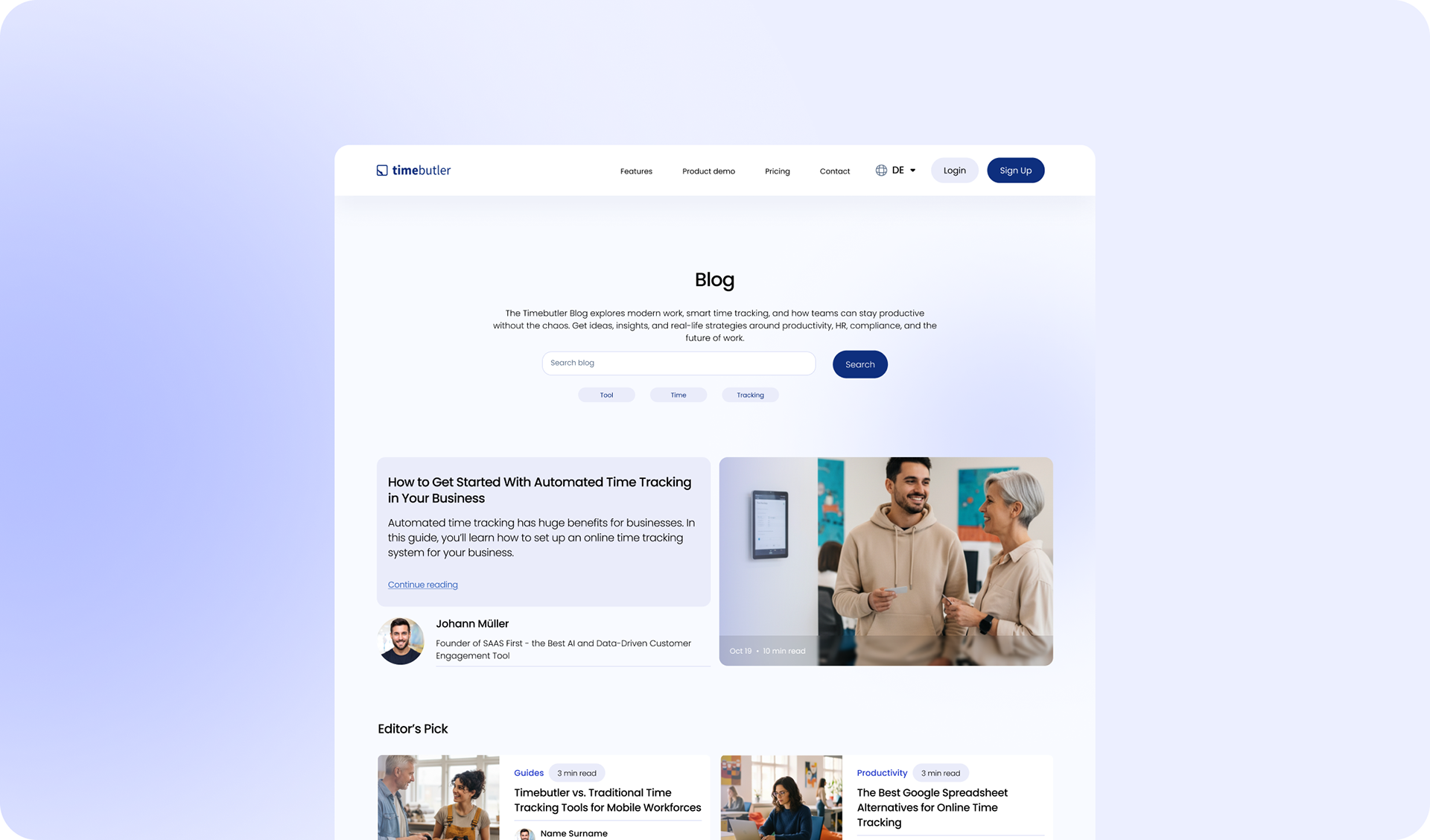
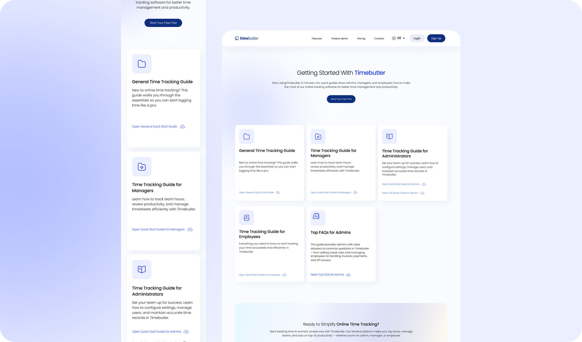
In 2025 Timebutler undergone a significant website redesign, aligning with its acquisition by saas.group and reflecting a modernized approach to user experience and functionality. Here's an overview of the key enhancements:
In 2025 Timebutler undergone a significant website redesign, aligning with its acquisition by saas.group and reflecting a modernized approach to user experience and functionality. Here's an overview of the key enhancements:
Key Highlights of the Redesign:
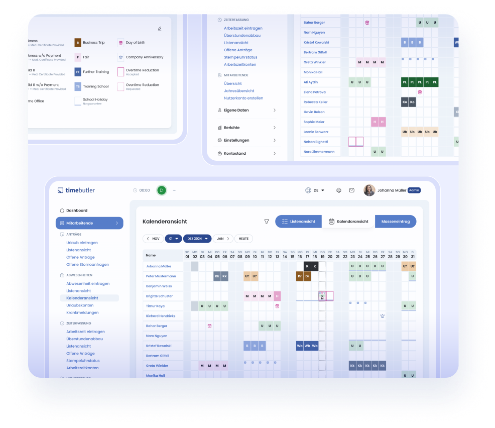
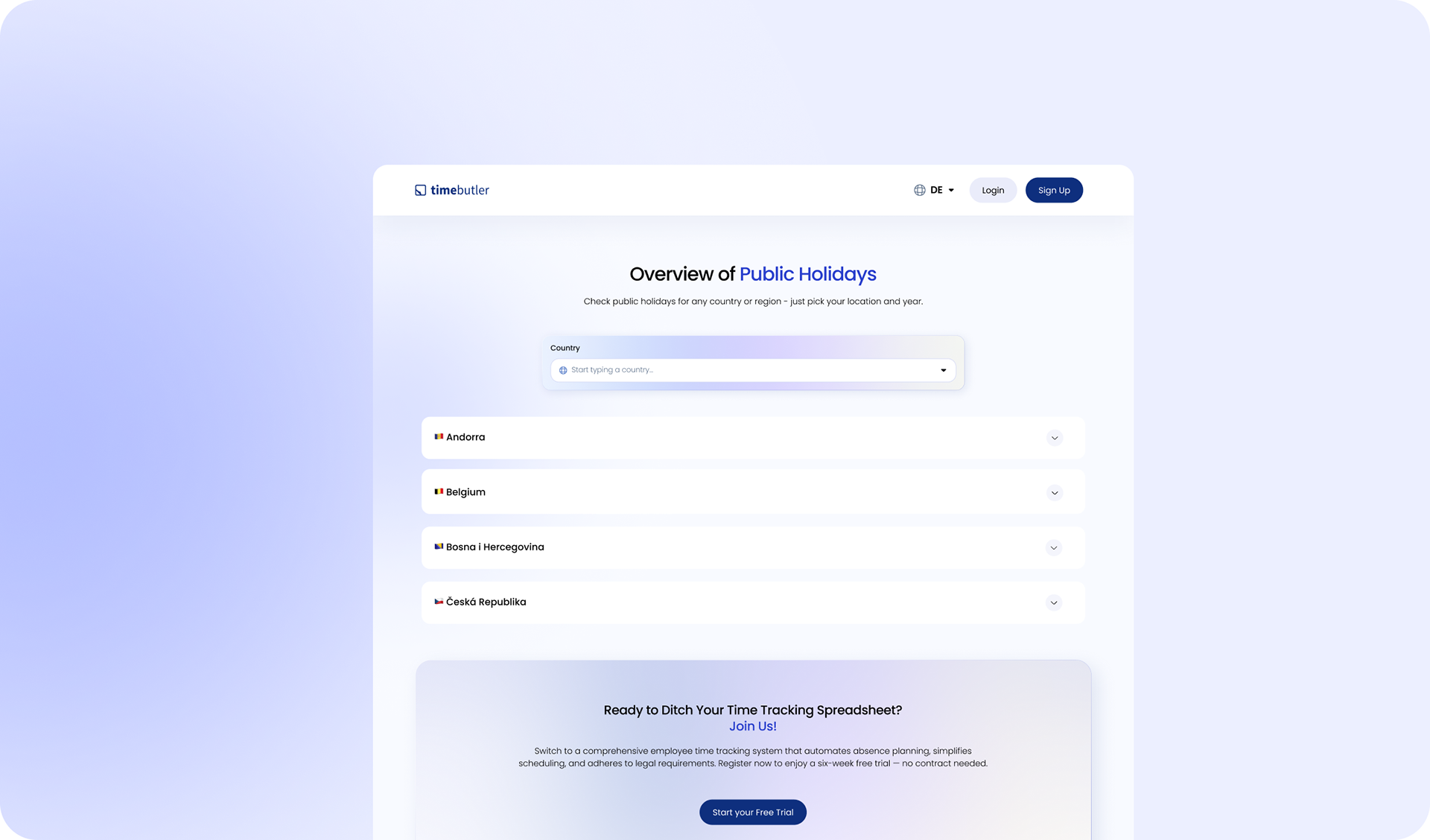
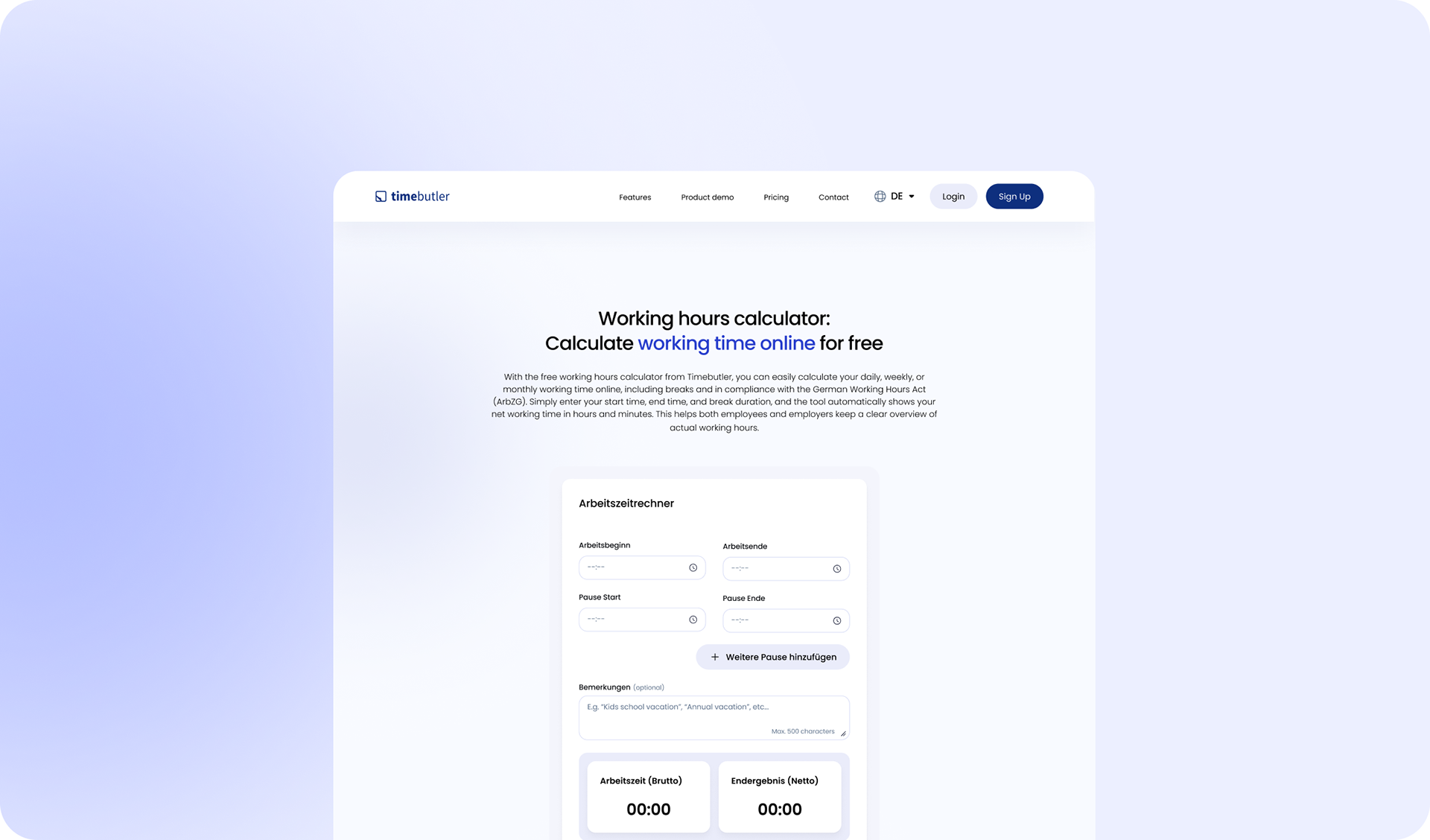
-Enhanced User Interface: The interface features a clean, intuitive design with improved navigation, making it easier for users to access key functionalities like time recording, vacation planning, and overtime management.
-Responsive Design: The website is fully optimized for various devices, ensuring seamless access and usability across desktops, tablets, and smartphones without the need for a dedicated app.
-Comprehensive Feature Set: Users can benefit from a range of features, including customizable personnel files, real-time reporting, and compliance tools aligned with German labor laws, all accessible through an organized dashboard.
-Responsive Interface: The new design ensures seamless usability across all devices, including smartphones and tablets, eliminating the need for a dedicated app.
-Intuitive Navigation: Users can easily access features such as time recording, vacation planning, and reports through a streamlined menu structure.
- Primary hurdle: ensuring the website and rebrand fully sync with the refreshed product design system.
- Proactive system ownership: Regularly reworked UI/UX within provided product design system, driving hands-on impact on tool design itself (Calender, Log In, Sign Up, Holiday pages, etc)
Process
Post-launch alignment: Team-driven color tweaks (buttons, backgrounds, typography weights) in product system required additional web-sync reviews after testing.
Post-launch alignment: Team-driven color tweaks (buttons, backgrounds, typography weights) in product system required additional web-sync reviews after testing.
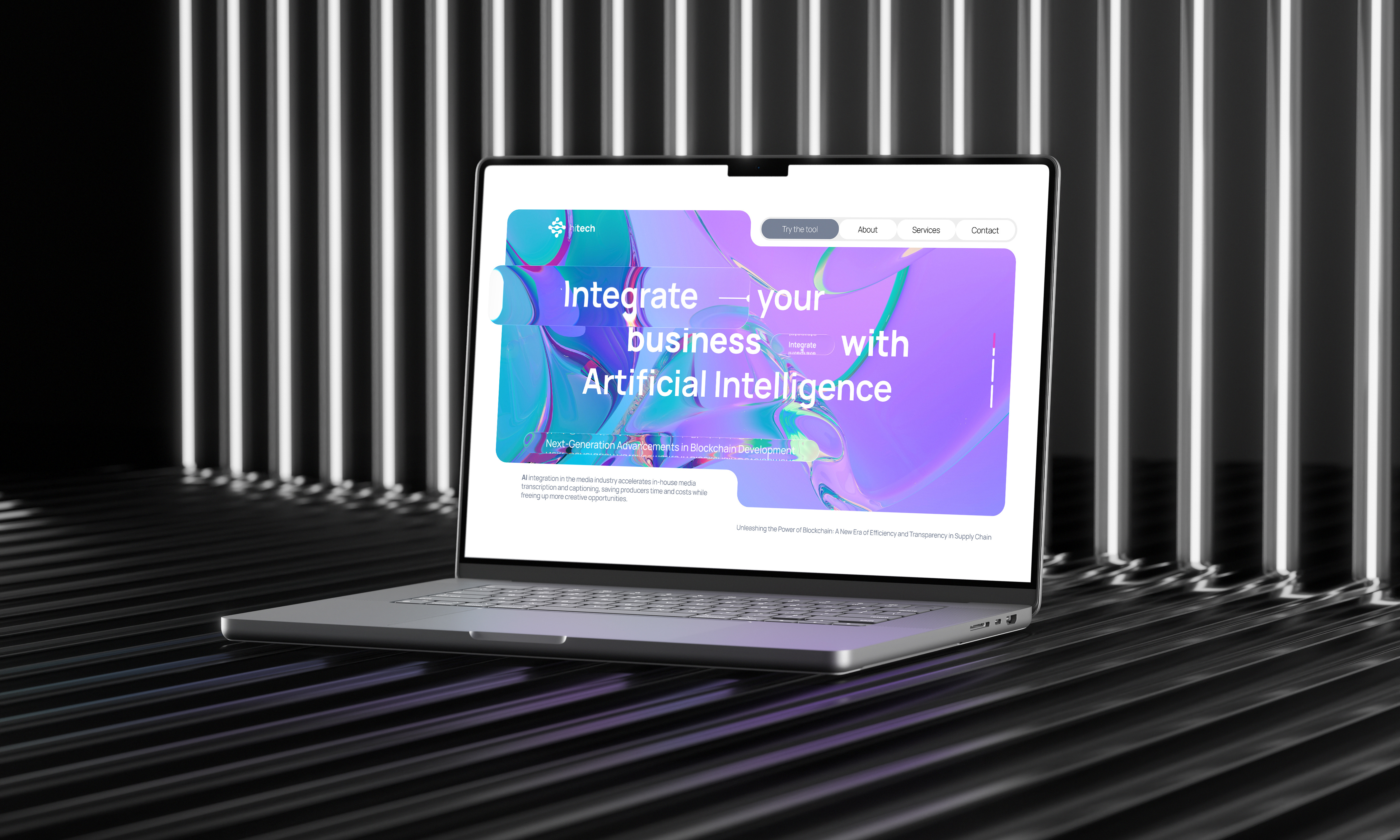
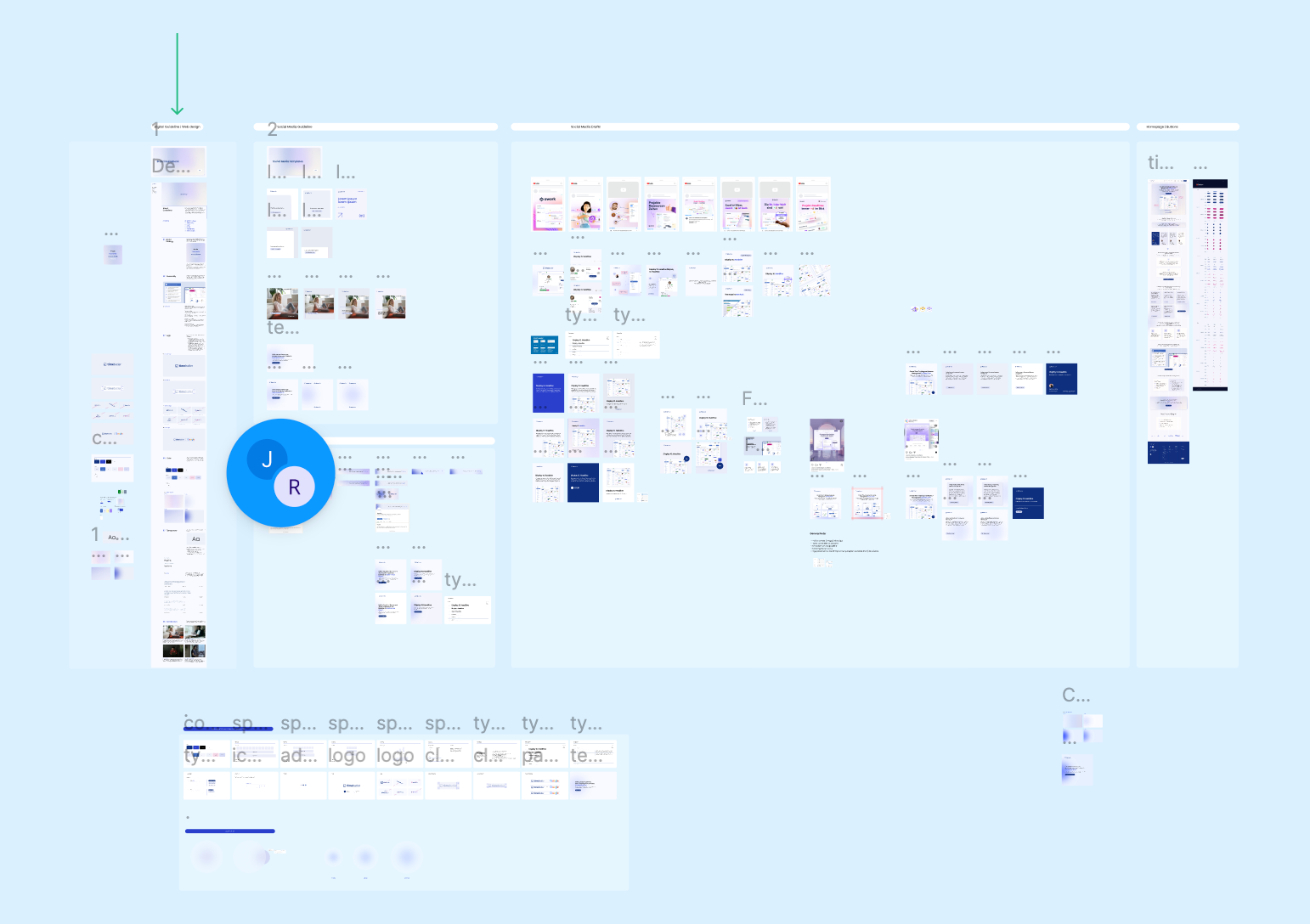
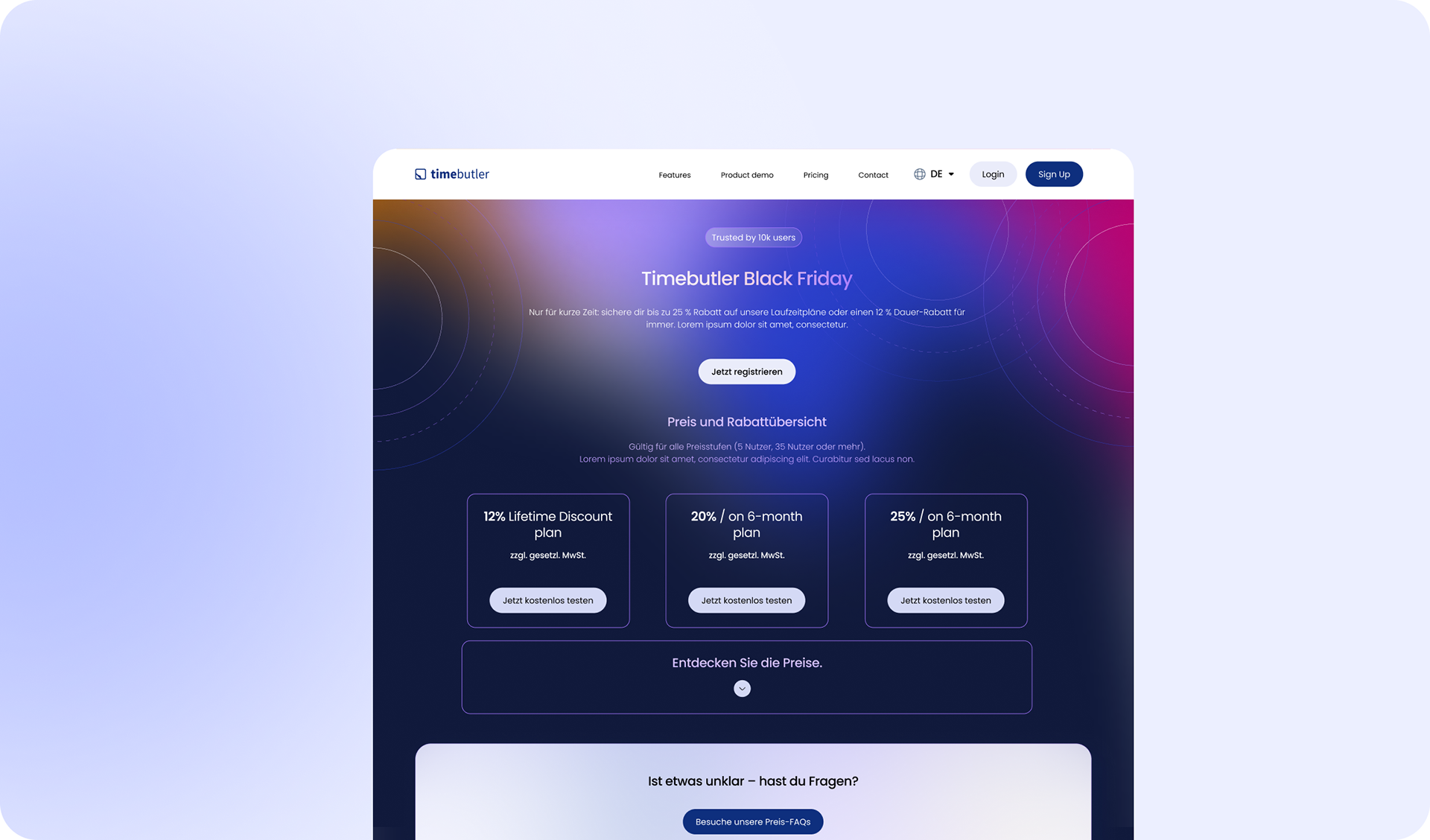
CHANNEL-OPTIMIZED SCALING
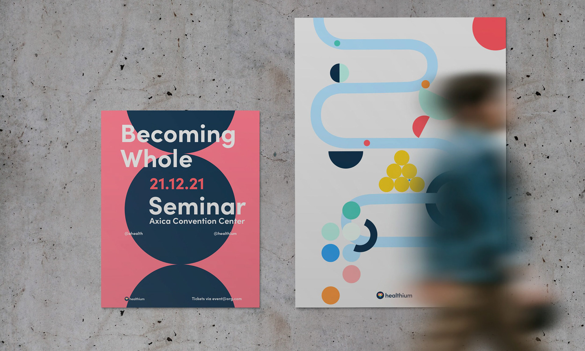
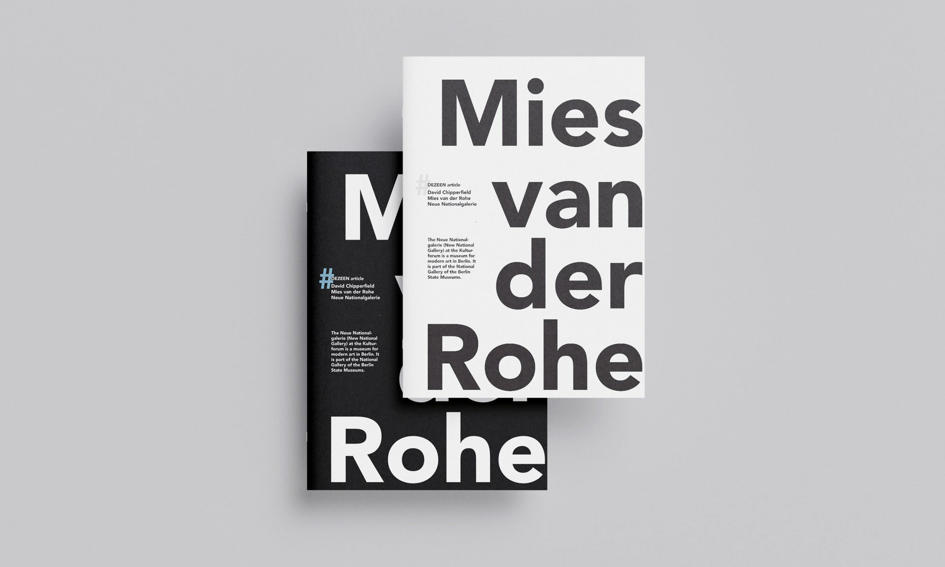
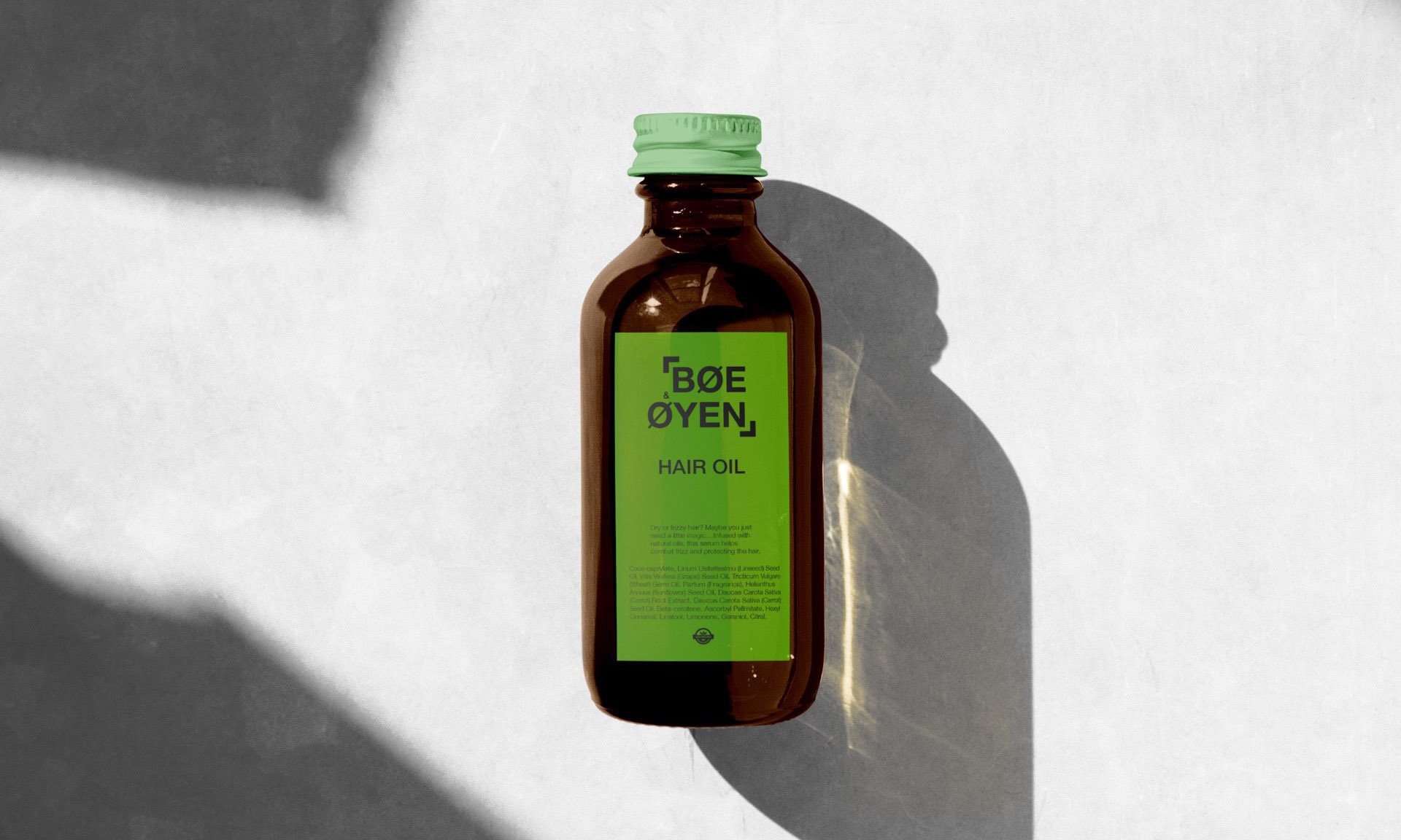
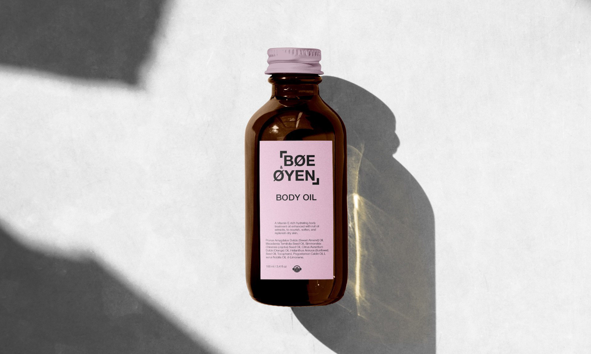
Inspired by the leading SaaS social presence: product storytelling via flexible systems, customized for Instagram, LinkedIn, and beyond.
Inspired by the leading SaaS social presence: product storytelling via flexible systems, customized for Instagram, LinkedIn, and beyond.
BRAND DNA
Quick overview
Quick overview
RESULT
Given Timebutler’s strong presence in the DACH region, Persona, the redesign should highlight this market expertise with localized content, testimonials from renowned DACH brands, and region-specific case studies. Overall, the redesigned Timebutler website offers a more user-friendly and efficient experience, catering to the evolving needs of modern businesses in time and absence management.
Given Timebutler’s strong presence in the DACH region, Persona, the redesign should highlight this market expertise with localized content, testimonials from renowned DACH brands, and region-specific case studies. Overall, the redesigned Timebutler website offers a more user-friendly and efficient experience, catering to the evolving needs of modern businesses in time and absence management.