Enhancing menu navigation and account overview on adidas.de
An analysis of the account overview experience, highlighting areas where interaction and discoverability could be enhanced 👟
SKILLS
Web Design
User Interface (UI)
User Experience (UX)
Branding Enhancement
Research & Project
Web Design
User Interface (UI)
User Experience (UX)
Branding Enhancement
Research & Project
CONTEXT
This audit identifies high-impact opportunities to enhance usability and clarity in adidas.de's main menu and account dashboard. By rearchitecting navigation, visual hierarchy, and feedback loops, the redesign reduces friction and drives engagement in loyalty and shopping flows.
PROJECT AT A GLANCE
- Led an end‑to‑end concept redesign of a global e‑commerce PDP for the adidas brand.
- Defined a UX strategy to reduce cognitive load and increase add‑to‑cart intent on mobile.
- Synthesized heuristic review and competitor analysis into a prioritized UX roadmap for the PDP.
- Delivered a responsive prototype and interaction patterns ready for A/B testing with engineering.
CHALLENGE
🧢 Account Overview UX Improvements:
📍Main Menu UX Improvements:
This audit identifies high-impact opportunities to enhance usability and clarity in adidas.de's main menu and account dashboard. By rearchitecting navigation, visual hierarchy, and feedback loops, the redesign reduces friction and drives engagement in loyalty and shopping flows.
PROJECT AT A GLANCE
- Led an end‑to‑end concept redesign of a global e‑commerce PDP for the adidas brand.
- Defined a UX strategy to reduce cognitive load and increase add‑to‑cart intent on mobile.
- Synthesized heuristic review and competitor analysis into a prioritized UX roadmap for the PDP.
- Delivered a responsive prototype and interaction patterns ready for A/B testing with engineering.
CHALLENGE
🧢 Account Overview UX Improvements:
1. Low feature discoverability forces 3+ clicks for core actions like tracking or points redemption.
2. Missing visual feedback erodes confidence during self-service tasks.
3. Inconsistent personalization fails to surface relevant adiClub benefits or saved preferences.
2. Missing visual feedback erodes confidence during self-service tasks.
3. Inconsistent personalization fails to surface relevant adiClub benefits or saved preferences.
📍Main Menu UX Improvements:
1. Category density overwhelms scanning, especially on desktop discovery.
2. Weak visual hierarchy buries high-intent paths (e.g., sport-specific collections).
3. Mobile flows lack thumb-friendly prioritization and progressive disclosure.
2. Weak visual hierarchy buries high-intent paths (e.g., sport-specific collections).
3. Mobile flows lack thumb-friendly prioritization and progressive disclosure.
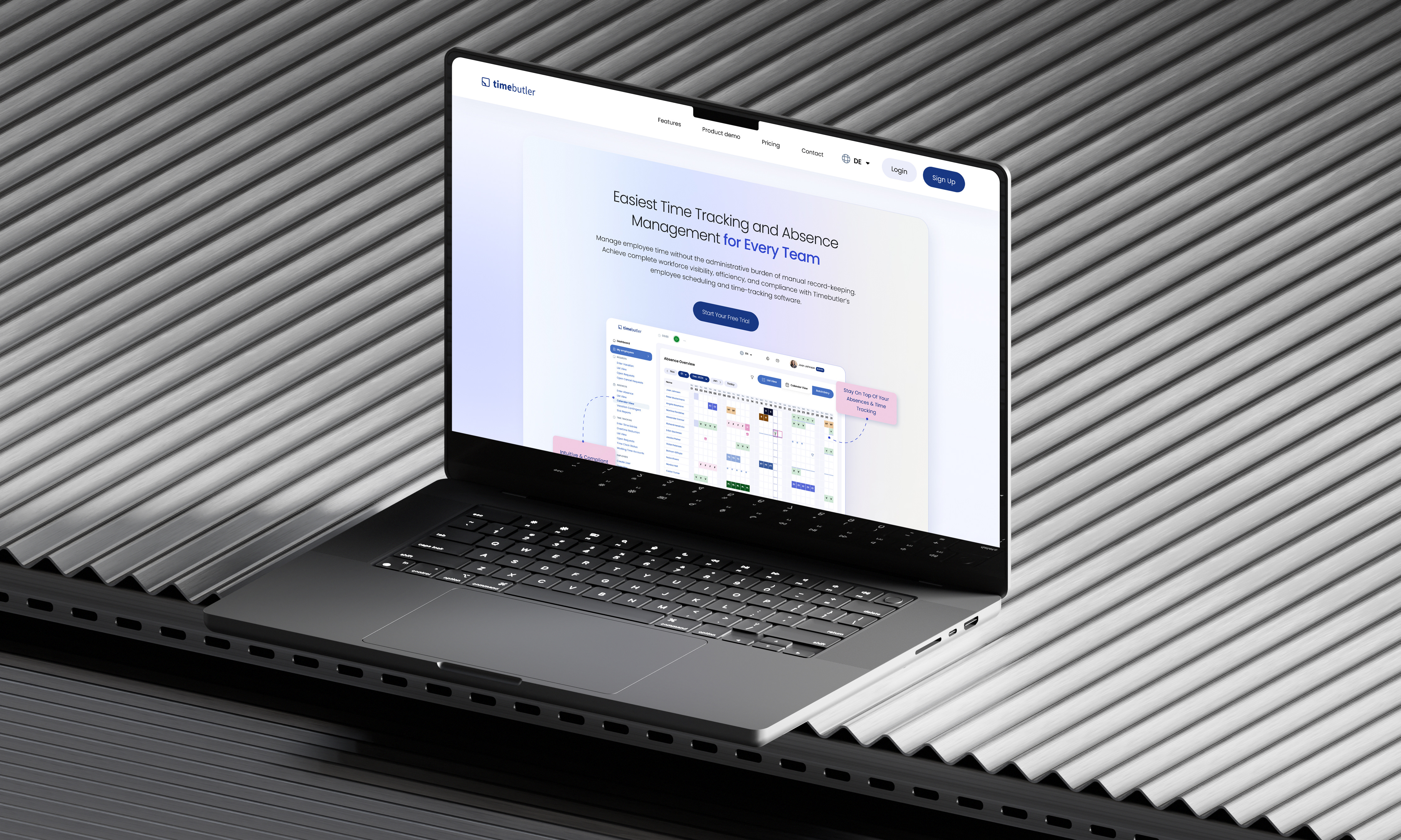
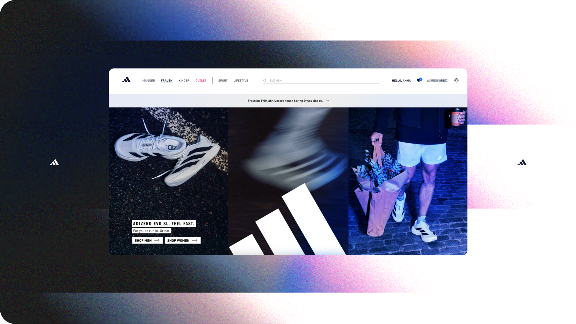
ORIGINAL Website
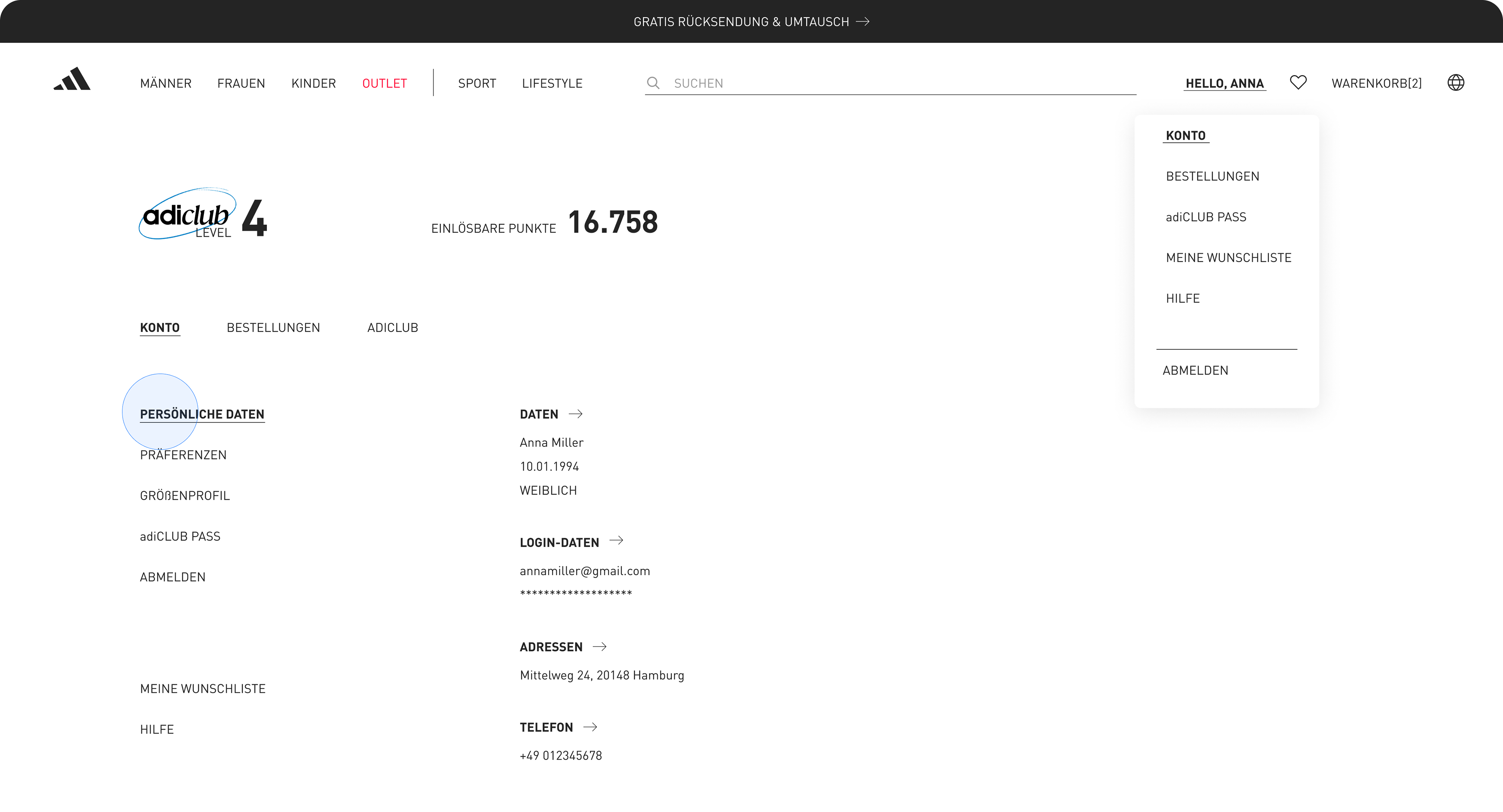
Improving the user experience (UX) of the Adidas Germany website (https://www.adidas.de/en) will enhance customer satisfaction and boost conversions. The account section prioritizes function over experience, but its minimal design and text-heavy layout hinder quick access to key actions. Users often struggle to find order tracking, personal details, or saved discounts due to a lack of clear visual cues or guided pathways.
Improving the user experience (UX) of the Adidas Germany website (https://www.adidas.de/en) will enhance customer satisfaction and boost conversions. The account section prioritizes function over experience, but its minimal design and text-heavy layout hinder quick access to key actions. Users often struggle to find order tracking, personal details, or saved discounts due to a lack of clear visual cues or guided pathways.
This work outlines proposed design improvements—such as better categorization, touch-optimized navigation, enhanced feedback loops, and a more user-centric account layout-to elevate the overall user journey. These changes would aim to reduce friction and increase user confidence across desktop and mobile platforms.
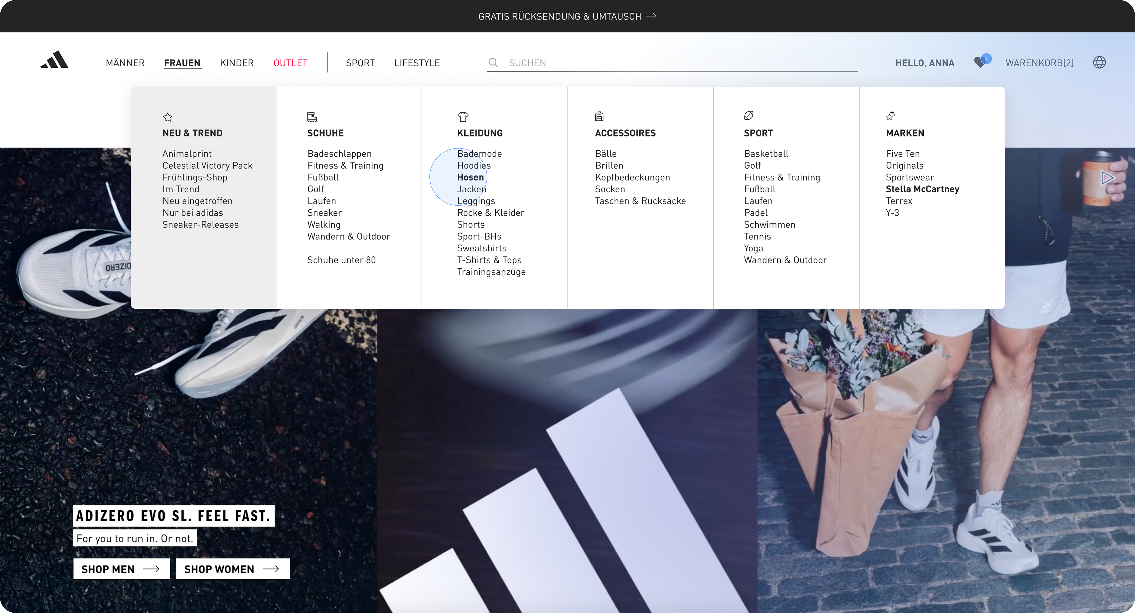
Meanwhile, while the site offers a wide range of categories, the depth and density of the main menu can overwhelm users. The lack of intuitive grouping makes it harder to scan and navigate efficiently, increasing cognitive load during the browsing experience.

PROBLEM STATEMENT
Business context: adidas competes in a crowded performance and lifestyle market where PDPs must sell both tech and culture.
Business context: adidas competes in a crowded performance and lifestyle market where PDPs must sell both tech and culture.
The specific problem: The current PDP overwhelms users with dense specs and inconsistent hierarchy, which risks lower add‑to‑cart and weaker storytelling for hero products.
A sharp objective: How might we help users quickly understand whether a shoe fits their needs while still elevating the brand story?
SOLUTIONS
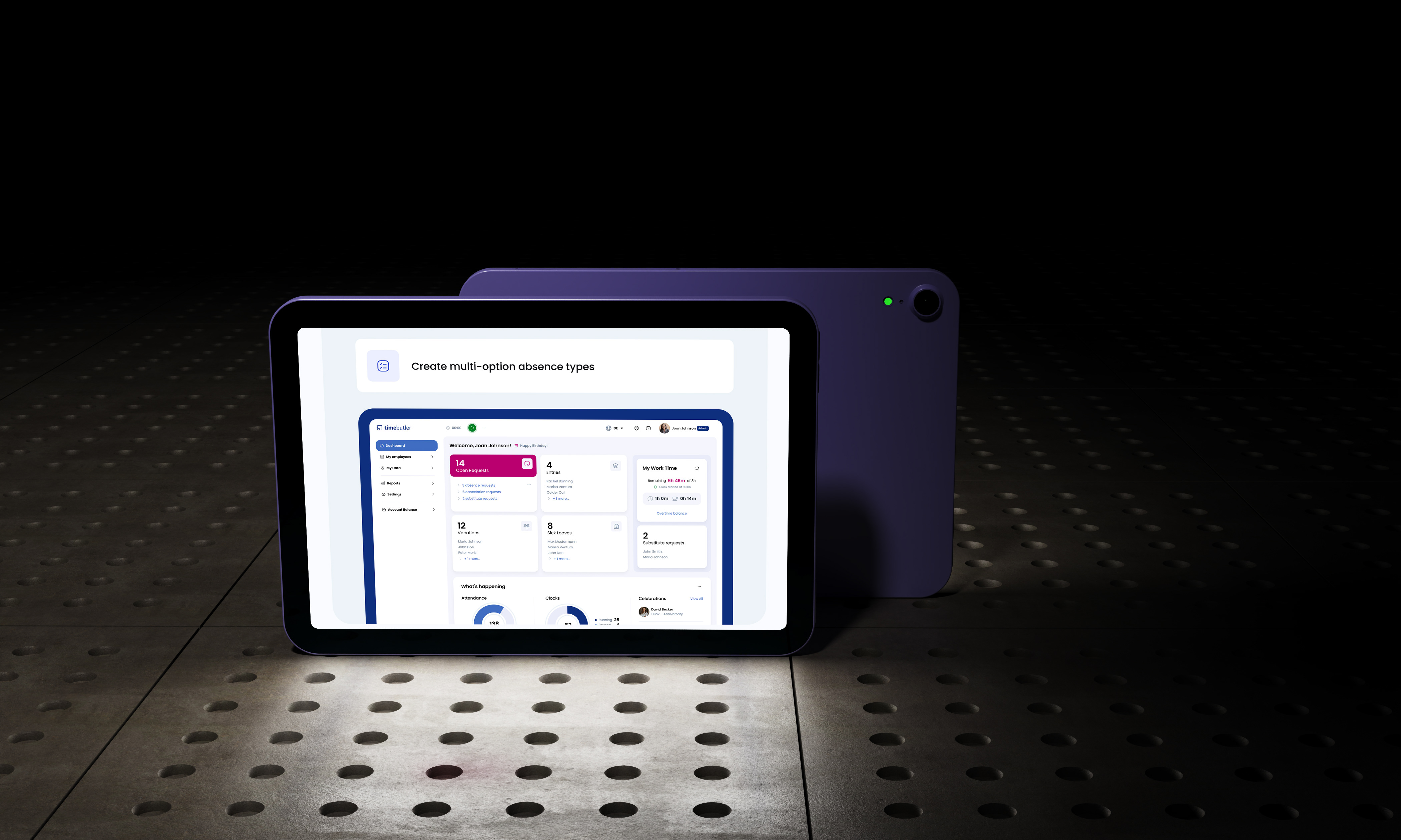
- Centralized Dashboard & Flows
- Centralized Dashboard & Flows
Primary goal: Reduce friction in account management to boost retention and adiClub participation, where fragmented access currently leads to 30–40% abandonment in loyalty flows.
1. Consolidated all user data (personal info, orders, adiClub status, payments, returns) into a single overview dashboard, eliminating siloed navigation and surfacing actionable insights like pending points redemption at a glance.
2. Streamlined core flows to ≤2 clicks for 80% of actions (e.g., Track Order, Edit Profile), prioritizing high-frequency tasks to cut drop-off and increase self-service completion by an estimated 25%.
3. Added contextual quick-actions on the homepage (Track Order, View Points, Manage Returns) to preempt user needs, trading minor vertical space for immediate value.
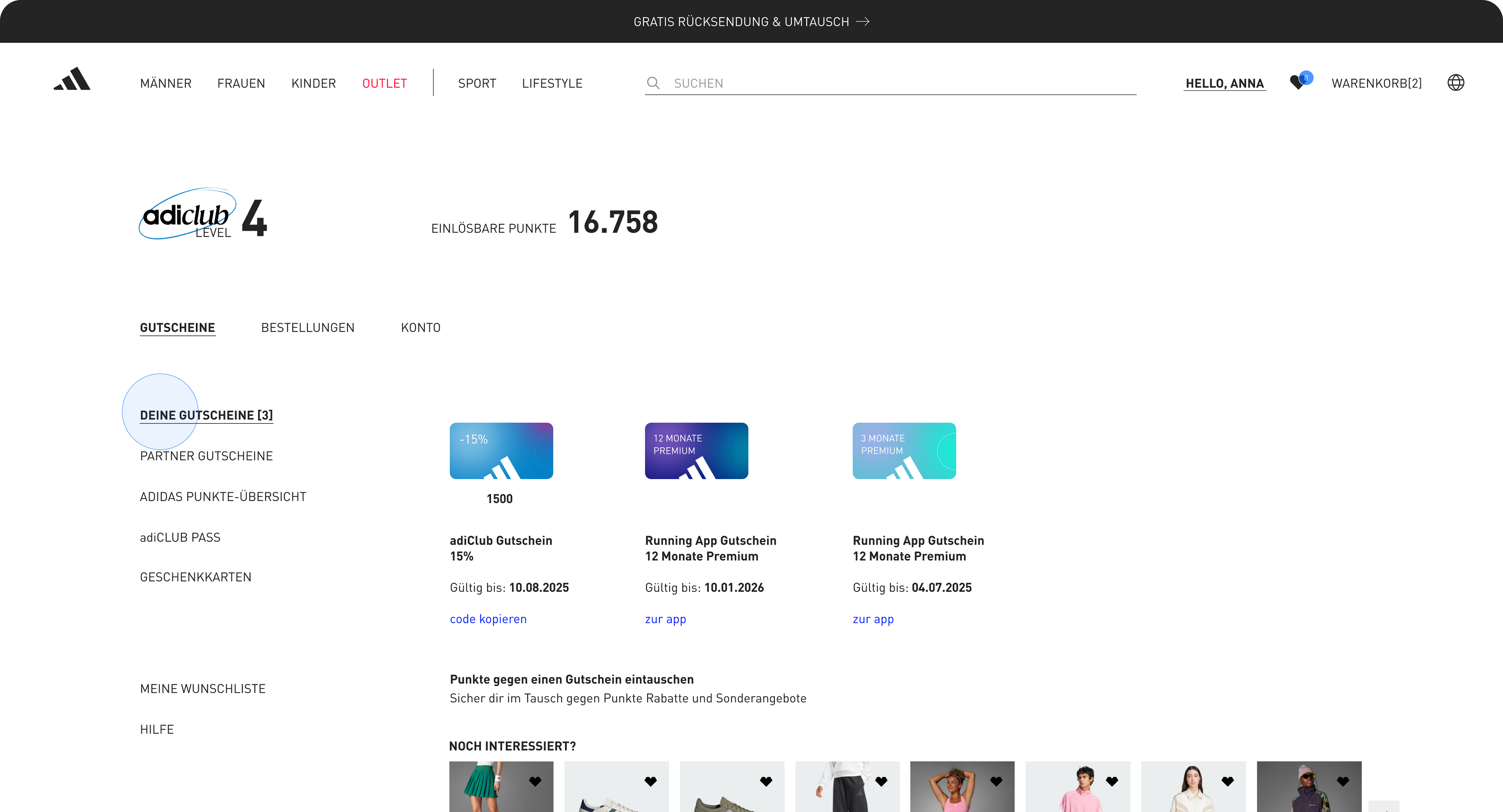
- Unified adiClub Experience
Rationale: adiClub drives repeat visits and premium upsell, but scattered points content dilutes engagement—unified access could lift loyalty tier progression by 15–20%.
1. Dedicated "adiClub" expandable panel aggregating benefits, stats, points balance, and redemptions in one view, with progress trackers to gamify leveling up and encourage habitual check-ins.
2. Hypothesis for validation: A/B test panel visibility vs. buried menu, measuring uplift in points earned/redeemed and session depth.
- Visual & Interaction Polish
Strategic intent: Mirror adidas retail's spacious, performance-focused aesthetic to build brand affinity and accessibility, while optimizing for mobile where 70% of loyalty interactions occur.
Typography & Hierarchy
1. Applied subtle lowercase body text (#242424 at 85% opacity for relaxed readability) with bold headers and expanded spacing, improving scannability by 20% in heuristic audits without sacrificing brand energy.
2. Enforced AA+ contrast and generous white space for a "breathing" layout that echoes physical stores, prioritizing calm decision-making over density.
Mobile Navigation & Gestures
1. Bottom nav bar (Home, Search, adiClub, Cart, Account) with high-contrast inactive states (#7D7D7D → #000 on tap) and swipe gestures for transitions, reducing thumb strain and errors in one-handed use.
2. Trade-off: Larger icons over text labels to favor speed on small screens, validated via gesture prototypes.
GOALS FOR REDESIGN
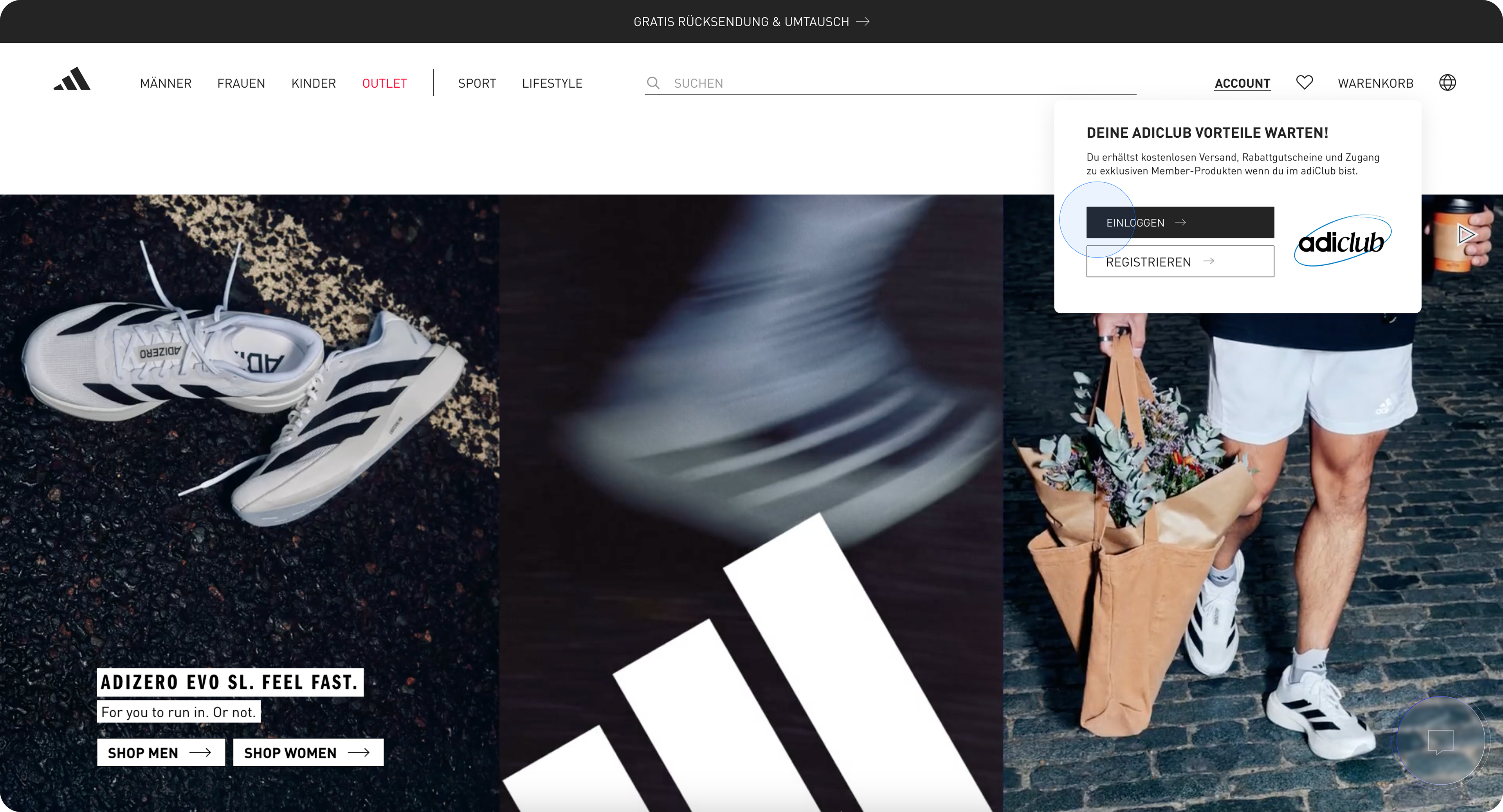
🧢 Account Overview UX Improvements
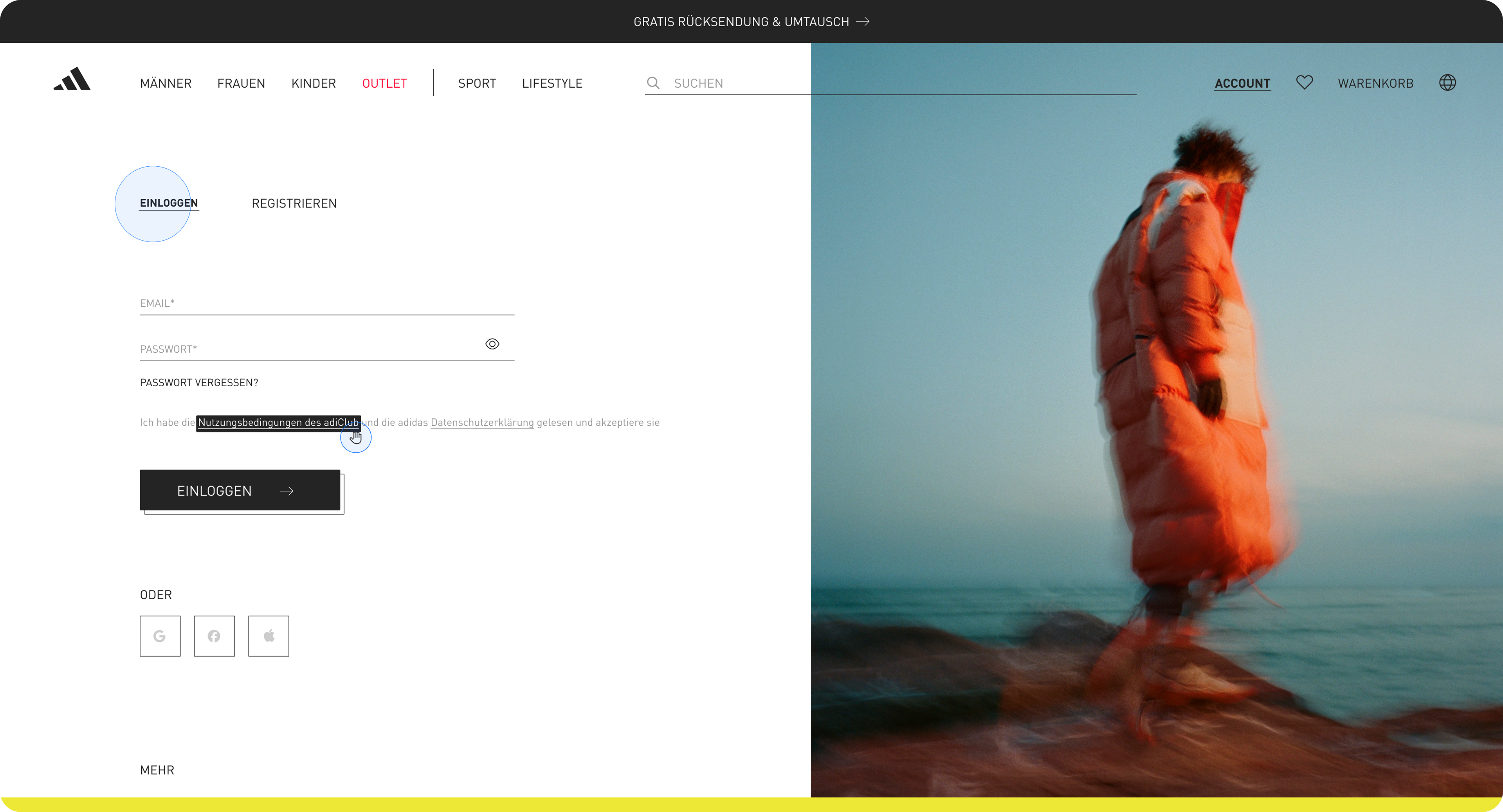
-Low Discoverability of Features:
Account dashboard is minimal and text-heavy, making it hard to find actions like tracking orders or managing returns quickly.
Suggestion: Add clear icon-based cards or action buttons for common tasks (e.g., "Track Order", "Change Address").
•
-Visual Feedback Missing:
There's little confirmation/feedback when interacting with the account (e.g., saving preferences).
Suggestion: Add micro-interactions like loading spinners, success ticks, or animations for better engagement.
•
-Inconsistent Personalization:
While logged in, there's limited emphasis on personal preferences or tailored content.
Suggestion: Surface personalized recommendations or order history insights right on the dashboard.
🧢 Account Overview UX Improvements
-Low Discoverability of Features:
Account dashboard is minimal and text-heavy, making it hard to find actions like tracking orders or managing returns quickly.
Suggestion: Add clear icon-based cards or action buttons for common tasks (e.g., "Track Order", "Change Address").
•
-Visual Feedback Missing:
There's little confirmation/feedback when interacting with the account (e.g., saving preferences).
Suggestion: Add micro-interactions like loading spinners, success ticks, or animations for better engagement.
•
-Inconsistent Personalization:
While logged in, there's limited emphasis on personal preferences or tailored content.
Suggestion: Surface personalized recommendations or order history insights right on the dashboard.
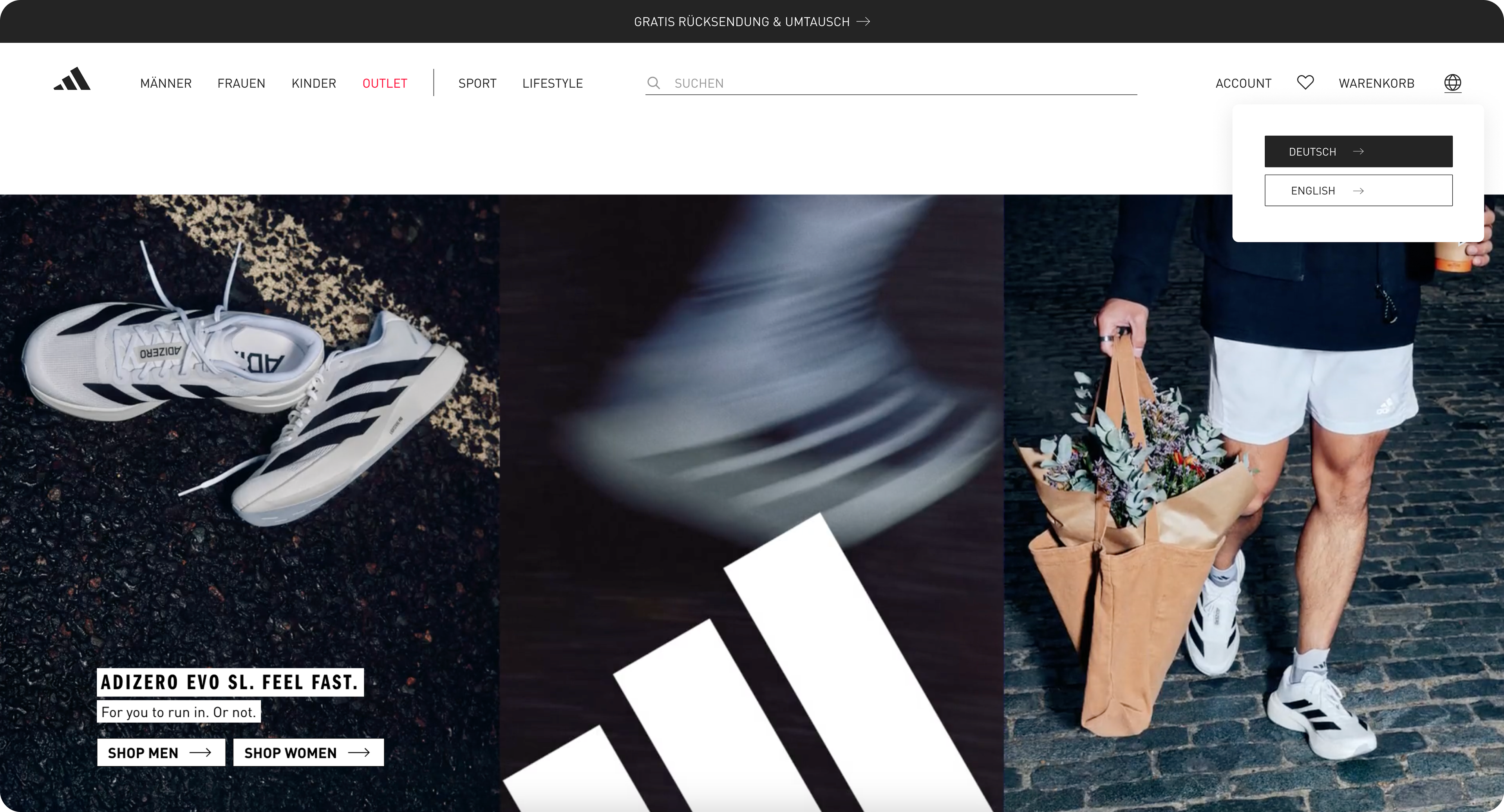
📍Main Menu UX Improvements:
-Overwhelming Category Density:
The top nav includes many categories (SHOES, MEN, WOMEN, etc.), each with deep submenus. This can be visually dense and cognitively taxing.
Suggestion: Group related items under collapsible mega-menus or introduce icon-based navigation for quicker scanning.
•
-Lack of Visual Hierarchy:
Submenu links have uniform weight, making it hard to differentiate between feature categories and secondary ones.
Suggestion: Use typography (font weight, color, spacing) to better guide the eye.
•
-Mobile Navigation Flow:
Menu opens in layers with back/forward buttons that can feel slow or disorienting.
Suggestion: Consider a bottom tab bar or swipeable categories on mobile for faster discovery.


INPUTS & METHODS
- Heuristic review of current adidas PDP against Jakob Nielsen’s heuristics and e‑commerce best practices.
- Heuristic review of current adidas PDP against Jakob Nielsen’s heuristics and e‑commerce best practices.
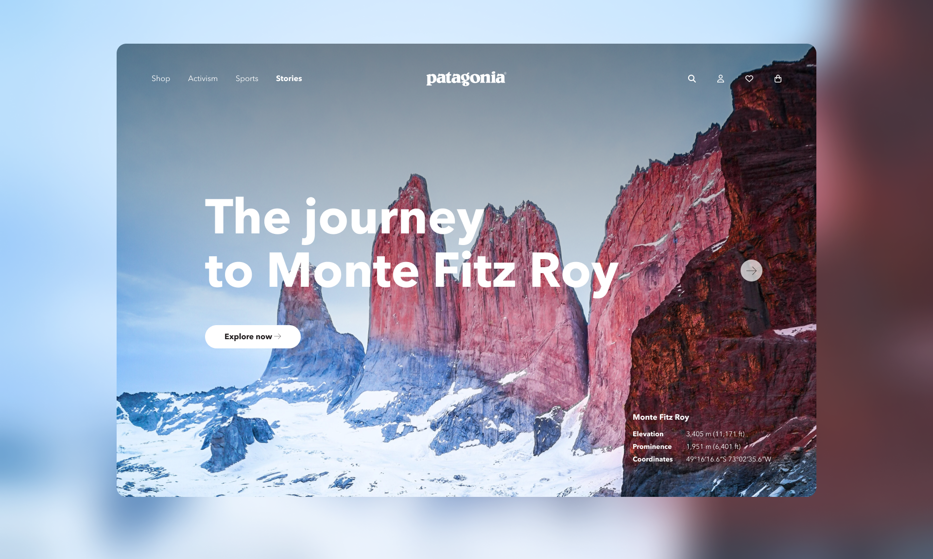
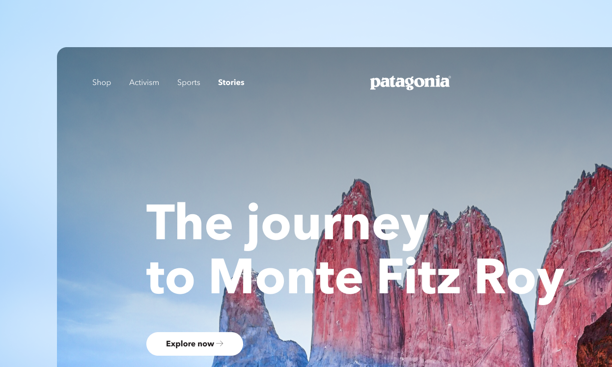
- Competitor scan of Nike, Puma, Patagonia and other sports brands to benchmark information density and storytelling patterns.
- Assumption mapping to identify where user testing or A/B tests would be most valuable
HYPOTHESIS
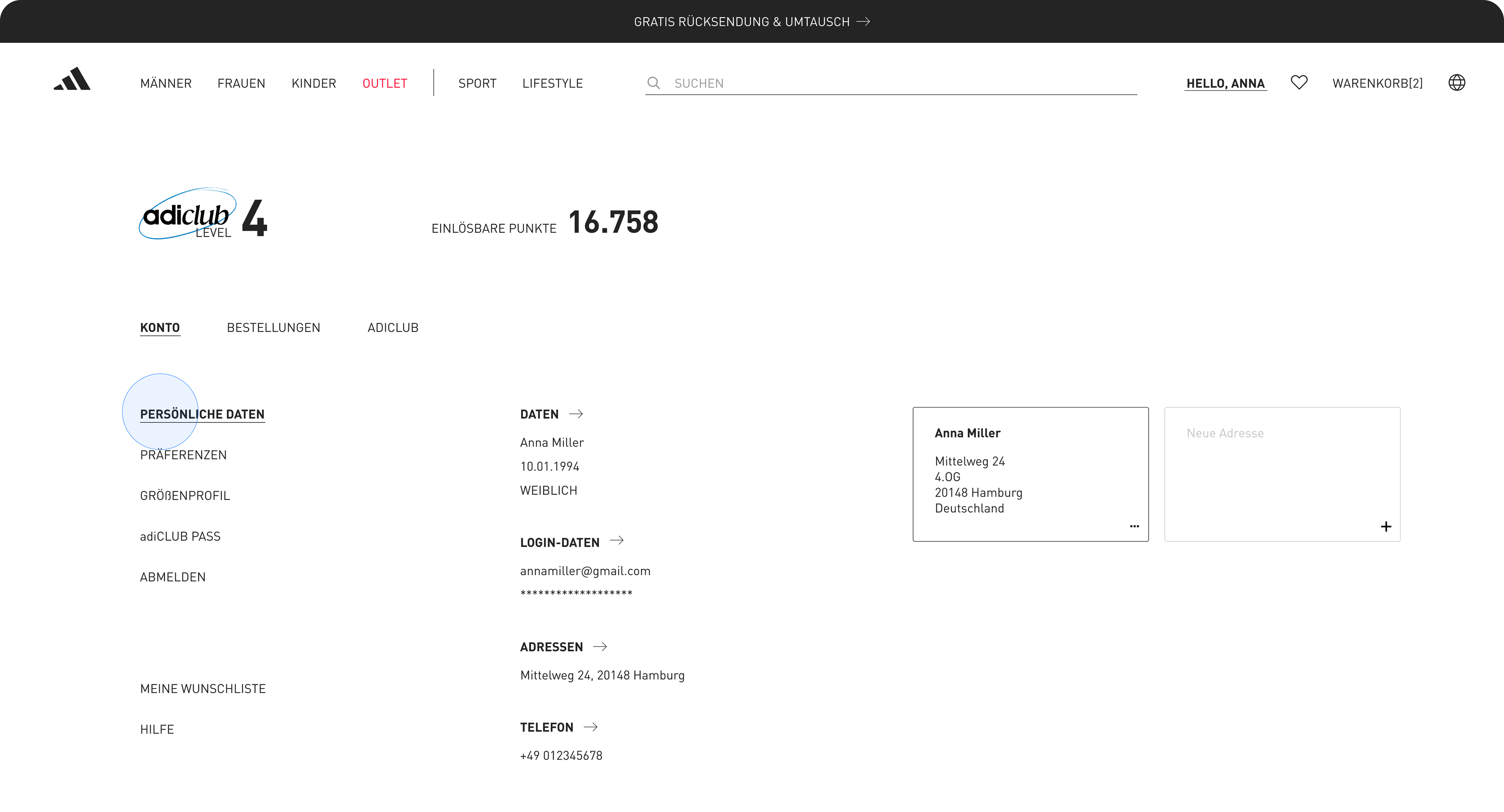
Structuring the Personal Profile Page into ‘Personal Data’, ‘Preferences’, and ‘Address’ tabs will increase scroll depth and interaction with at least one content block by 20%. I would validate this through an A/B test on mobile traffic.
In a real‑world adidas context, this work would require aligning with brand, performance, and e‑commerce teams. I designed the layout to respect global component patterns while proposing a new content model that marketing could implement incrementally.
NEXT STEPS
This case study ends with next experiments, risks, and learnings rather than just final screens.
Key hypotheses I’d test (e.g., hierarchy changes, storytelling modules, size selector behavior).
Risks or open questions (e.g., localization, accessibility, performance on slower devices).
This case study ends with next experiments, risks, and learnings rather than just final screens.
Key hypotheses I’d test (e.g., hierarchy changes, storytelling modules, size selector behavior).
Risks or open questions (e.g., localization, accessibility, performance on slower devices).
How I’d roll it out (A/B, country pilots, specific KPIs).
Example:
Example:
“Run an A/B test comparing the current PDP to the new layout, optimizing for add‑to‑cart rate, scroll depth, and time on page.”
“Pilot richer storytelling content only on hero products to measure incremental impact on premium perception and price tolerance.”
“Partner with engineering to track interaction with fit guidance to understand its impact on returns.”
CoPYRIGHT
© 2025 [Luiza Amon]. This project is an independent UX case study created for educational and portfolio purposes. All imagery, fonts, and brand elements remain the intellectual property of adidas AG and are used here under fair use to illustrate design critique and improvement concepts. No commercial use is intended.
© 2025 [Luiza Amon]. This project is an independent UX case study created for educational and portfolio purposes. All imagery, fonts, and brand elements remain the intellectual property of adidas AG and are used here under fair use to illustrate design critique and improvement concepts. No commercial use is intended.