A pleasant financial experience.
The goal of this project is to create a more intuitive experience for the Commerzbank Banking app.
PROJECT INFO
Duration: 2 weeks sprint
Duration: 2 weeks sprint
SKILLS
UI Design
UX Design
User Research
Information Architecture
UI Design
UX Design
User Research
Information Architecture
CATEGORY
Finance
Finance
context
The Commerzbank AG is a major German bank operating as a universal bank, headquartered in Frankfurt am Main. All the advantages of modern mobile banking with the security of a major German bank. Banking is quick and easy with the Commerzbank Banking app, whenever you want and wherever you are. The bank goes with the slogan: "Your bank is always with you".
The Commerzbank AG is a major German bank operating as a universal bank, headquartered in Frankfurt am Main. All the advantages of modern mobile banking with the security of a major German bank. Banking is quick and easy with the Commerzbank Banking app, whenever you want and wherever you are. The bank goes with the slogan: "Your bank is always with you".
Disclaimer
I am not in any way affiliated with Commerzbank, just an avid Commerzbank user that want to find a better design solution.
I am not in any way affiliated with Commerzbank, just an avid Commerzbank user that want to find a better design solution.
The Problem
The current Commerzbank app has a lot of functions, and some of them are very useful for customers. However, users feel that the app experience is not very intuitive. There is a lack of sense of accessibility and for new users, the app seems rather complicated and crowded with a lot of services.
“The balance on the credit card is not updated while the update on the account is already done which shows a wrong negative balance at the end of the month. Sometimes it takes over a week to update. It puts me in a such bad position when my card declines because the account is out of money, but the app shows you're still 200+” — Google Play Store comments based on review by 200+ users
Based on user reviews from the Apple App store and several interviews with daily users, I identify several pain points that occur during the experience.
Pain Points
1. The actual balance and the upcoming transactions are not shown.
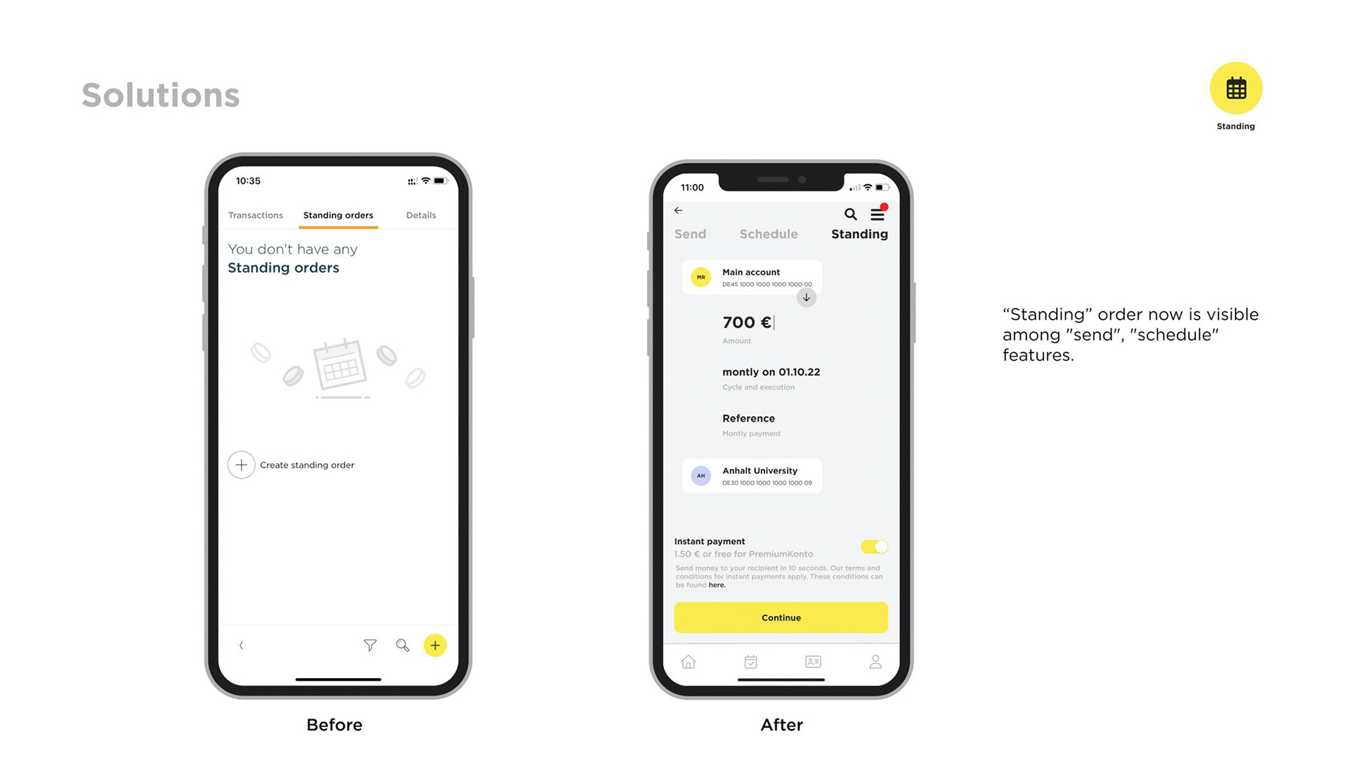
2. Missing option to create Standing orders (scheduled transfers), it is only possible through the website.
3. The Analysis of money needs a more intuitive interface and sufficient
options to overview more in deep my earnings and expenses.
4. The process of Photo Tan is long for new users to get it functioning and quite complicated to use for every transaction through a subsidiary app.
5. Transparency of payments, want to know the payment in the original currency and also the number of fees the bank is charging.
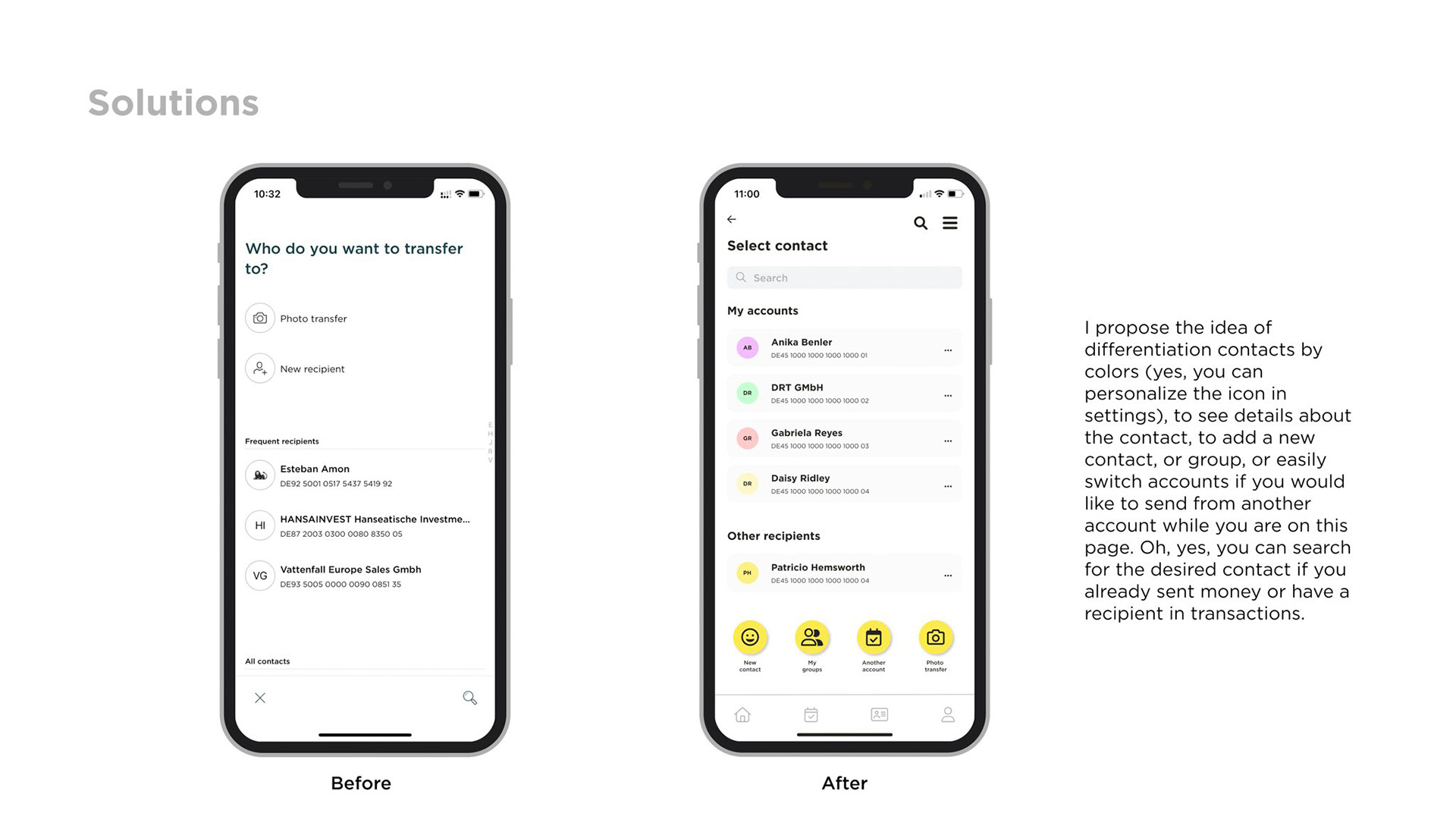
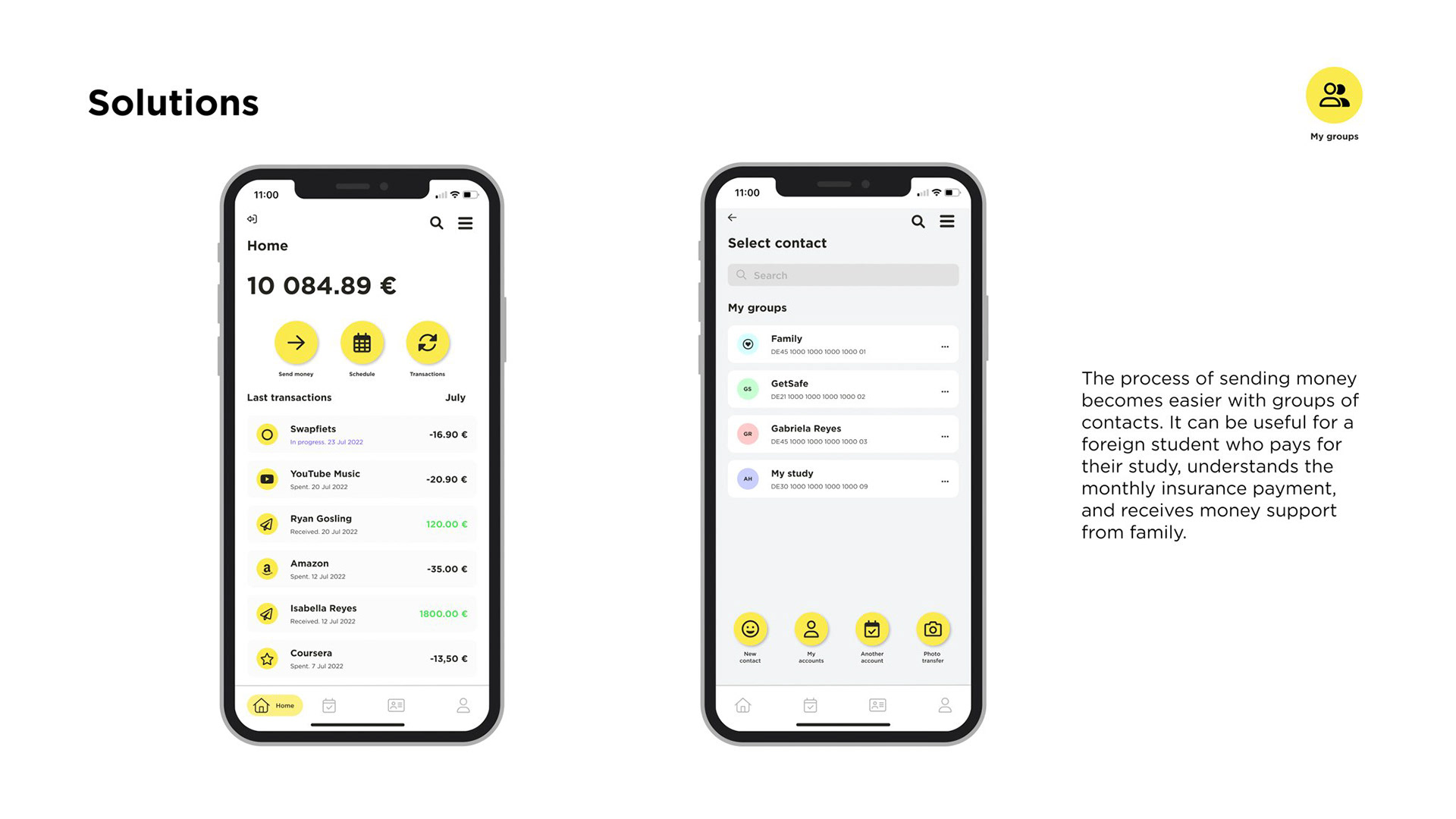
6. Managing recipients is cumbersome.
1. The actual balance and the upcoming transactions are not shown.
2. Missing option to create Standing orders (scheduled transfers), it is only possible through the website.
3. The Analysis of money needs a more intuitive interface and sufficient
options to overview more in deep my earnings and expenses.
4. The process of Photo Tan is long for new users to get it functioning and quite complicated to use for every transaction through a subsidiary app.
5. Transparency of payments, want to know the payment in the original currency and also the number of fees the bank is charging.
6. Managing recipients is cumbersome.
Research
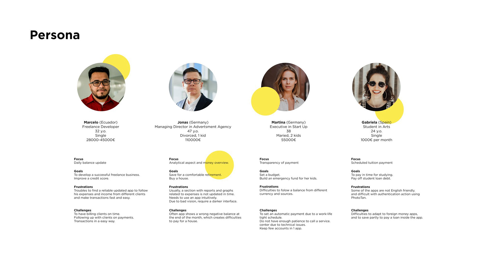
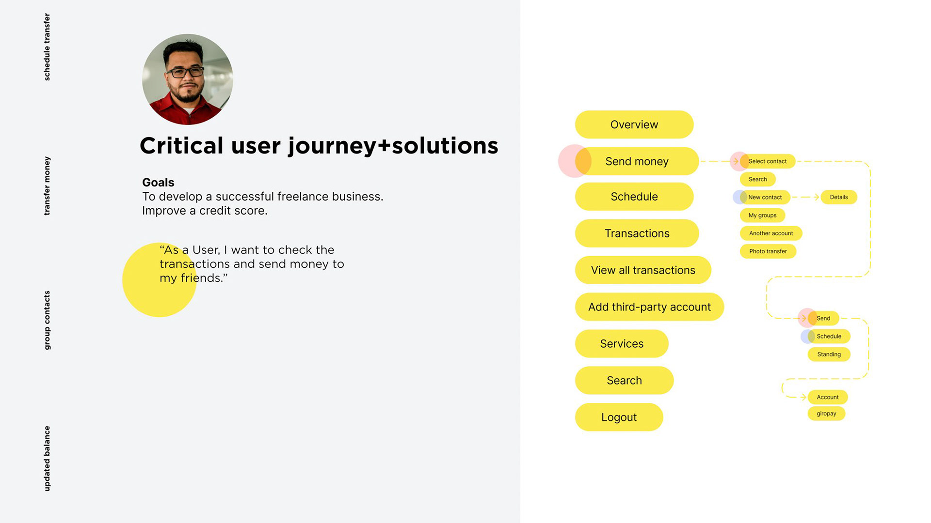
To start with, I interviewed 8 app users, trying to figure out what tools they use, what problems they face, and what vision they have for improving their experience. The conversations validated my assumption that I have defined 4 types of persona and their needs leveraging the existing app functions. After research, I identified 4 Personas with different professional backgrounds who use the app daily for different purposes.
To start with, I interviewed 8 app users, trying to figure out what tools they use, what problems they face, and what vision they have for improving their experience. The conversations validated my assumption that I have defined 4 types of persona and their needs leveraging the existing app functions. After research, I identified 4 Personas with different professional backgrounds who use the app daily for different purposes.
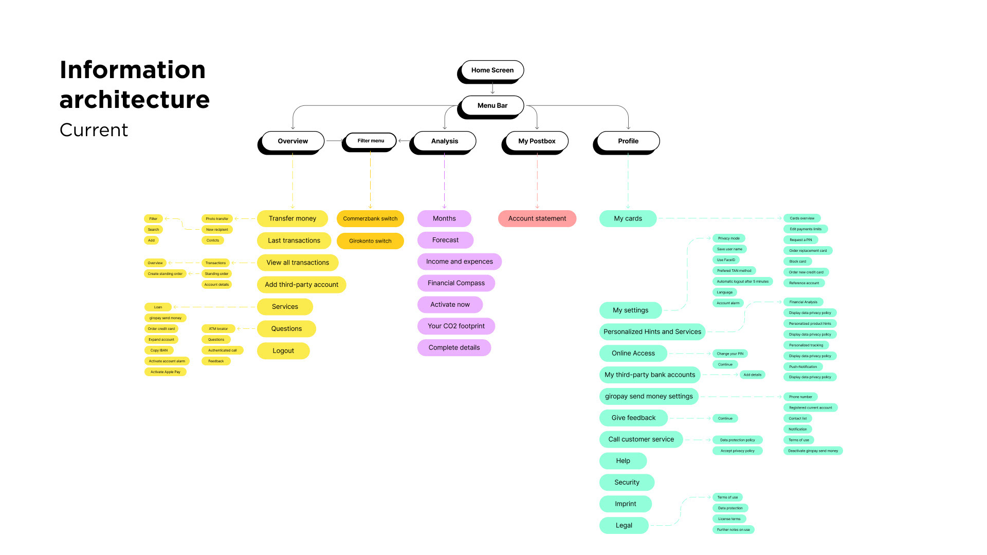
Information architecture
To understand more about the app structure, I created a rough rendition of the Commerzbank information architecture. Most of the core functions are not easily accessible because it is all placed in different parts of the app, filter menu has only 2 options for switching accounts service. The user gets lost easily looking for a specific option which is challenging to find.
To understand more about the app structure, I created a rough rendition of the Commerzbank information architecture. Most of the core functions are not easily accessible because it is all placed in different parts of the app, filter menu has only 2 options for switching accounts service. The user gets lost easily looking for a specific option which is challenging to find.
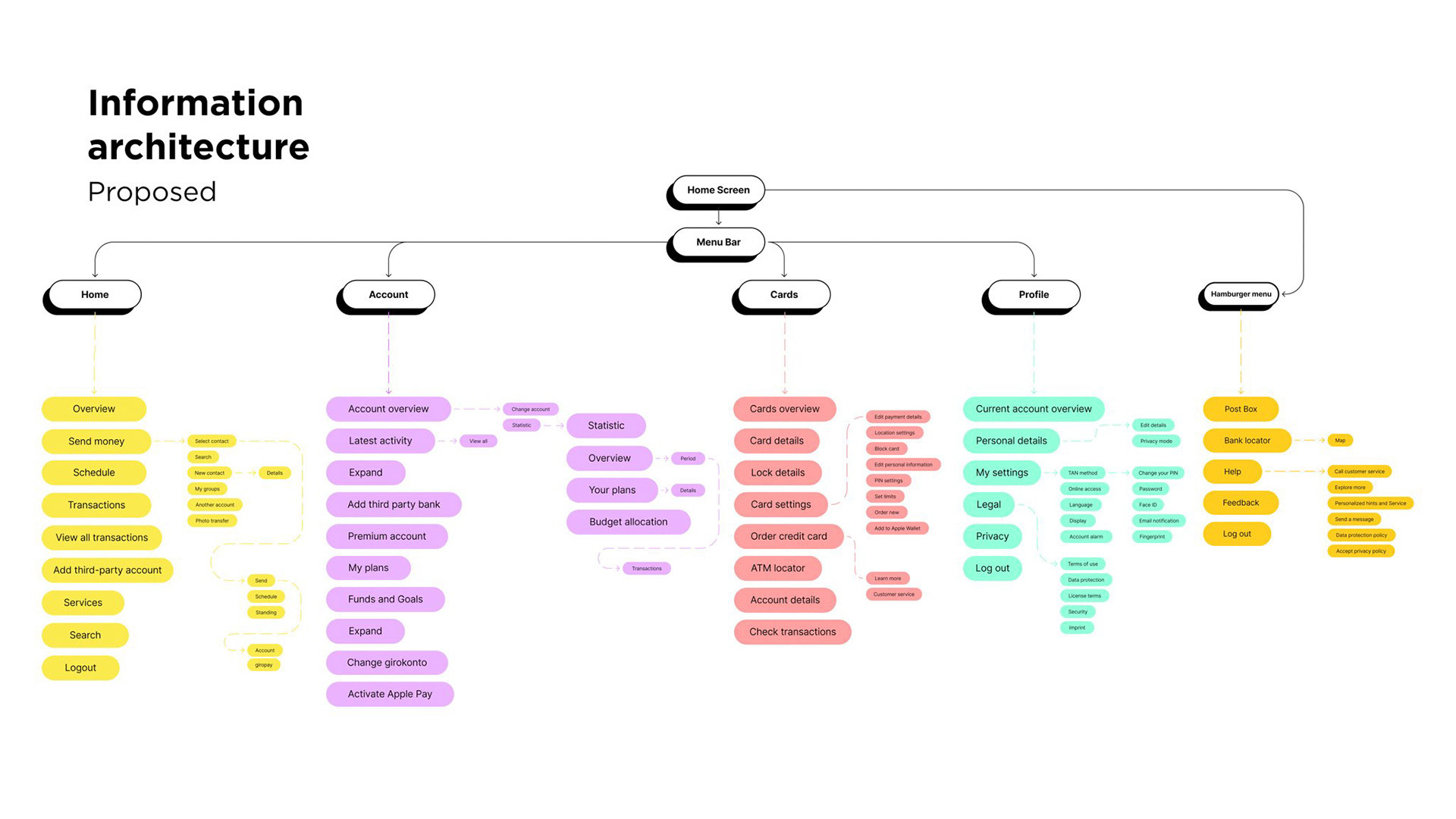
Redesigning Information Architecture
With the card sorting method, I identified another information architecture considering users' experience with the app and completed the research. Thus I proposed a new information architecture design for the app, with a simpler and more intuitive arrangement of the functions.
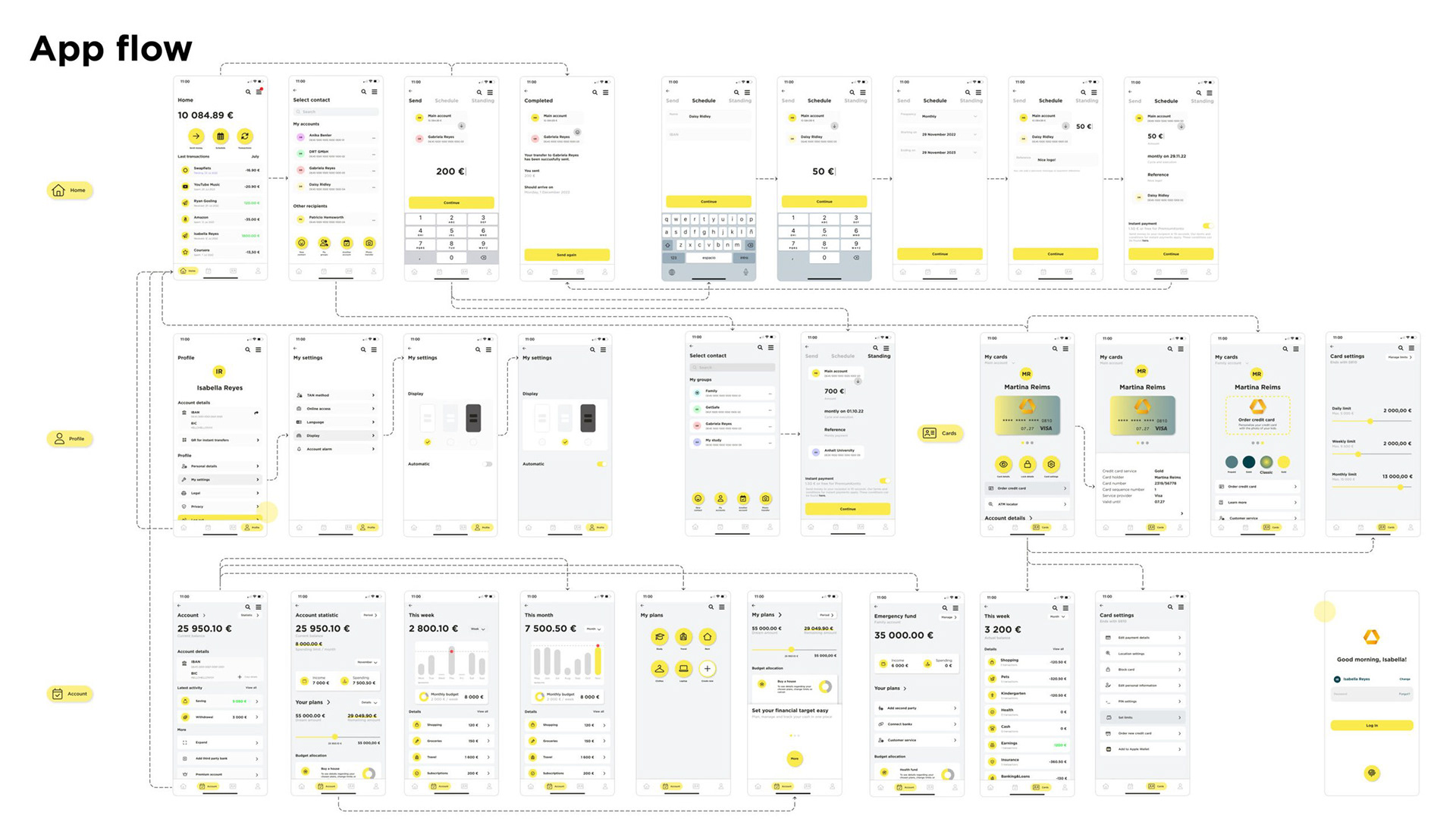
wireframing
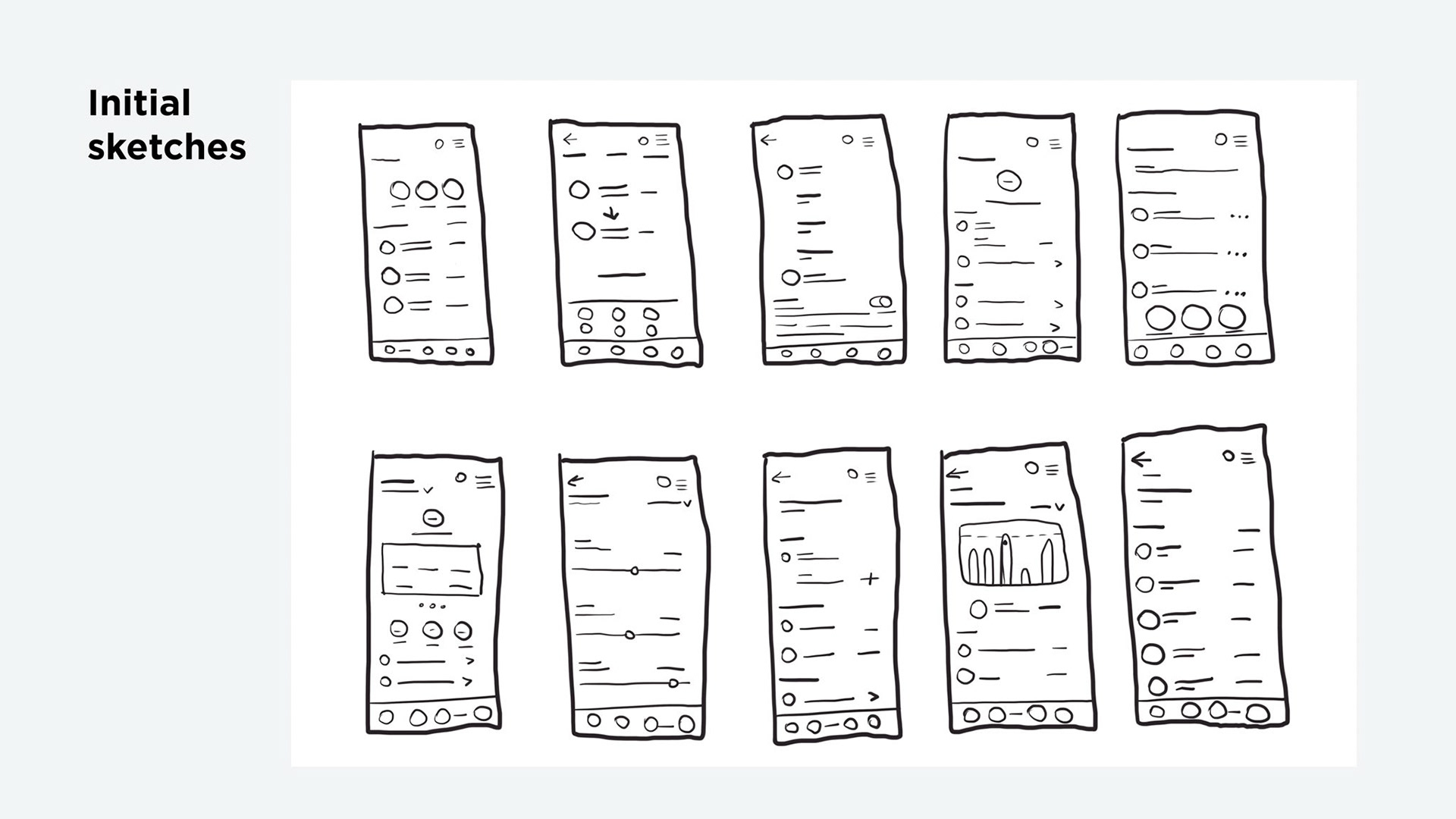
Crafting a User-Centric Interface
The next step is to redesign the interface. I started with pencil & paper, develop several paper prototypes before moving on to high fidelity wireframe.
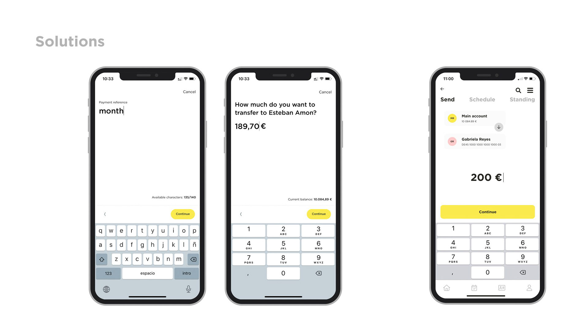
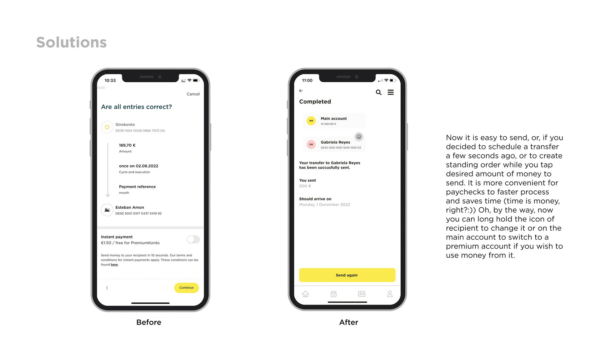
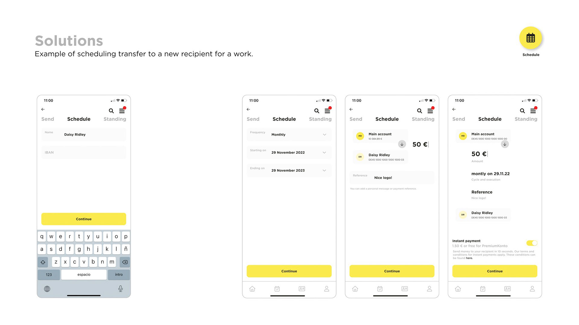
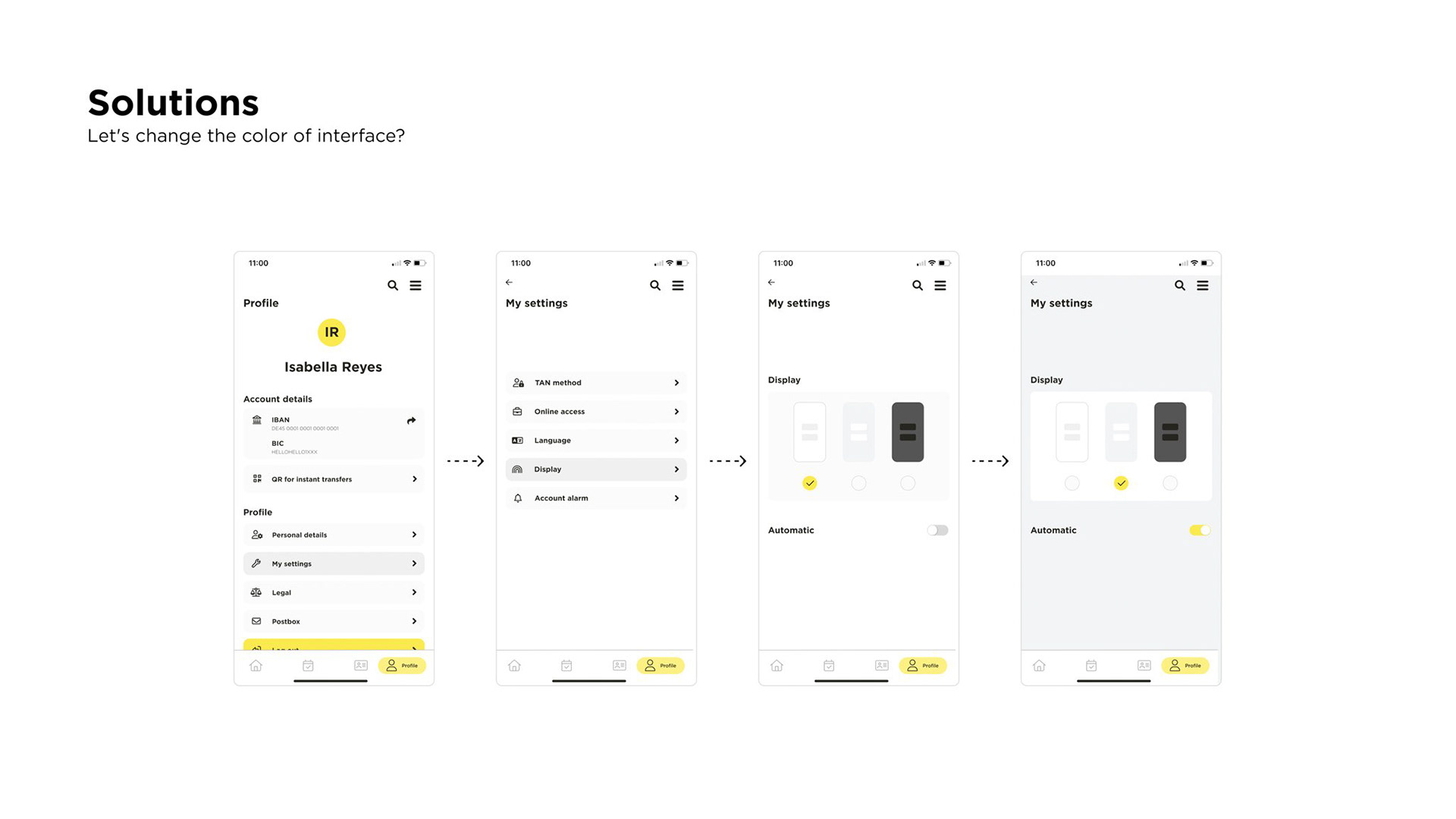
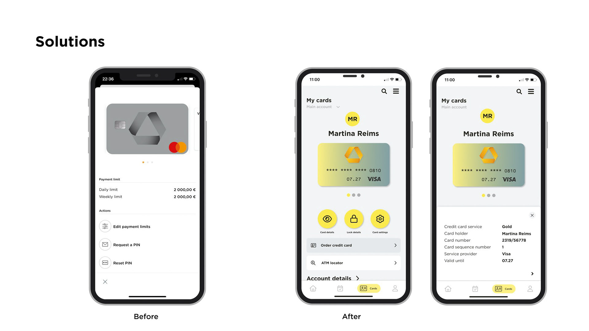
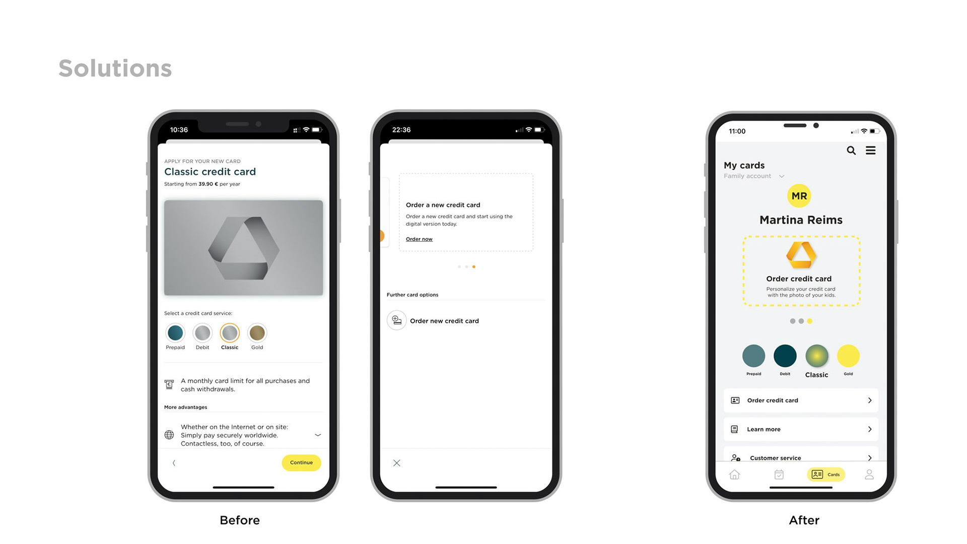
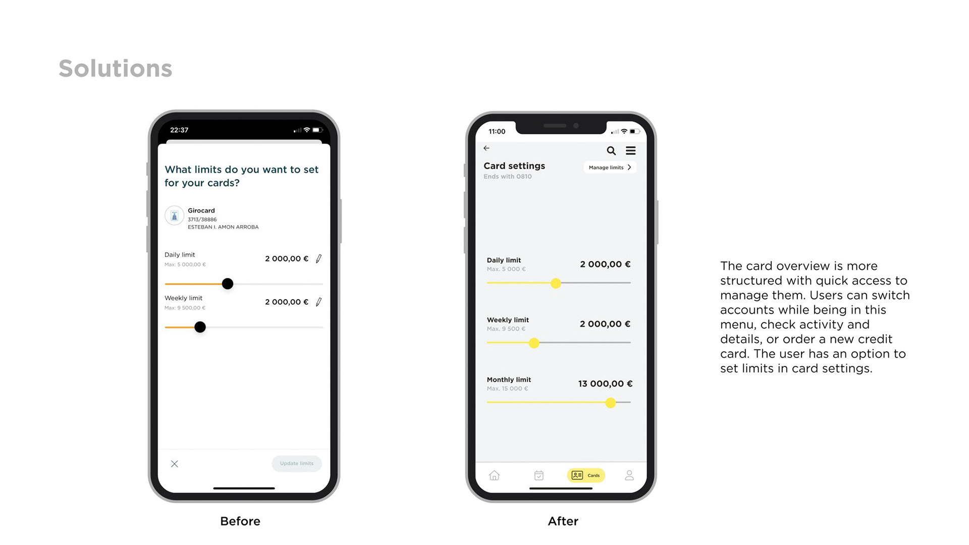
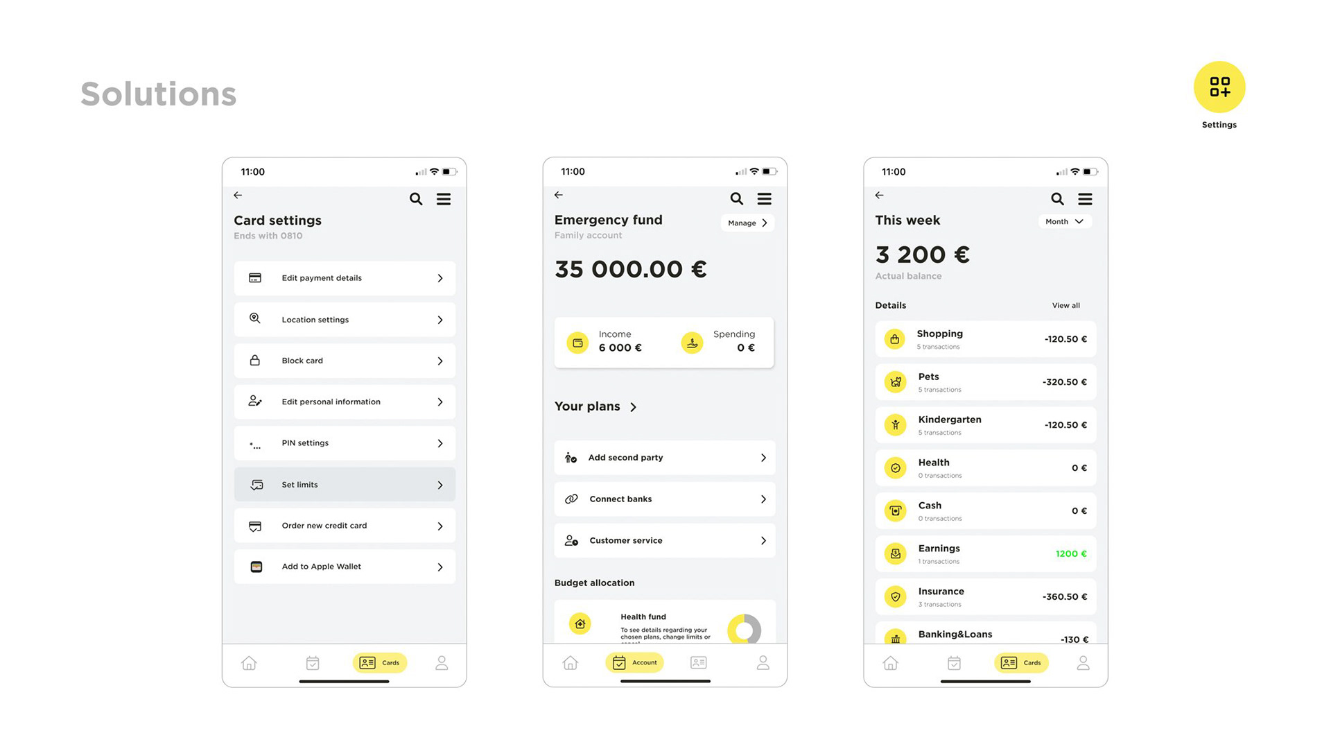
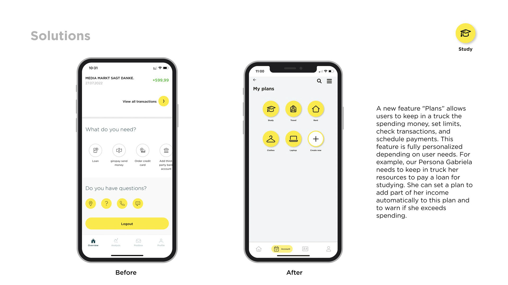
Solutions
Let’s start with the solutions
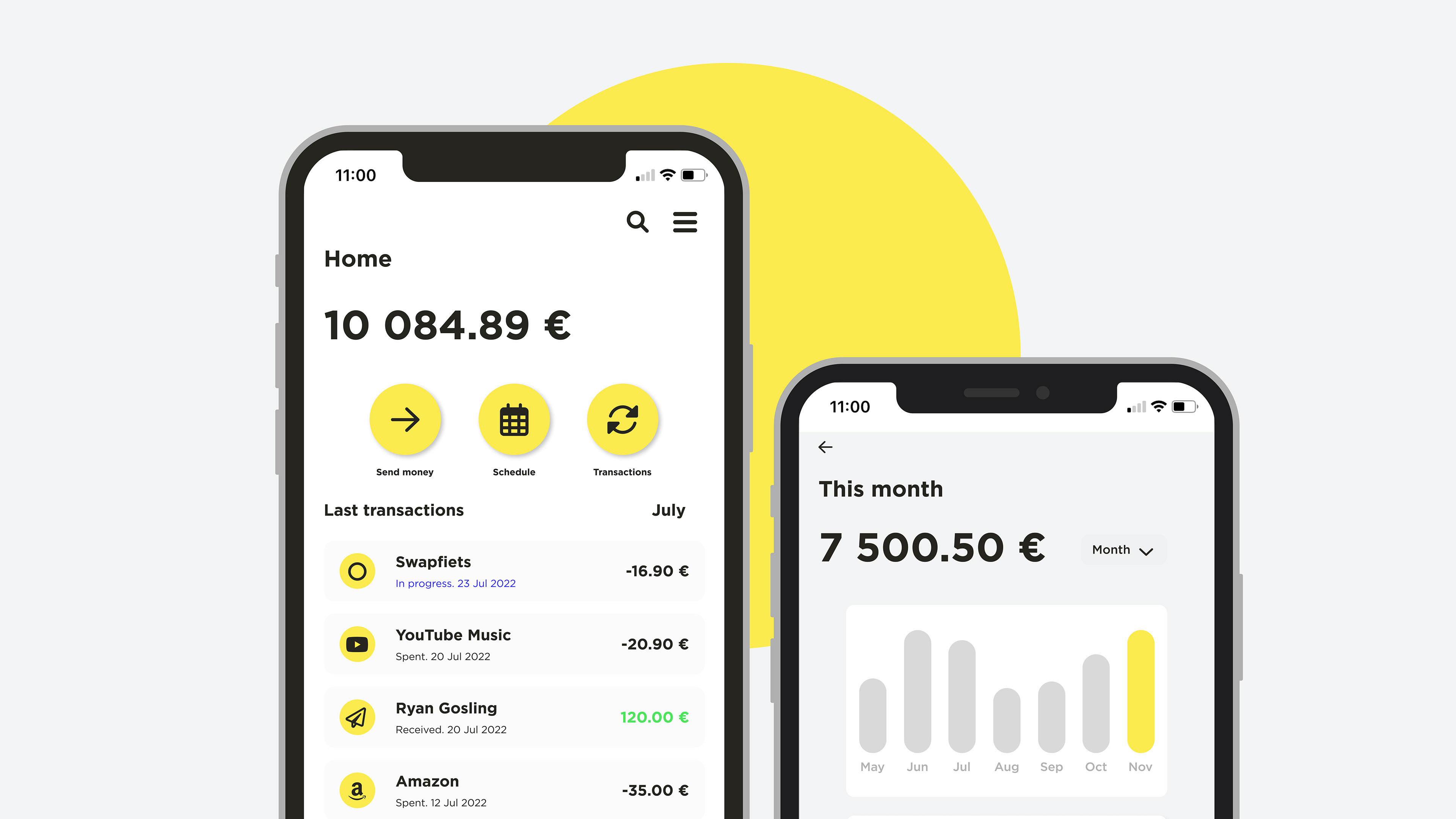
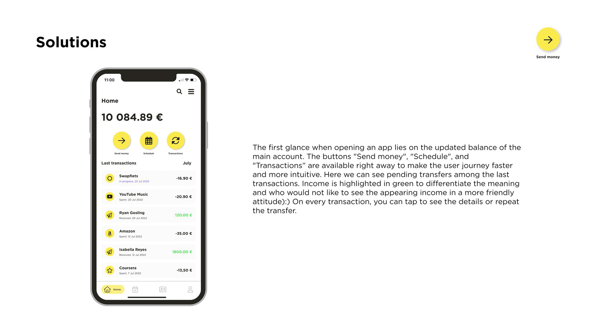
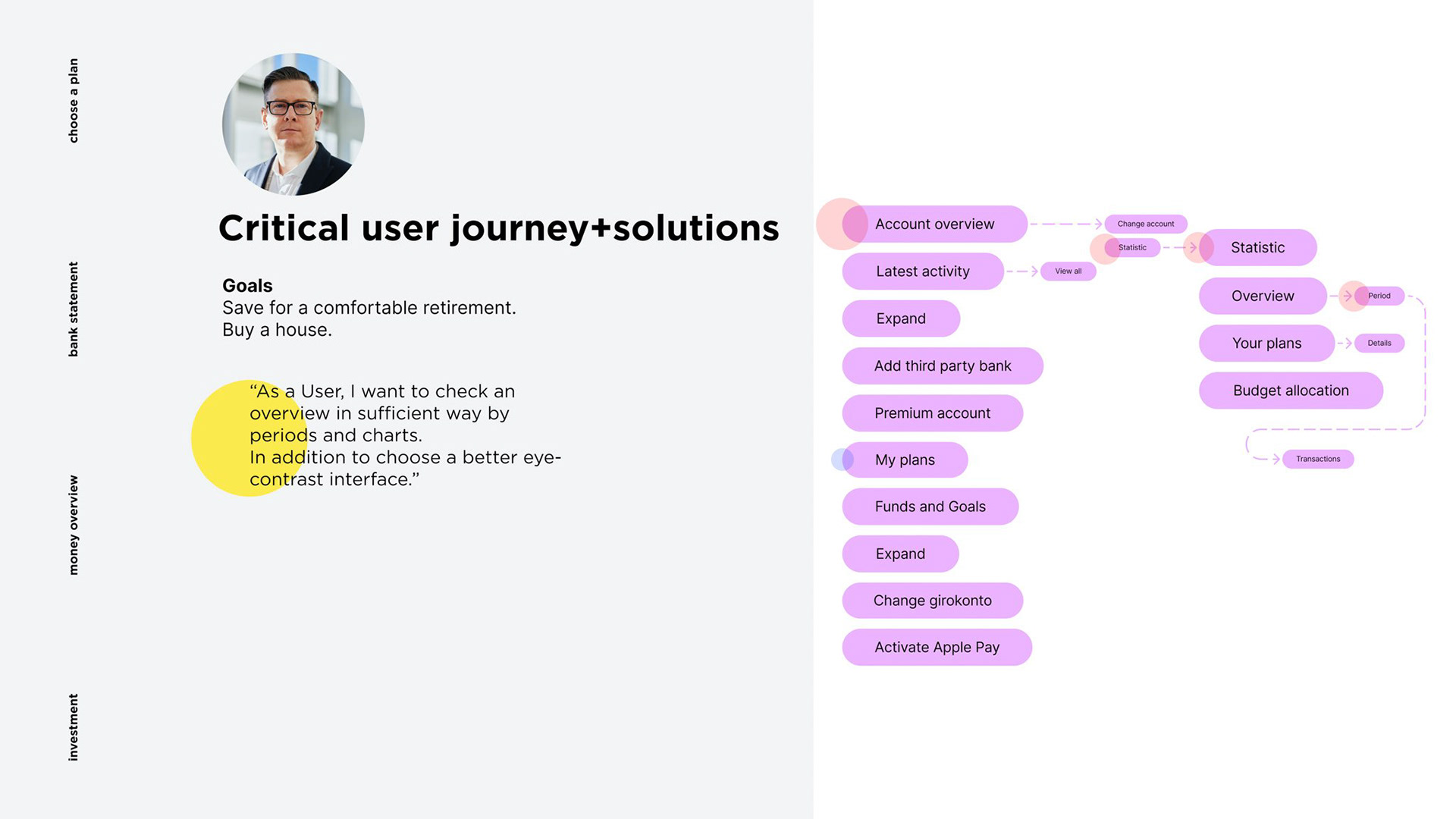
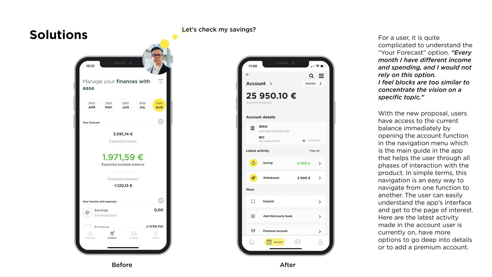
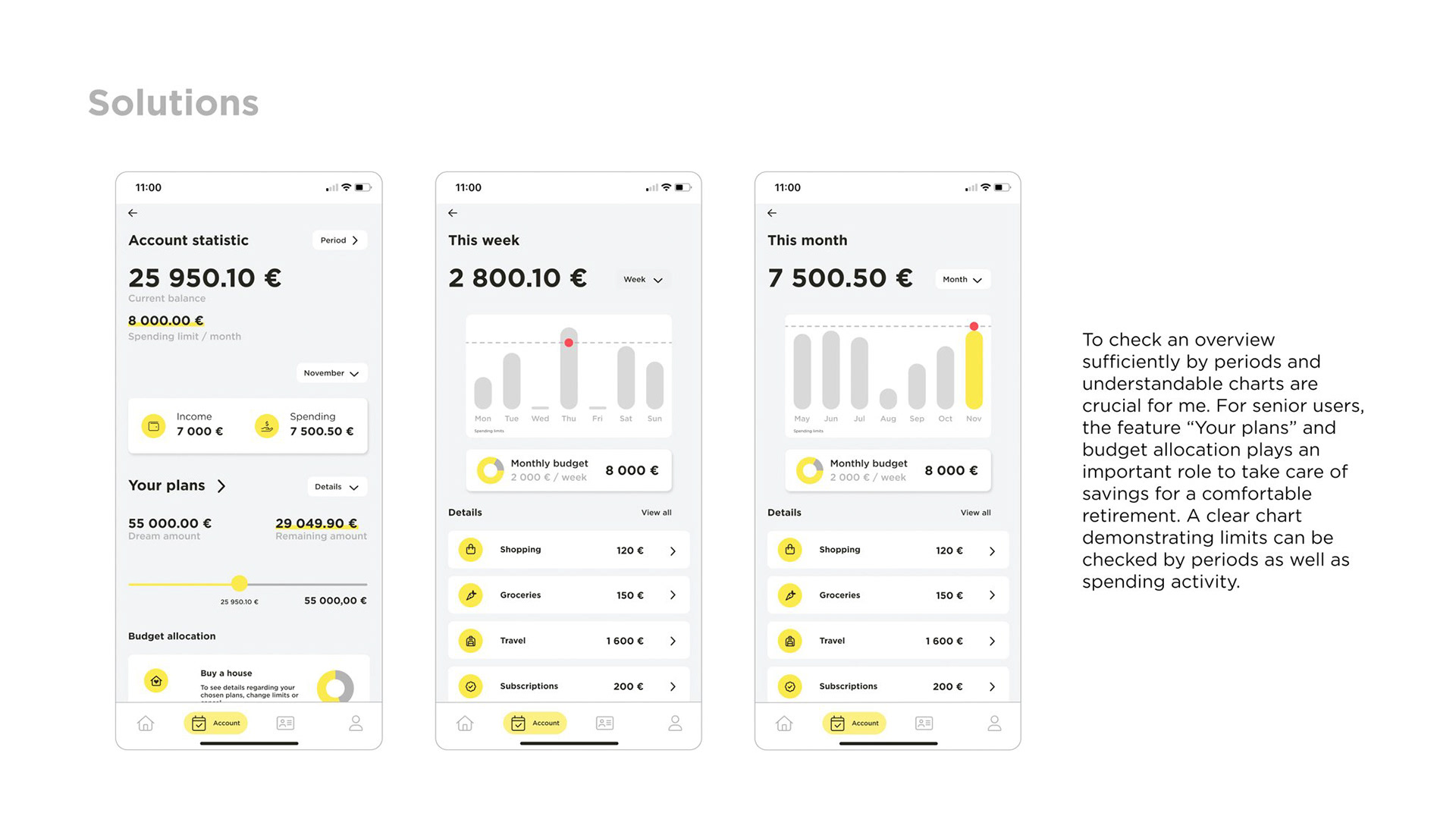
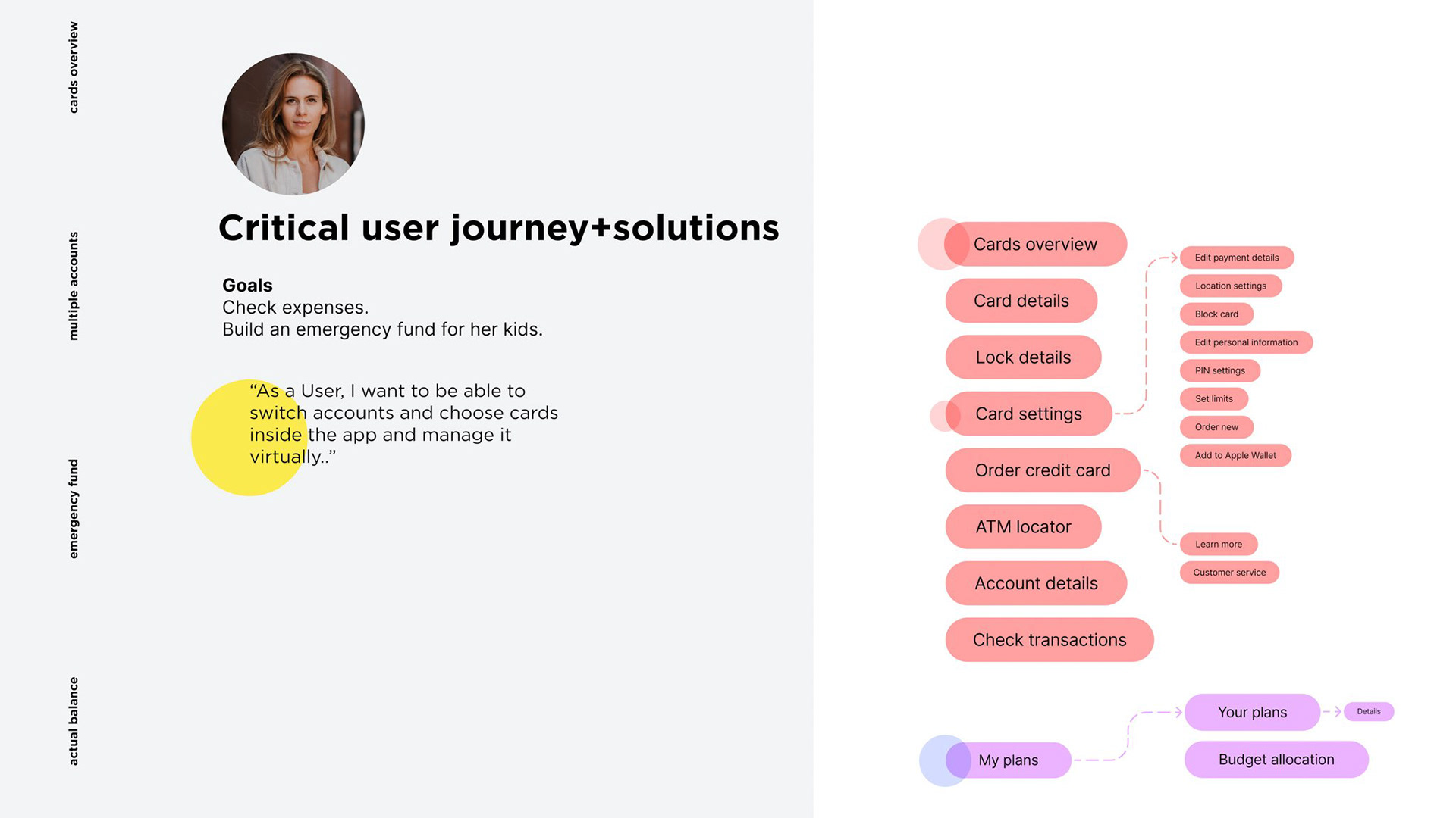
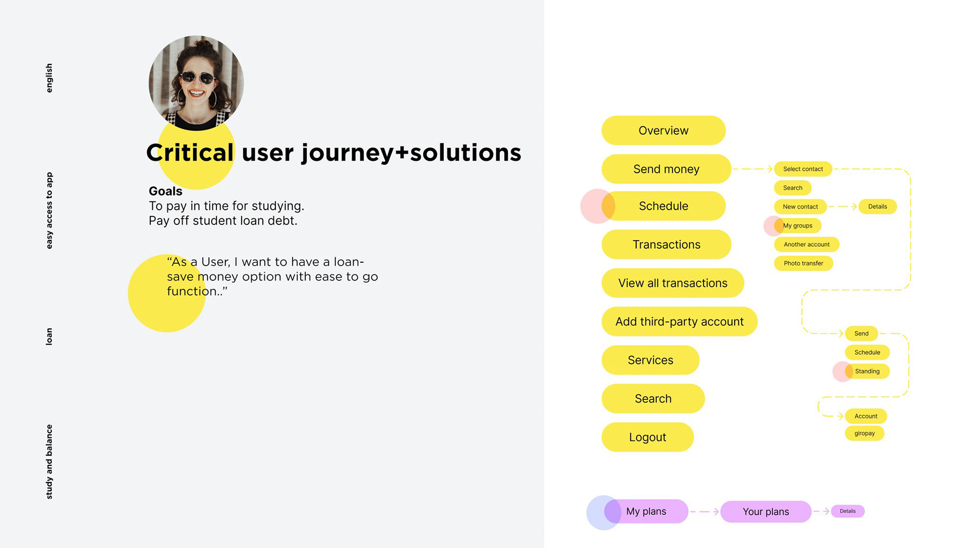
I analyzed the app interface, and after Information Architecture research I propose new tools based on the features the app offered. Based on the research findings, I started the process of the ideation the product framework and strategy. On each critical user journey, I propose a solution based on the user's goals. The highlighted areas indicate features that the user would use the most.
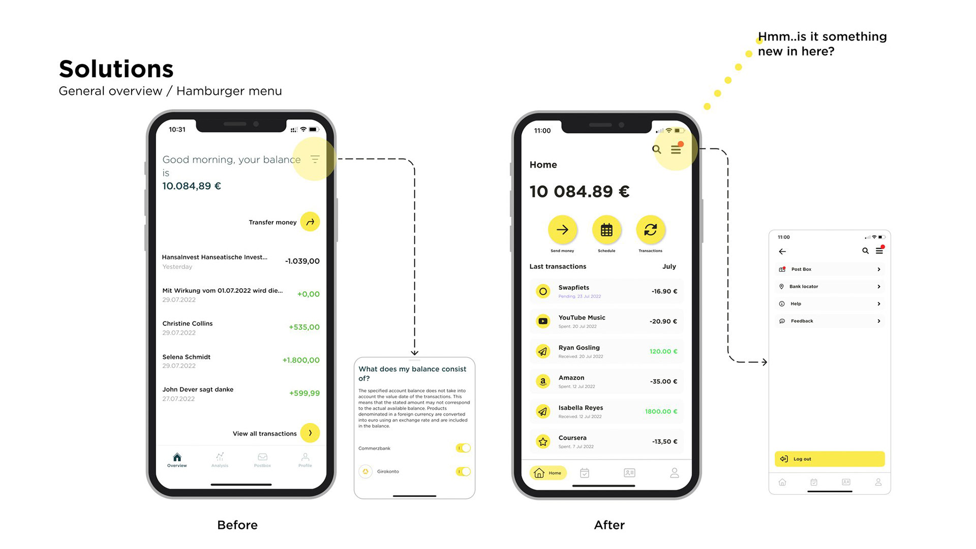
After synthesising all ideas, I identified 5 emerging themes that an app could offer: home, account, cards, profile, and hamburger menu with more structured features inside of each divided logically by purpose. The hamburger menu can hold more than before and consists of features users would use not so often


Conclusion
I researched and analyzed the user experience of Commerzbank's banking app by looking at user feedback on App Store and Play Store, conducting interviews, and analyzing competitors.
Based on my findings, I implemented a new approach that aims to make the app more friendly, interactive, and inviting for English-speaking foreign users and younger people.
The new design concept uses the yellow color to make the app more recognizable and intuitive, and it also creates a harmonious interplay with the petrol color.
Due to time limitations, the research was conducted with a smaller audience and data set. Further research and prototype testing will be needed to refine the design solutions. If you have any feedback, please feel free to share it with me.