A place where longevity meets joy, and age becomes something to celebrate. Inspired by the wisdom of the world’s Blue Zones, we believe that life is at its best when it is lived with balance, purpose, and connection. Here, community is at the heart of everything - we gather to share, to grow, and to support one another in living fully at every stage.
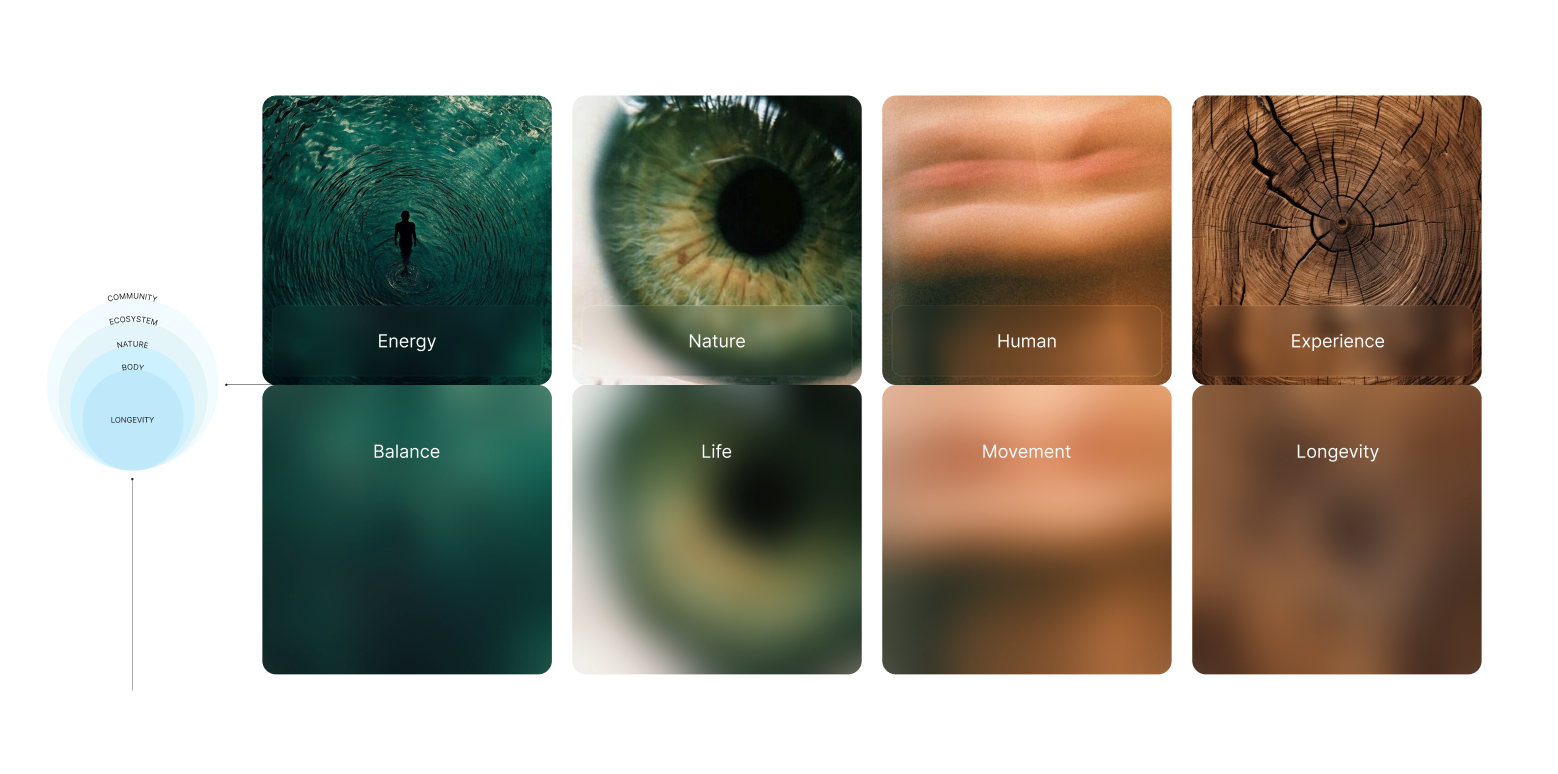
Blue Age Club embraces five values inspired by five Blue Zones. The sixth is alive, evolving - discovered together with joy, with you.

SKILLS
Brand Design
User Interface (UI)
Branding Strategy
Visual Storytelling
Research & Project Management
Art Direction
Scallable Brand Design System
Brand Design
User Interface (UI)
Branding Strategy
Visual Storytelling
Research & Project Management
Art Direction
Scallable Brand Design System
CATEGORY
Health | Start up
Health | Start up
CONTEXT
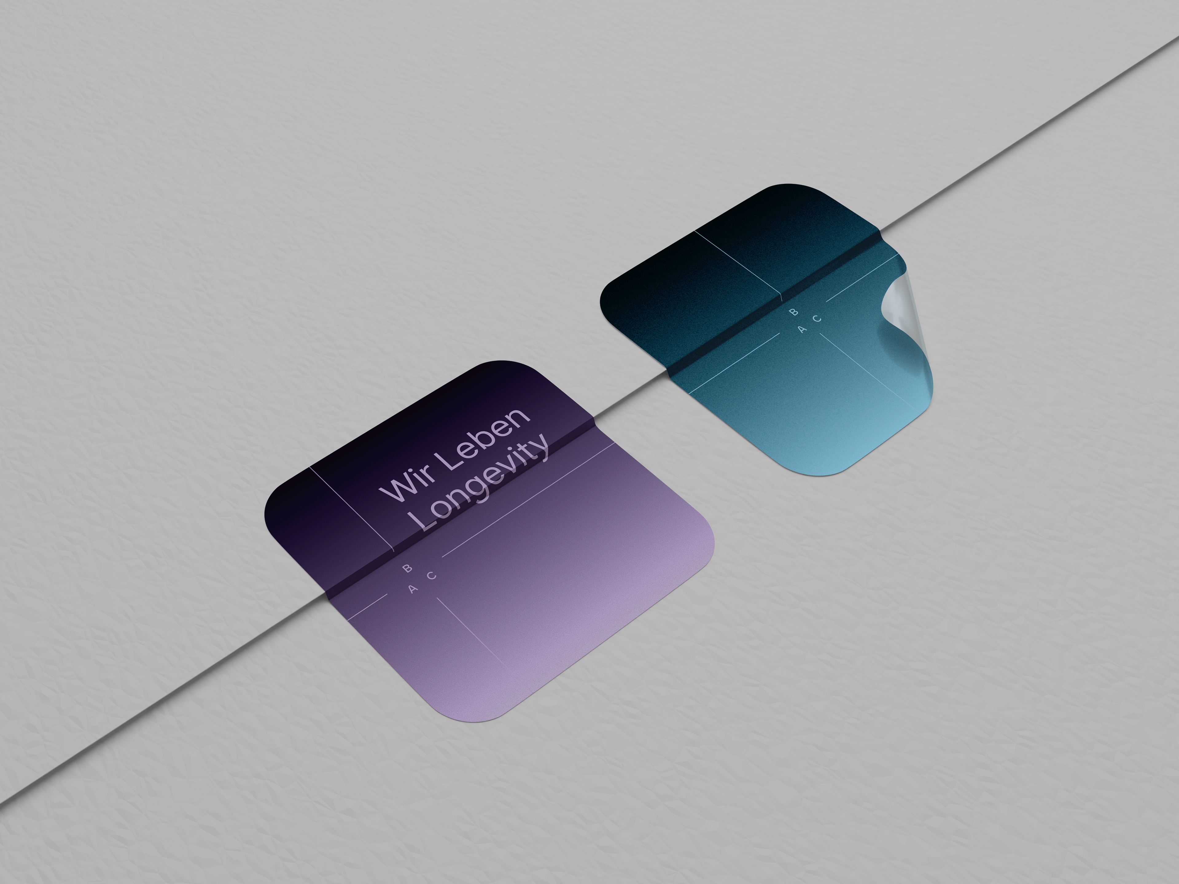
Our visual language is built on the idea that life, like longevity, is made of reflections and layers. Every element - from typography to color -carries more than one meaning. A surface may reflect clarity, but beneath it lies depth; a tone may appear simple, but together with others it creates richness.
Our visual language is built on the idea that life, like longevity, is made of reflections and layers. Every element - from typography to color -carries more than one meaning. A surface may reflect clarity, but beneath it lies depth; a tone may appear simple, but together with others it creates richness.
This approach allows the brand to feel timeless yet evolving, just as Blue Age Club itself grows through shared stories and discoveries.
GOALS
For a new startup entering its first branding phase, the goal for the quarter should focus on establishing a clear, consistent, and emotionally resonant brand foundation. Think of it as setting the roots before the tree grows.
Goal for the Quarter: Create and launch a distinctive brand identity that captures the essence of the startup’s vision, differentiates it from competitors, and builds early recognition and trust among the target audience.
1. Define the Brand Core
Clarify the purpose, mission, and values. The goal is to translate the startup’s reason for existing into a clear statement that will guide all design and communication decisions.
Output: Brand strategy document (vision, mission, values, tone, audience insights, competitive positioning)
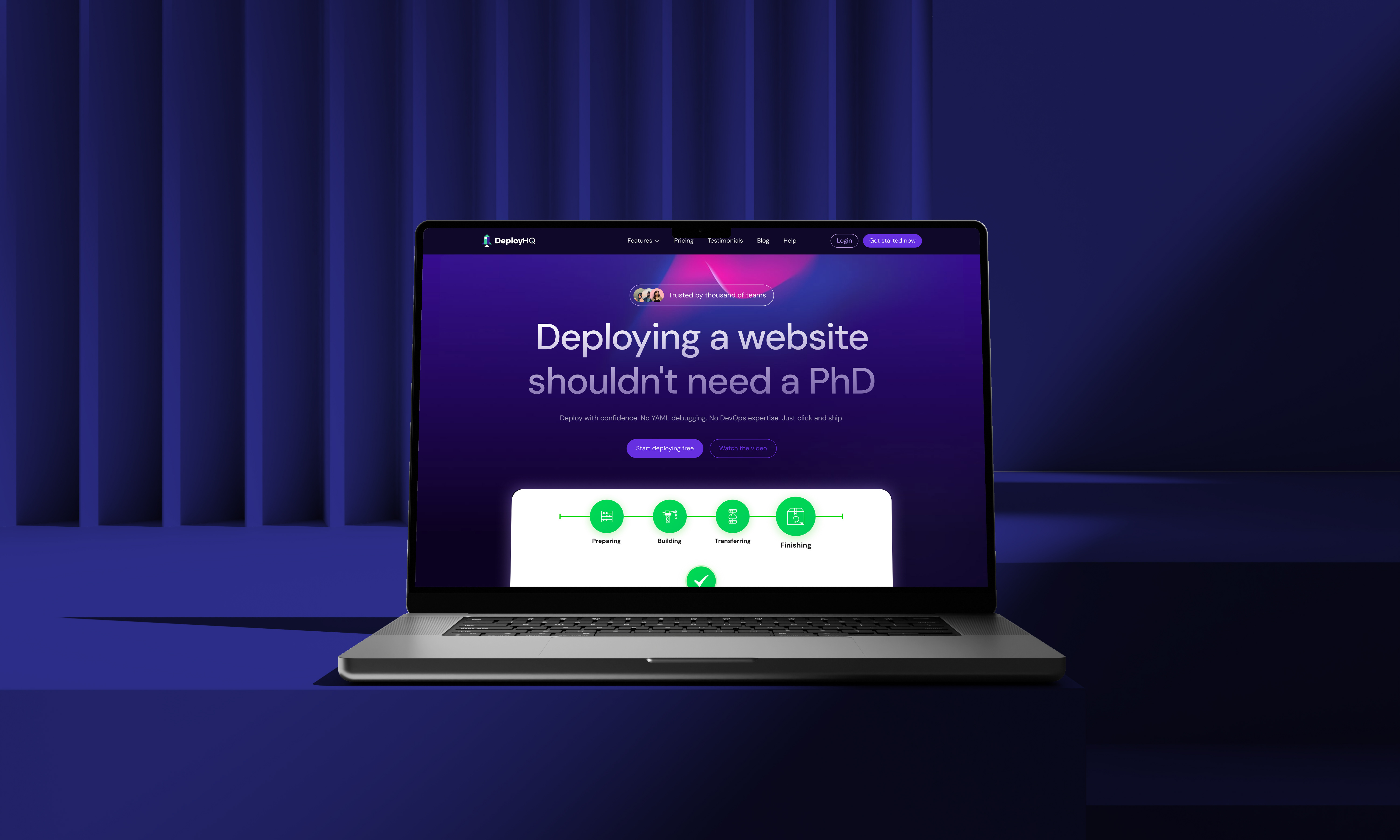
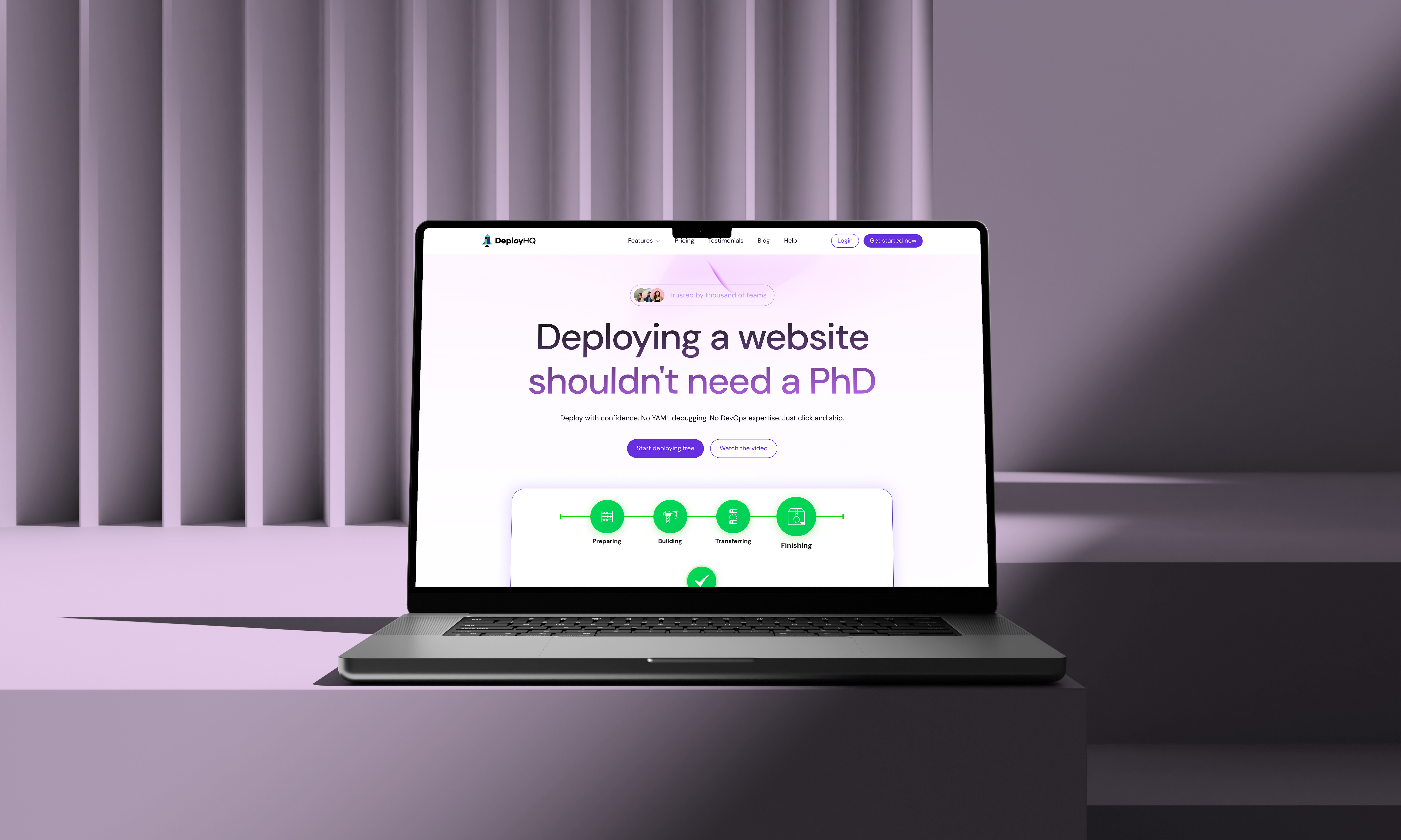
2. Develop Visual Identity Craft the visual DNA of the brand - logo, color palette, typography, and imagery style. The goal is to create a system that feels fresh but cohesive across digital and print materials. Output: Visual identity system and brand guidelines
2. Develop Visual Identity Craft the visual DNA of the brand - logo, color palette, typography, and imagery style. The goal is to create a system that feels fresh but cohesive across digital and print materials. Output: Visual identity system and brand guidelines
VISION & MISSION
Our visual language is built on the idea that life, like longevity, is made of reflections and layers. Every element - from typography to color -carries more than one meaning. A surface may reflect clarity, but beneath it lies depth; a tone may appear simple, but together with others it creates richness.
Our visual language is built on the idea that life, like longevity, is made of reflections and layers. Every element - from typography to color -carries more than one meaning. A surface may reflect clarity, but beneath it lies depth; a tone may appear simple, but together with others it creates richness.
This approach allows the brand to feel timeless yet evolving, just as Blue Age Club itself grows through shared stories and discoveries.
OBJECTIVE
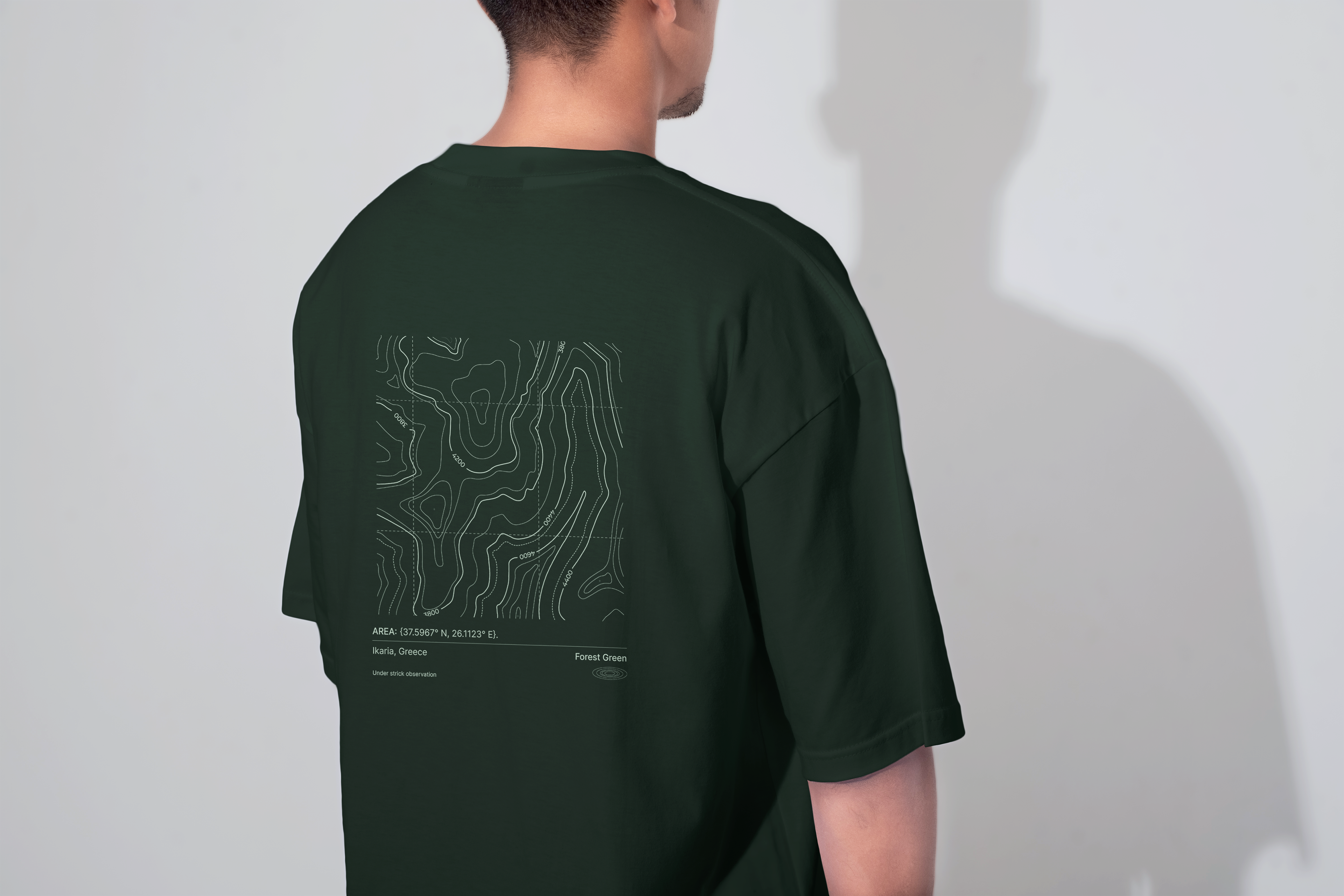
Blue Age Club draws inspiration from Blue Zones-real-world regions like Okinawa, Sardinia, Nicoya, Ikaria, and Loma Linda where people live exceptionally long, healthy lives through community, diet, movement, and purpose. For your 30-50 person community focused on longevity, health, happiness, and connection, here's a tailored branding objective.
Blue Age Club draws inspiration from Blue Zones-real-world regions like Okinawa, Sardinia, Nicoya, Ikaria, and Loma Linda where people live exceptionally long, healthy lives through community, diet, movement, and purpose. For your 30-50 person community focused on longevity, health, happiness, and connection, here's a tailored branding objective.
Develop a complete visual identity system inspired by Blue Zones longevity principles, positioning Blue Age Club as an intimate community hub for 30-50 members pursuing extended healthy, joyful lives through shared rituals, nutrition, and social bonds.
STRATEGY POINTS
- Define audience (30-50 aged persona prioritizing long life via community, nutrition, movement) and position as a "personal Blue Zone" with time-zone visuals mapping life stages to habits.
- Define audience (30-50 aged persona prioritizing long life via community, nutrition, movement) and position as a "personal Blue Zone" with time-zone visuals mapping life stages to habits.
- Capture essence through calm blues/greens (evoking sea, earth), organic shapes, and timeless type for trust and renewal.
- Visual Identity
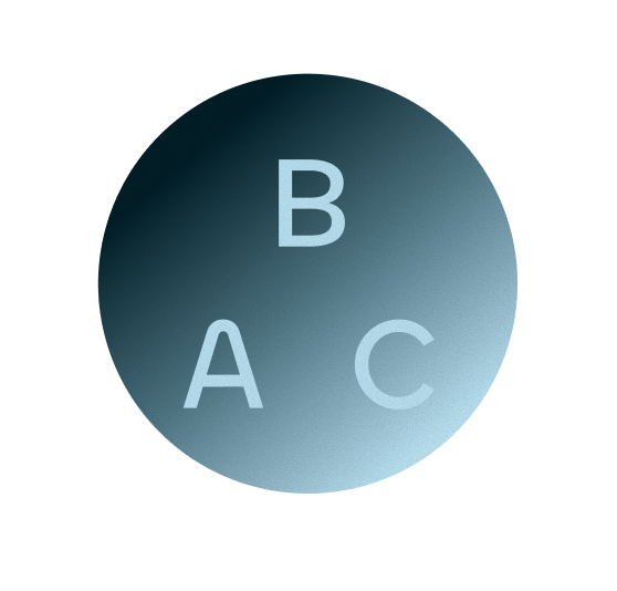
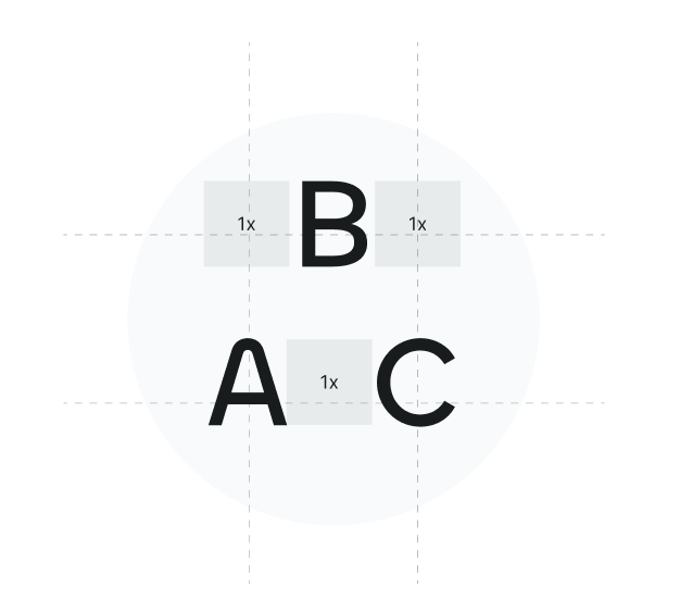
1. Develop logo variants (primary: interconnected zones symbol; secondary: wordmark) with flexible lockups for digital/print.
2. Specify color palette (core blues for calm, accents for energy, connecting to Blue Zones), typography scale (headings in fluid serif, body sans-serif with rem-based sizing for web), and icons for rituals.
- Scallable System & Applications
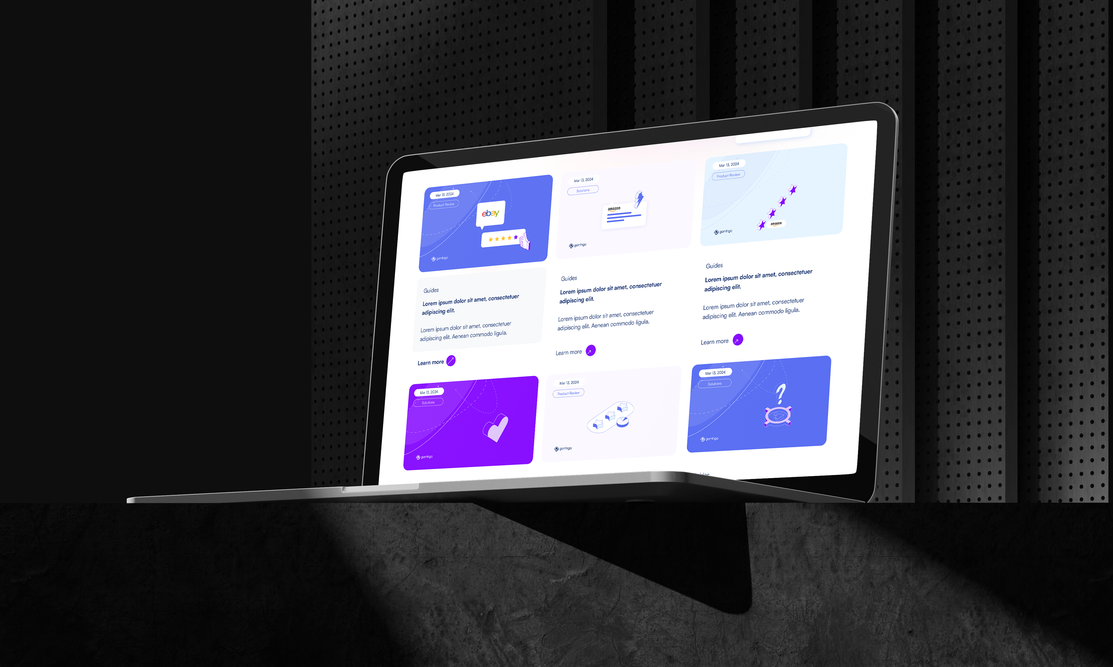
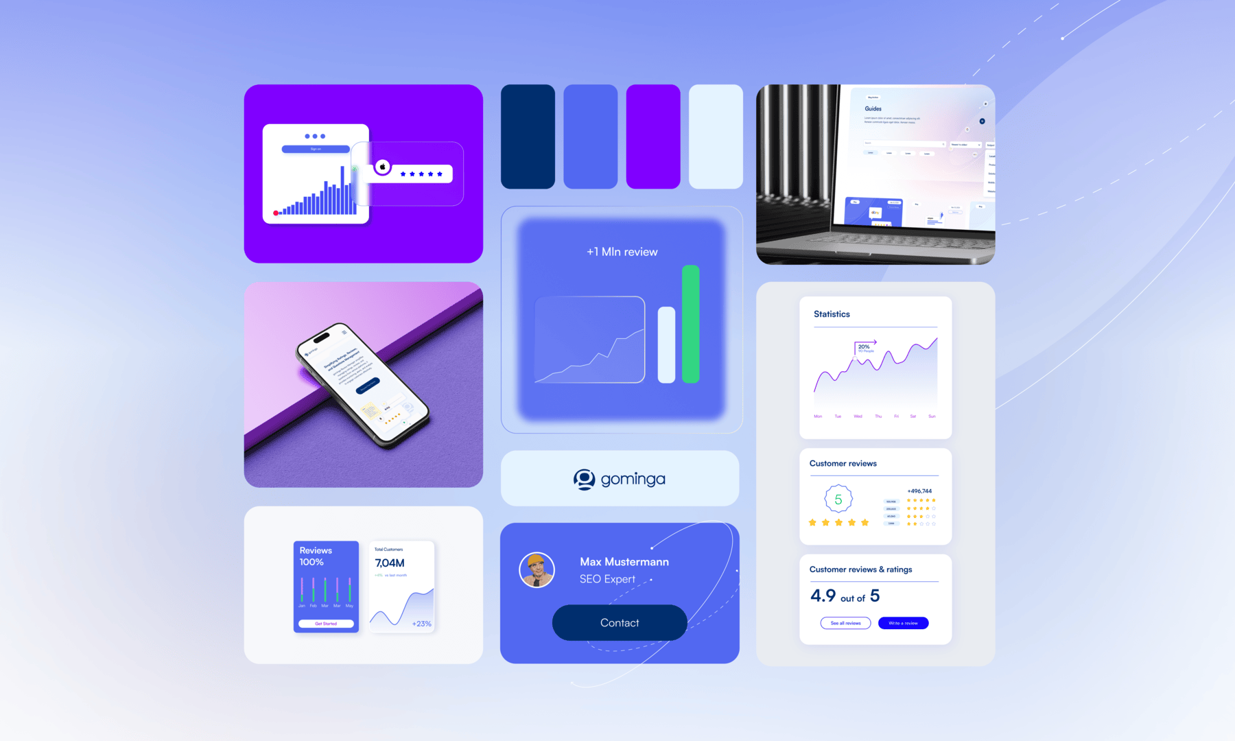
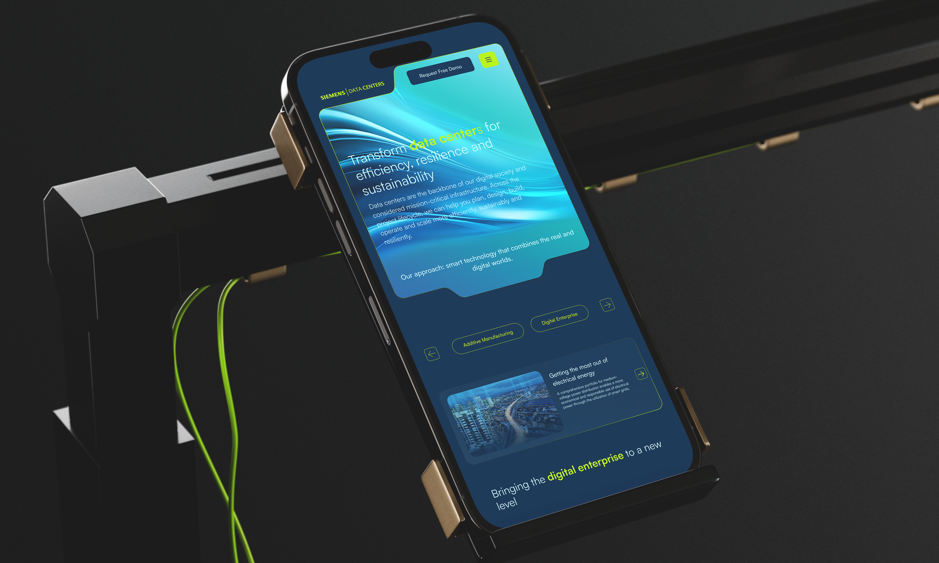
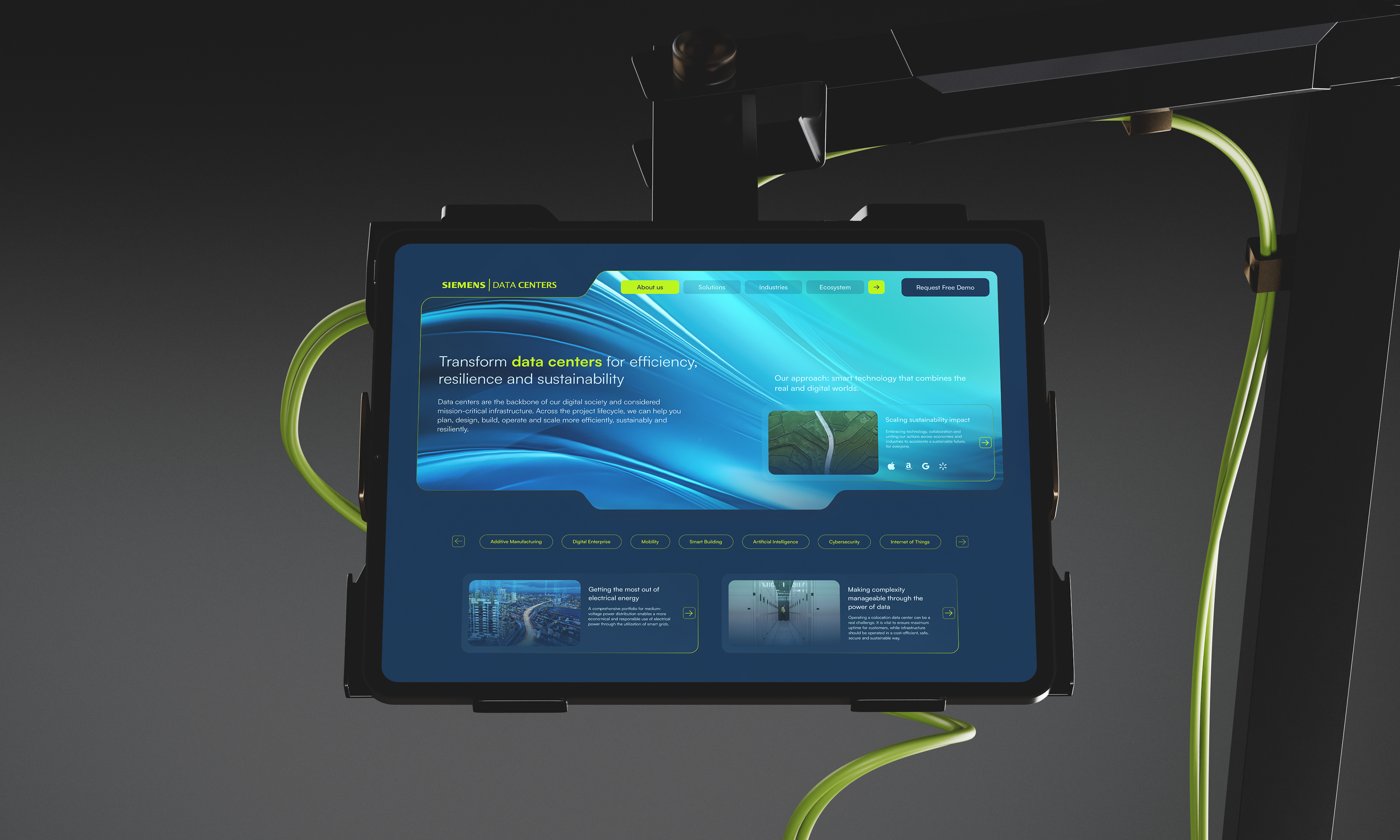
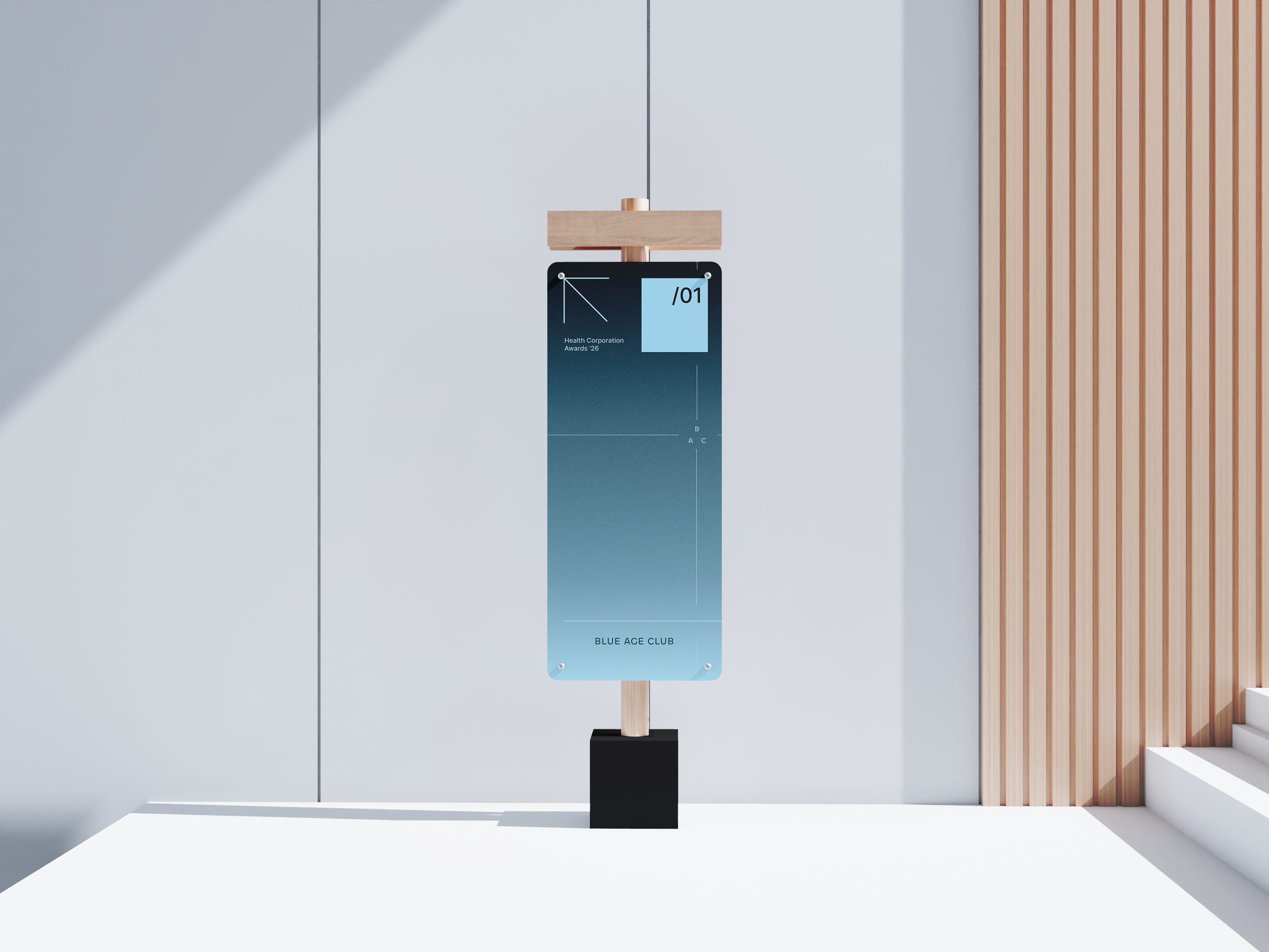
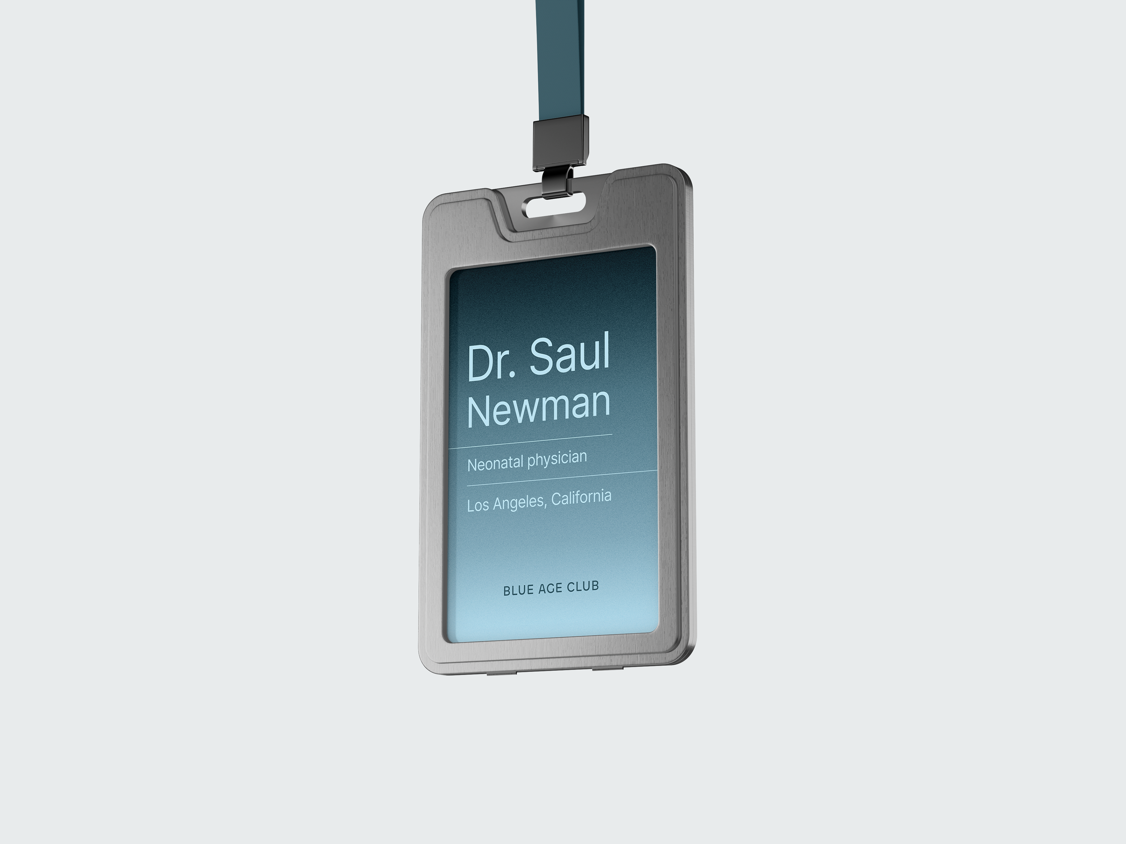
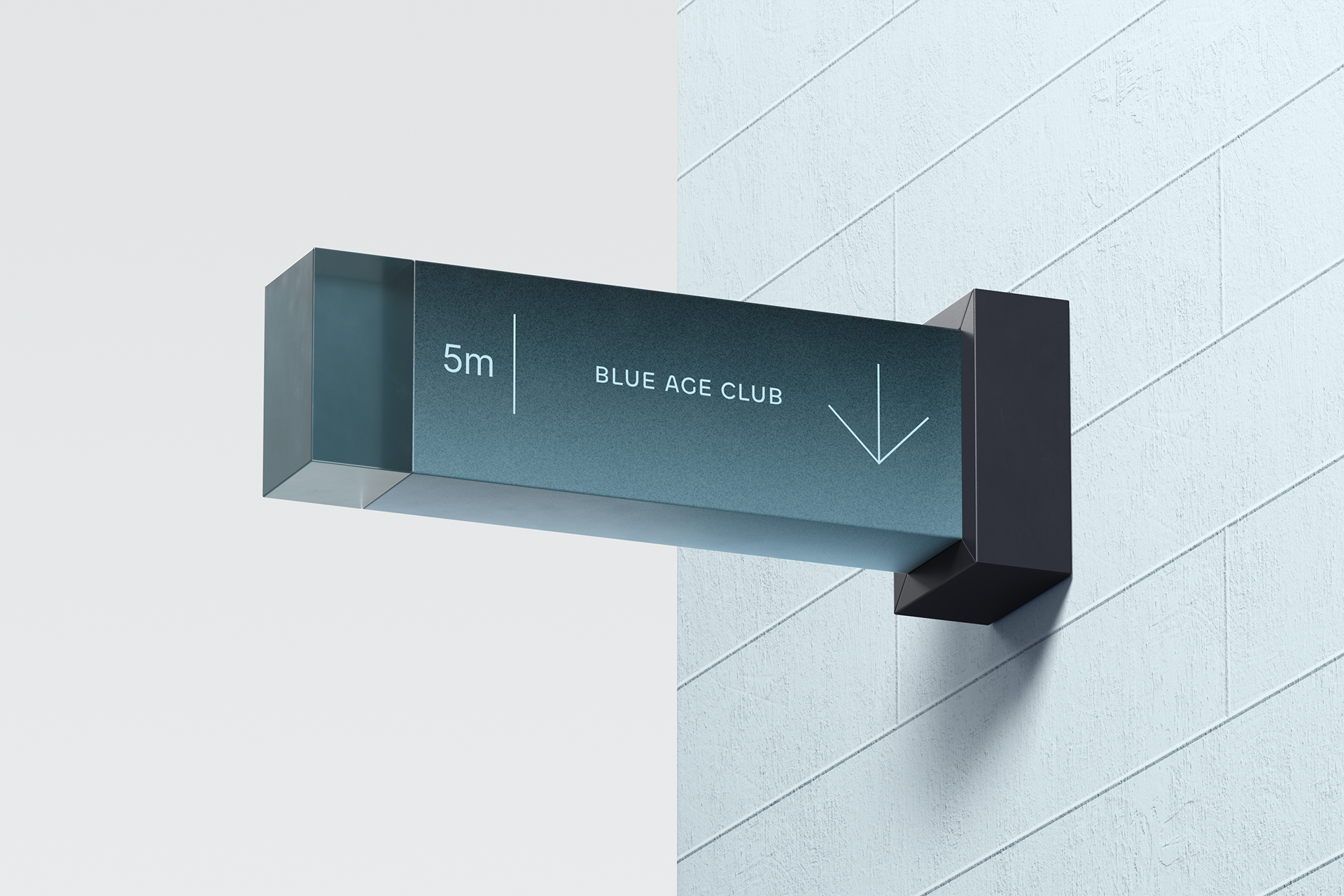
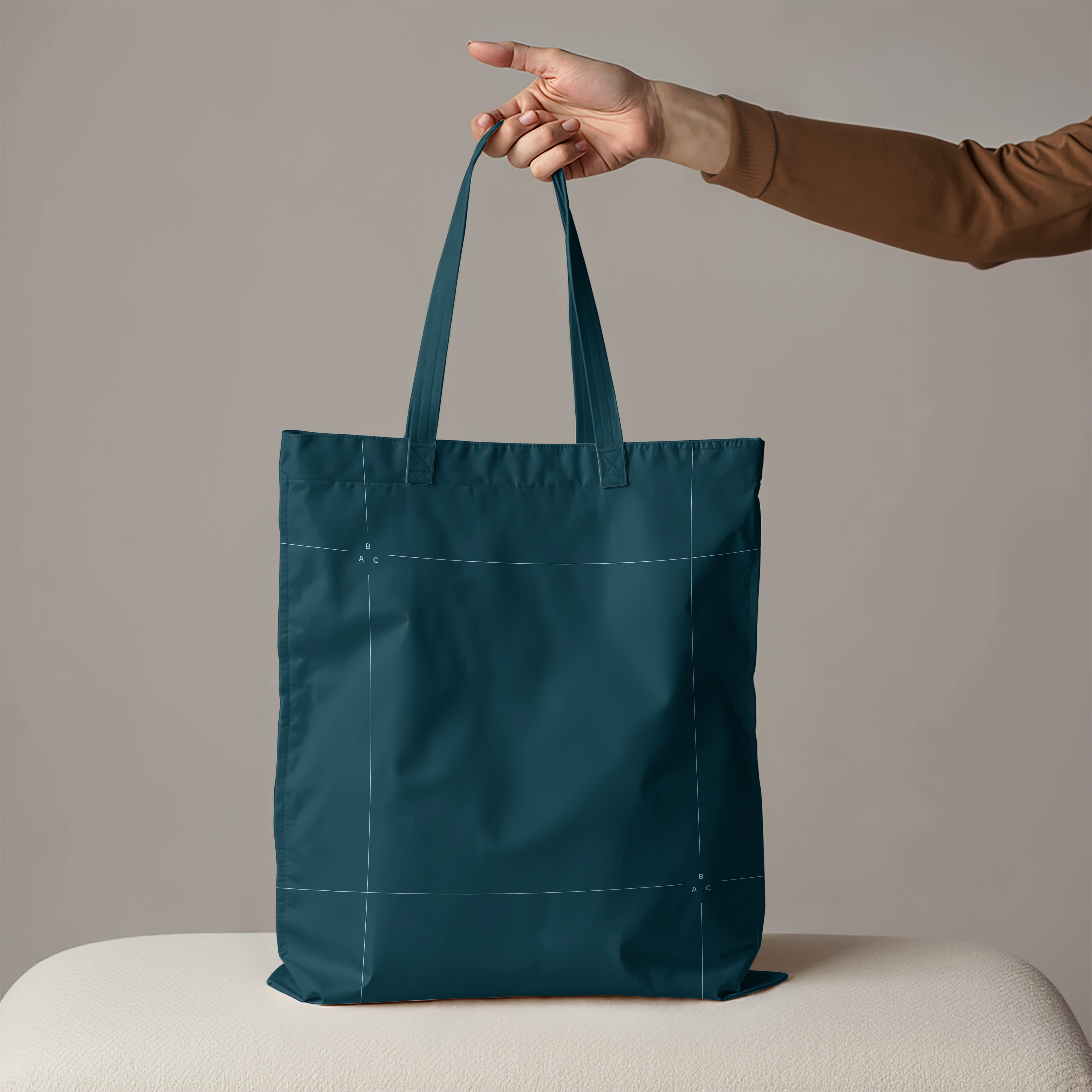
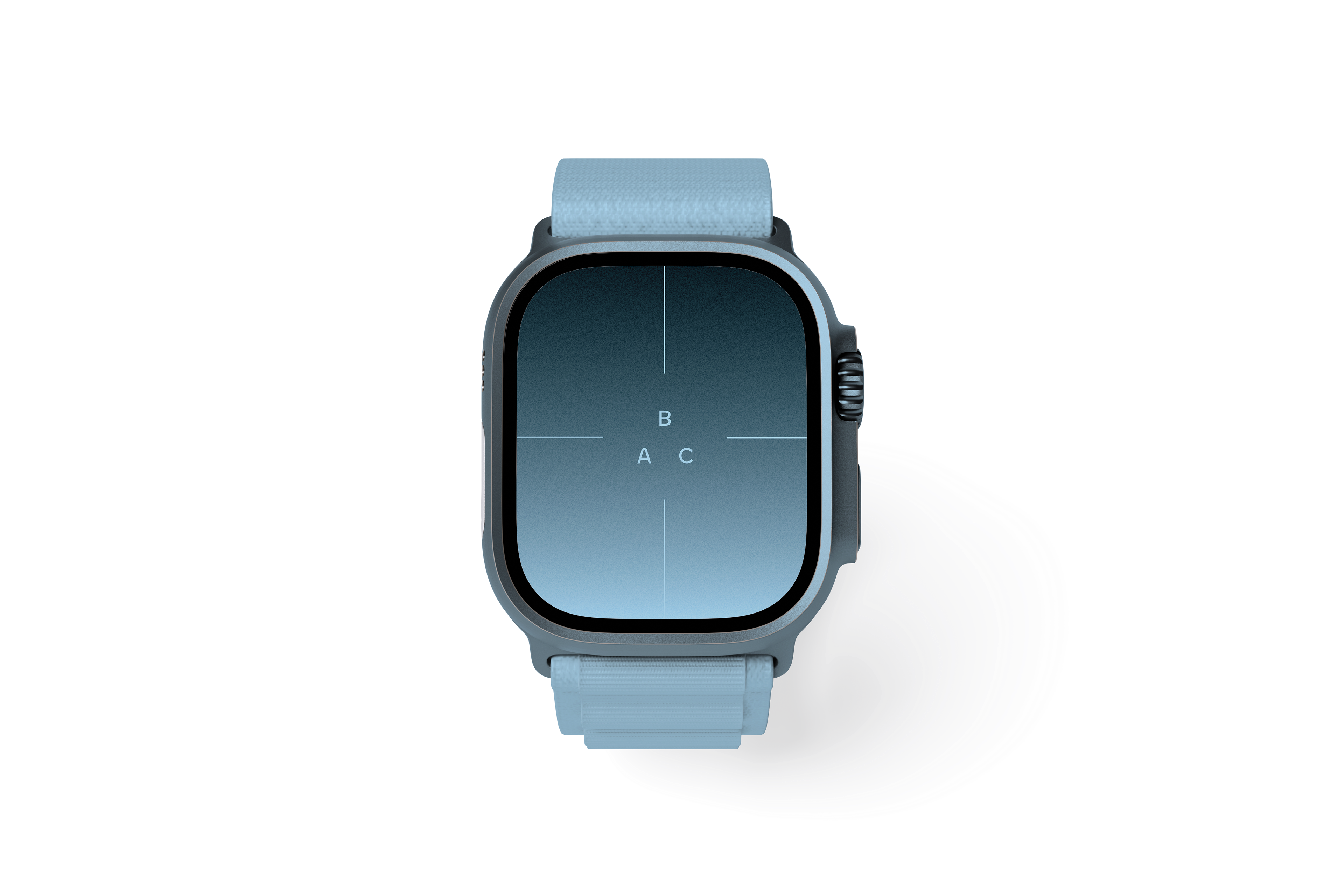
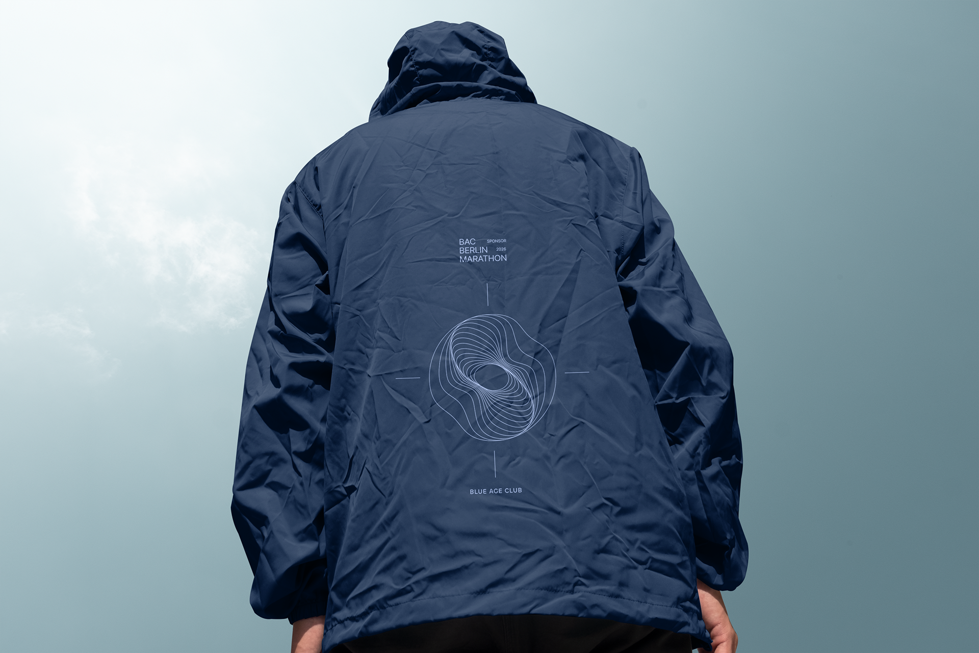
Mock core touchpoints: website, ID card, event touch points, social templates, merch, digital evolution on varios social media channels.
- Demonstrate cohesion across scales (e.g., favicon to billboard).
- Guidelines Deliverable
Produce Figma-embedded brand book (ex. colors in HEX/RGB, type in px/rem/%, spacing rules, do's/don'ts) for self-serve use by BAC team, emphasizing accessibility (WCAG AA)
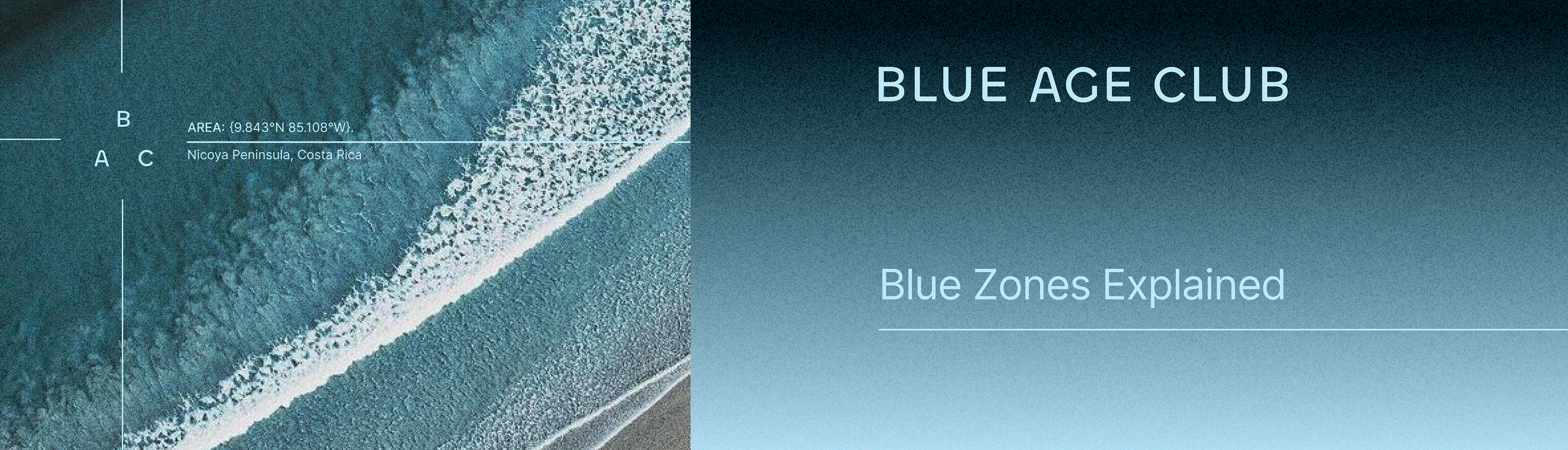
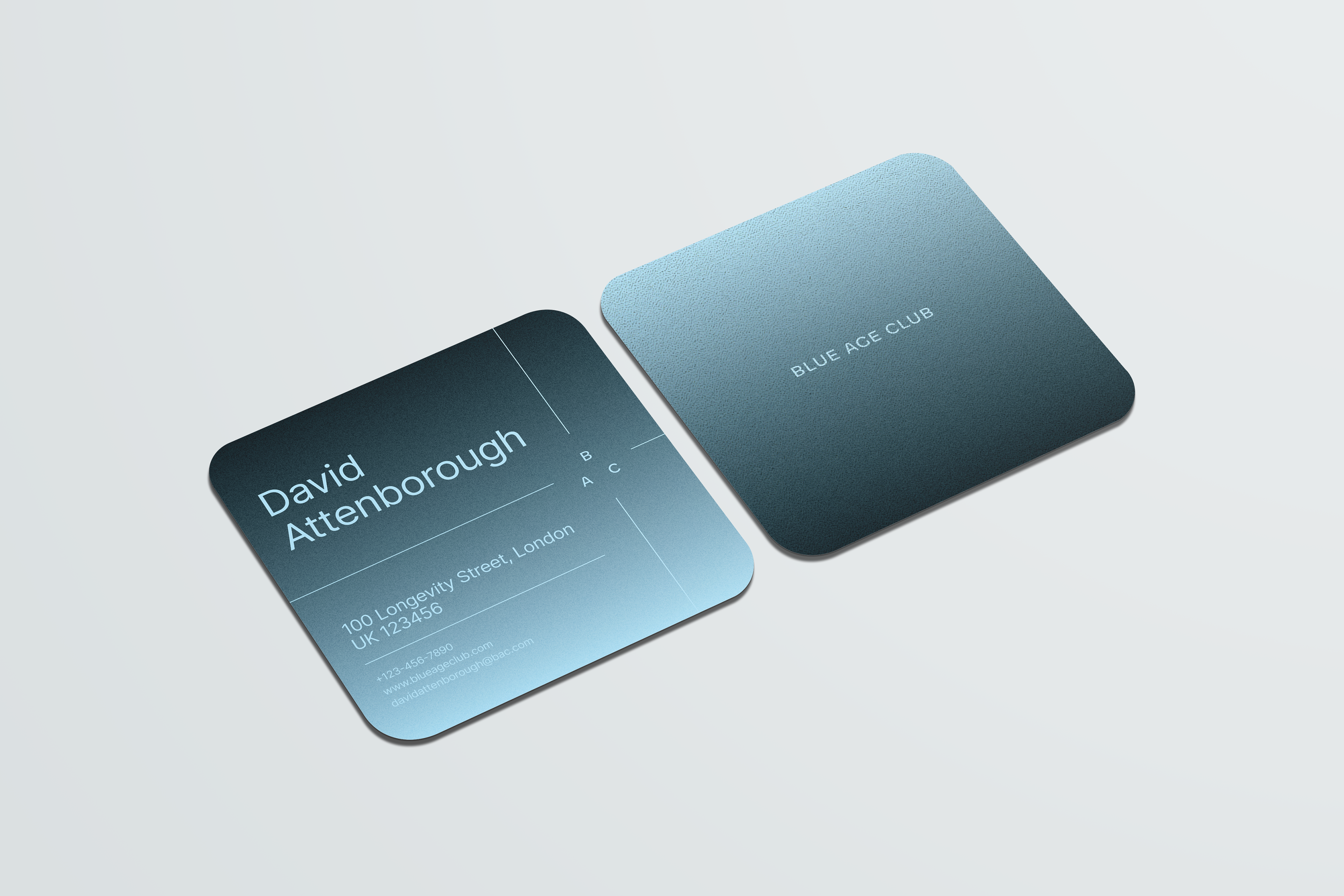
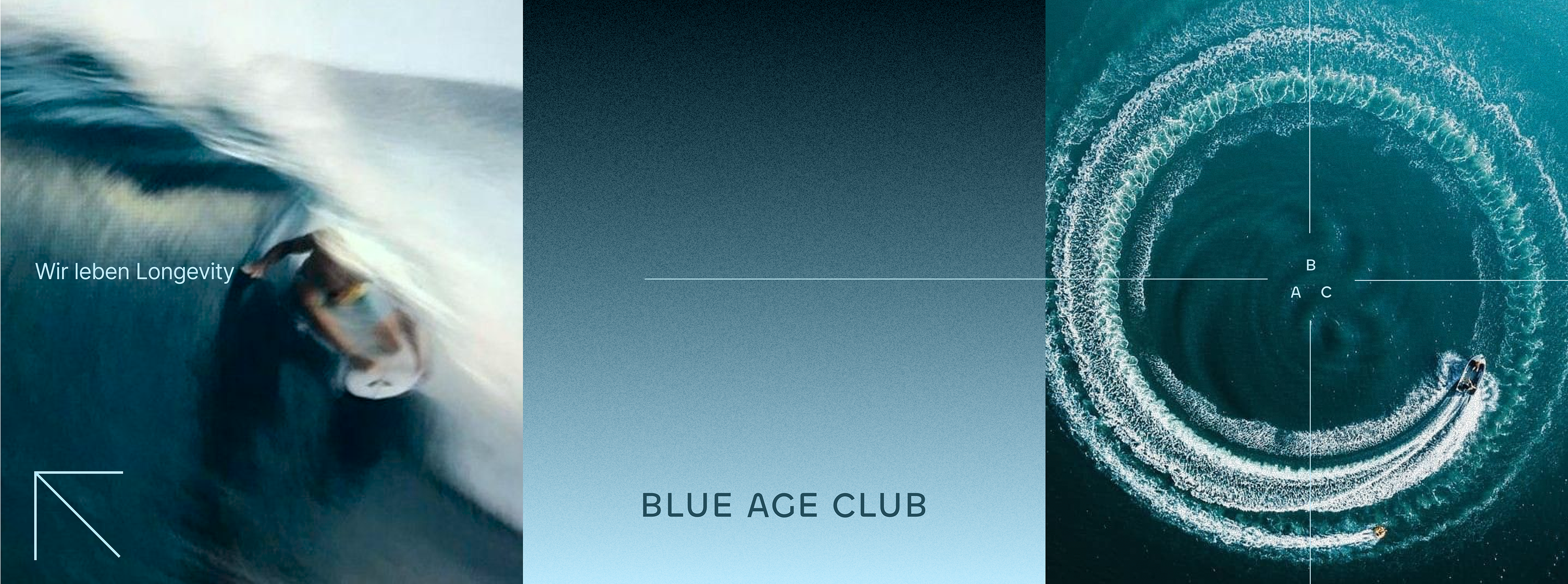
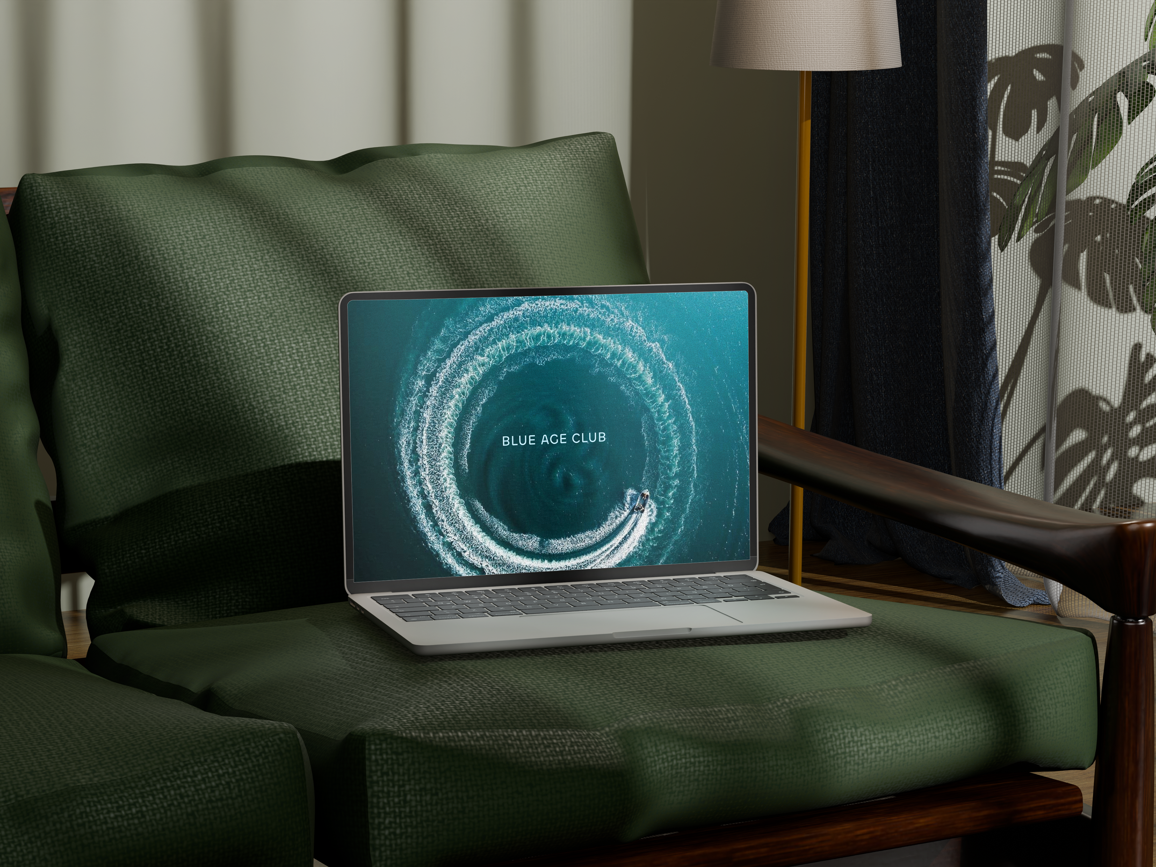
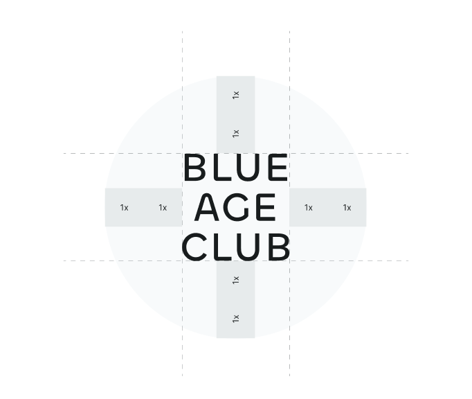
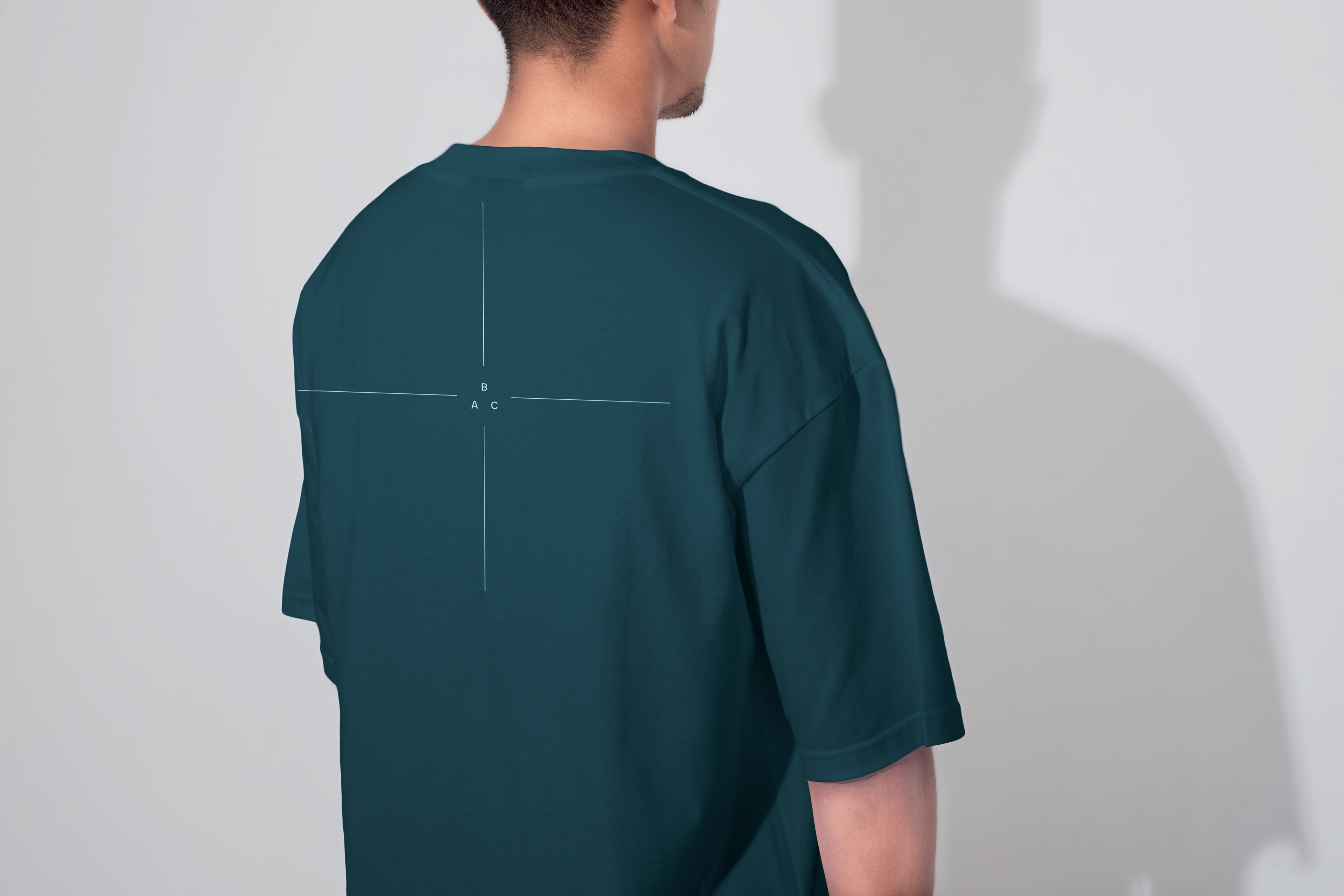
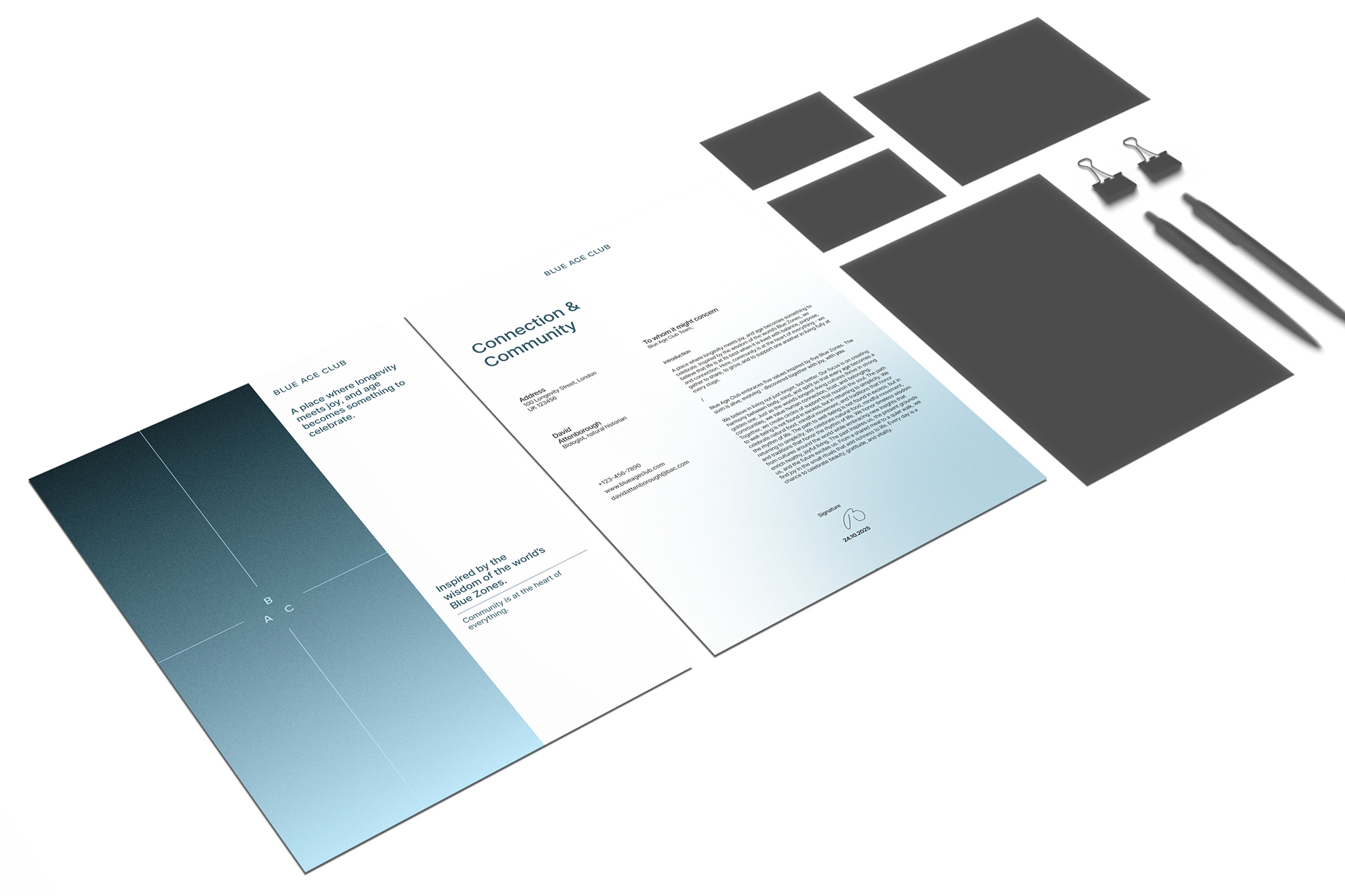
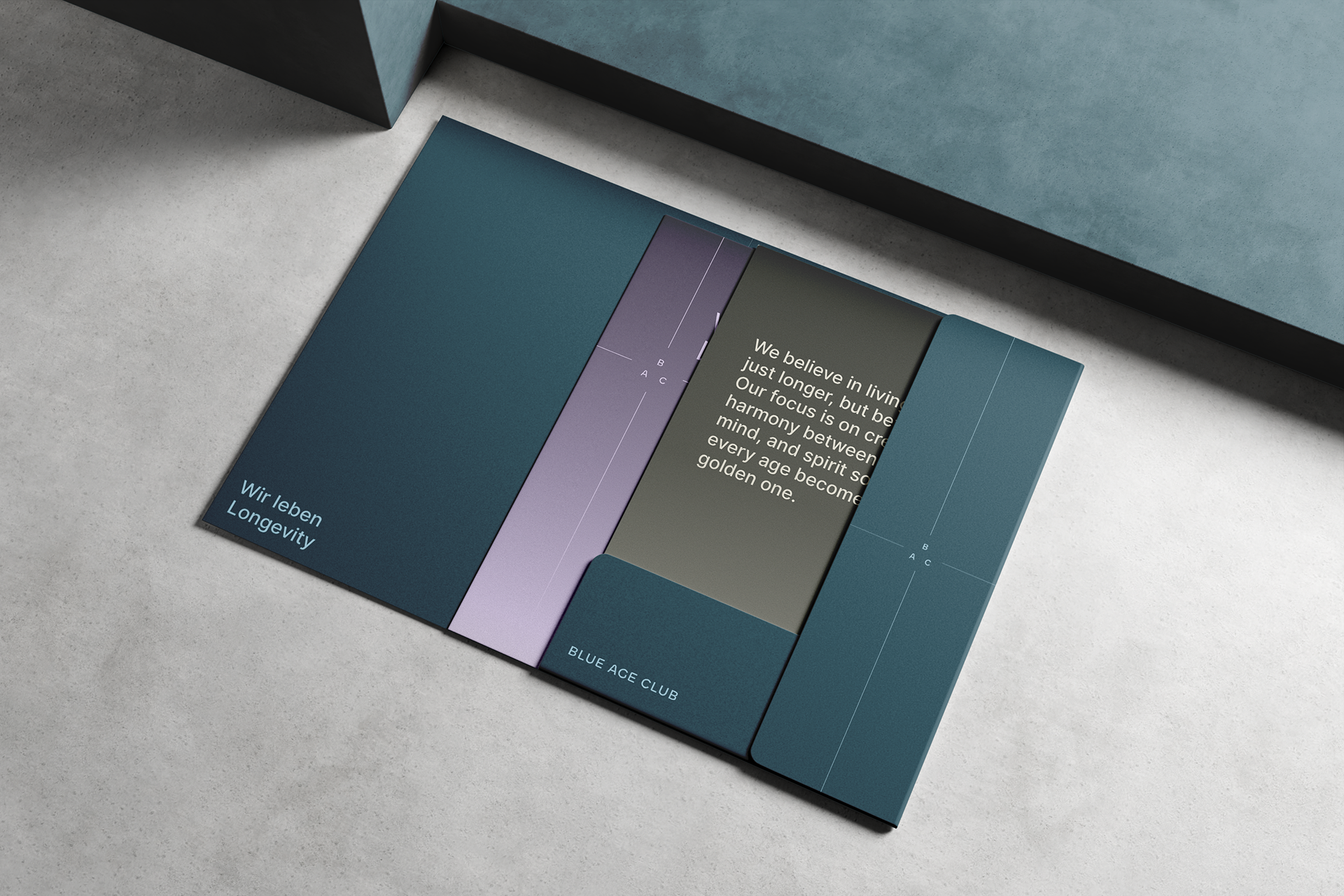
LOGO
The Blue Age Club logo is a wordmark built from clear, modern typography that reflects simplicity, balance, and timelessness. It represents our identity in its purest form and should always be used consistently across all applications to maintain recognition and trust.
The Blue Age Club logo is a wordmark built from clear, modern typography that reflects simplicity, balance, and timelessness. It represents our identity in its purest form and should always be used consistently across all applications to maintain recognition and trust.


MOOD
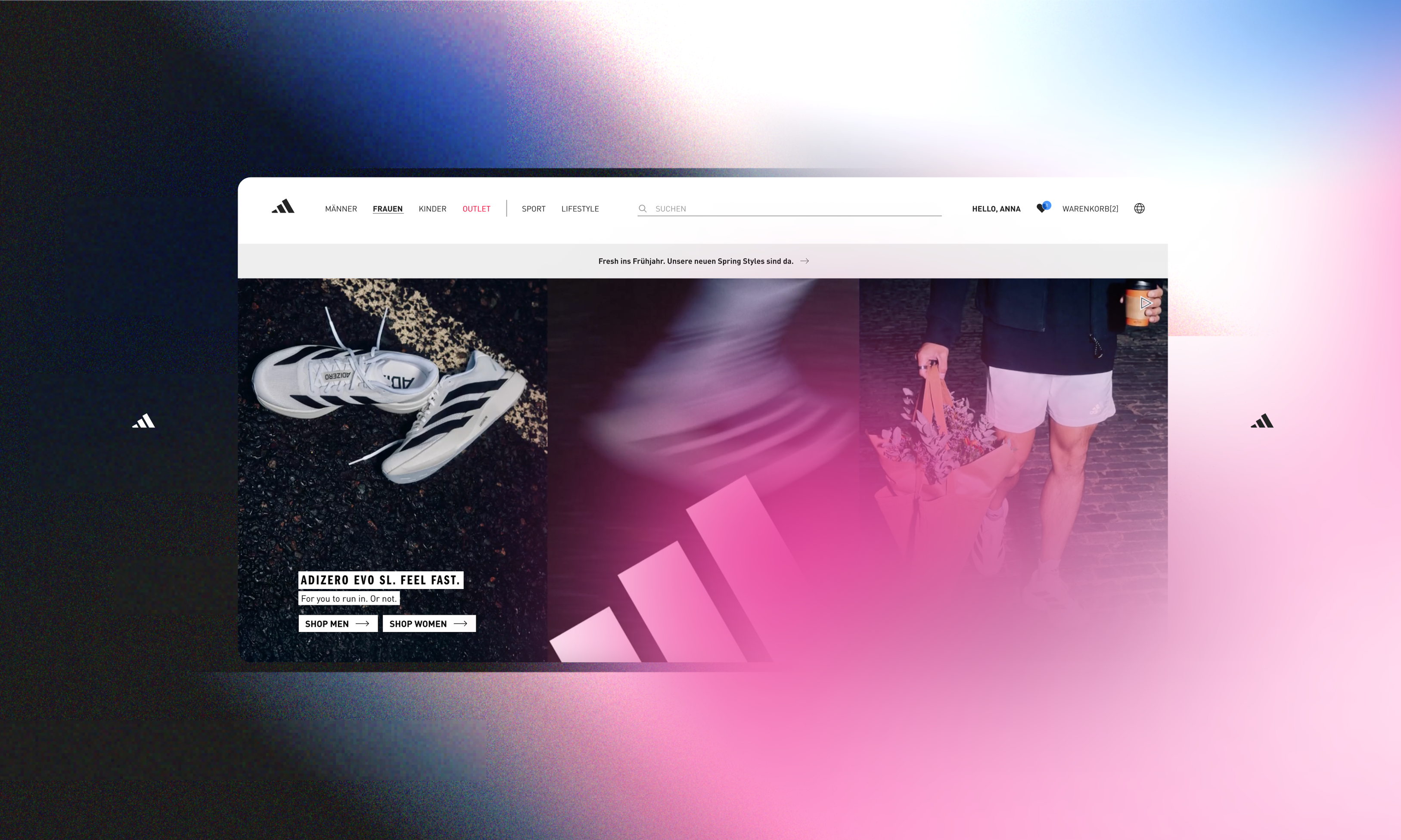
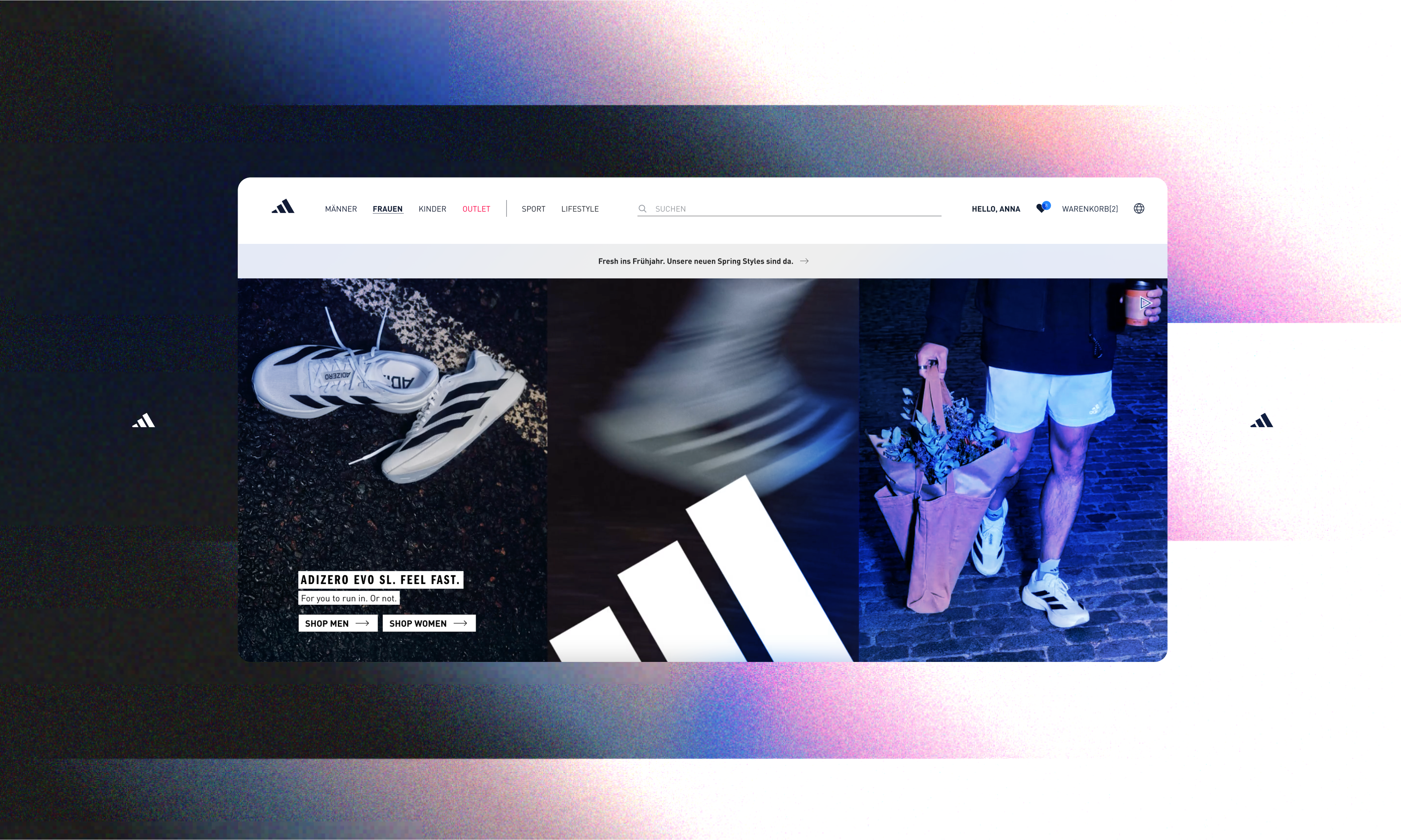
Blue Age Club embodies a sense of calm, balance, and timeless elegance. Our visual identity is designed to feel warm, inviting, and grounded, while inspiring vitality and curiosity. Through natural tones, thoughtful typography, and clean layouts, we create a space that encourages connection, reflection, and mindful living. Every touchpoint, from colors to imagery, sets a mood of serene sophistication - a place where longevity, joy, and purpose meet.
Blue Age Club embodies a sense of calm, balance, and timeless elegance. Our visual identity is designed to feel warm, inviting, and grounded, while inspiring vitality and curiosity. Through natural tones, thoughtful typography, and clean layouts, we create a space that encourages connection, reflection, and mindful living. Every touchpoint, from colors to imagery, sets a mood of serene sophistication - a place where longevity, joy, and purpose meet.
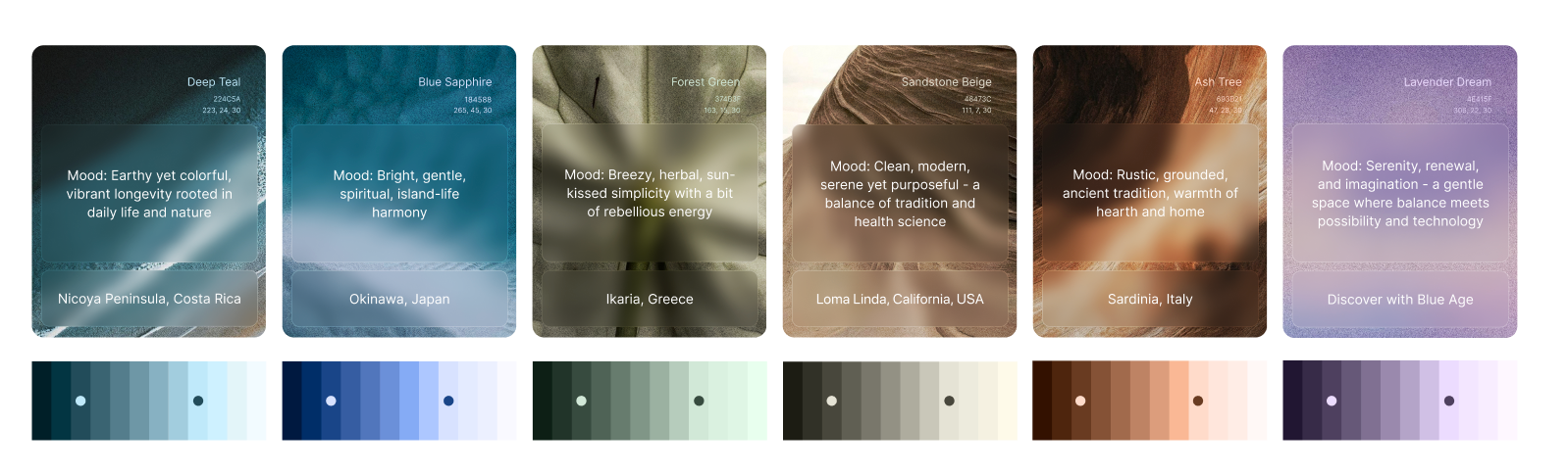
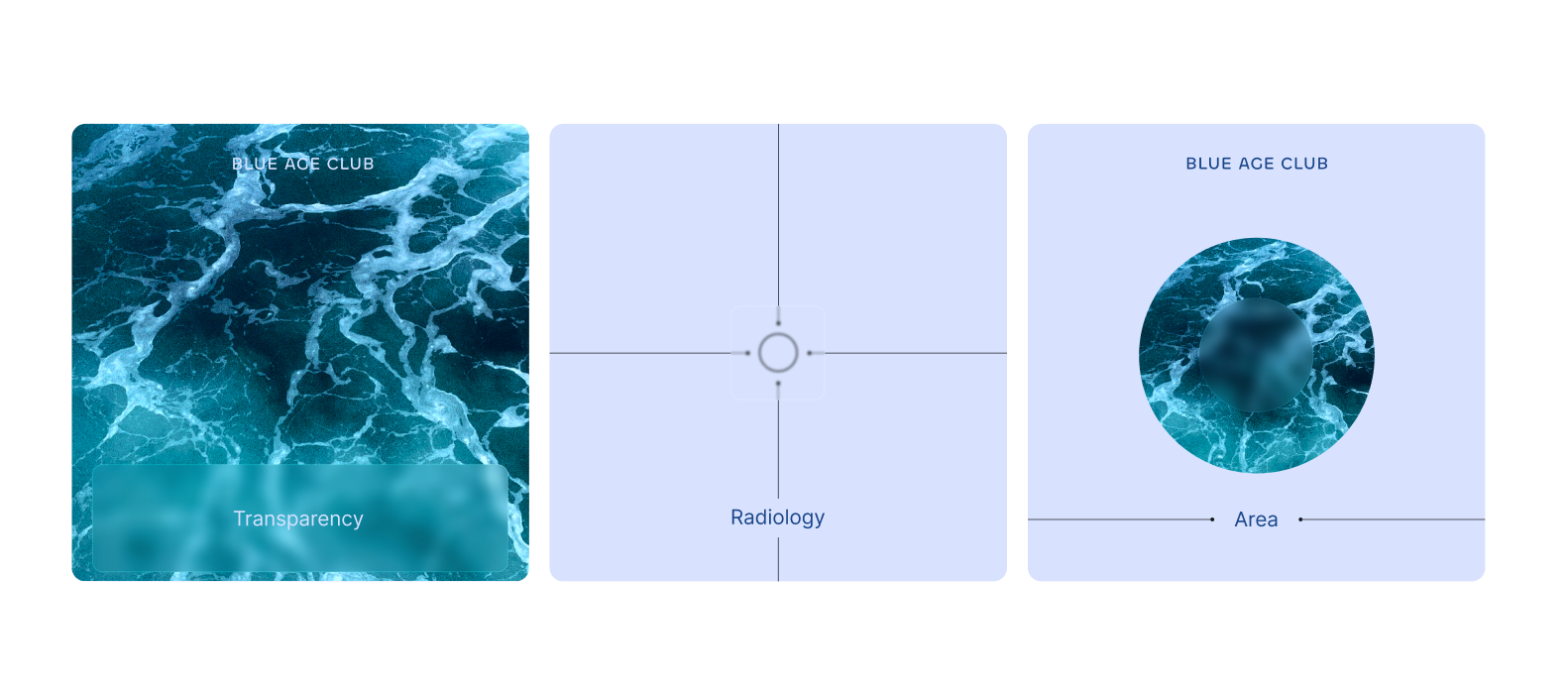
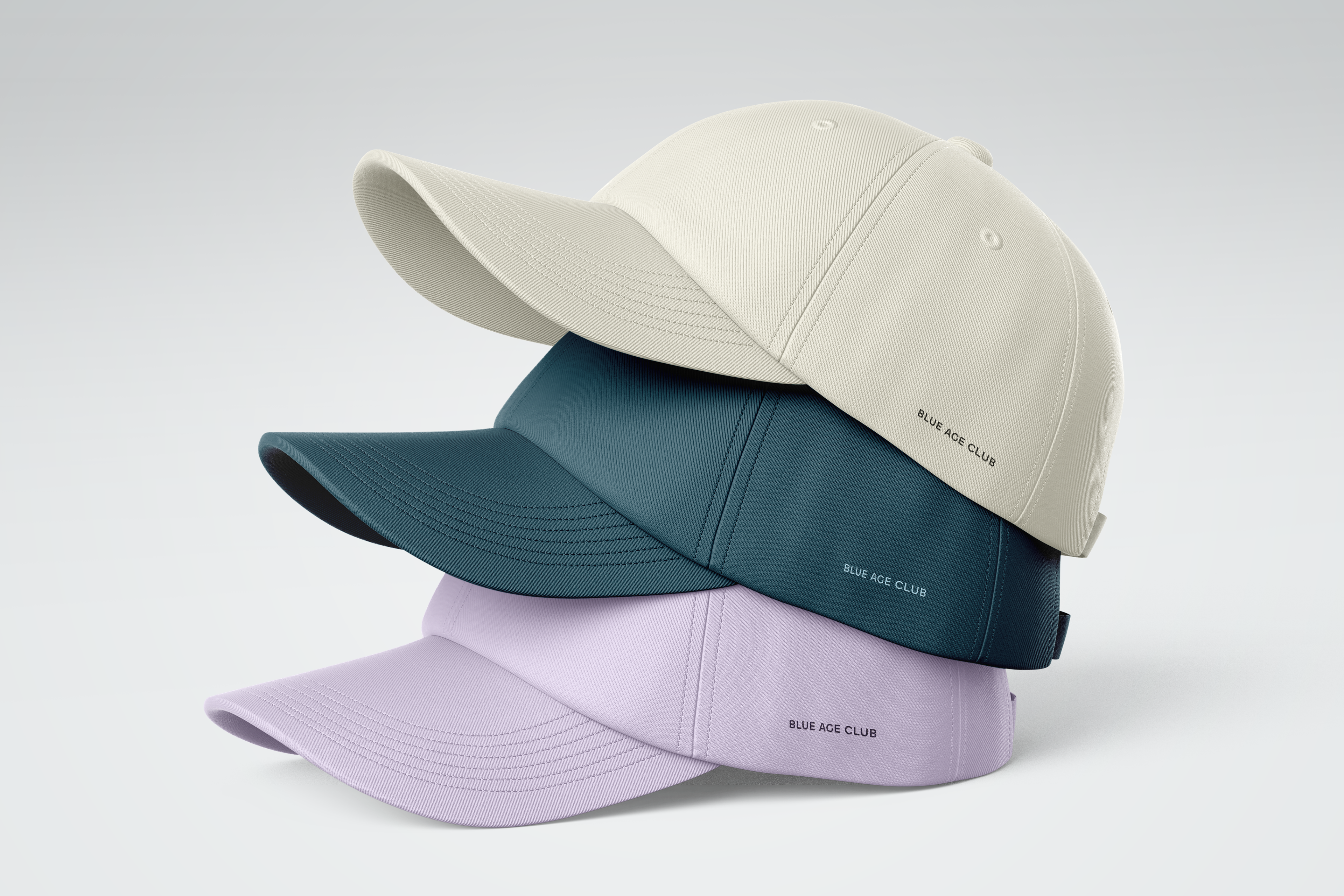
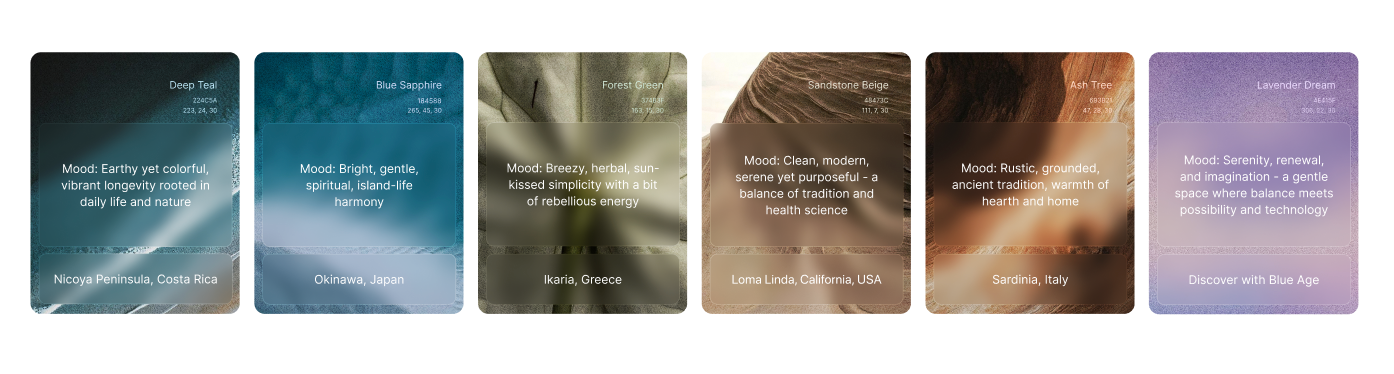
COLOR
The Blue Age Club color palette is drawn from the landscapes and atmospheres of meaningful locations around the world. Each shade reflects the spirit of places where people live in balance with nature and community - the deep blues of the sea, the earthy warmth of stone and soil, the soft greens of olive groves, and the sunlit tones of open skies. By grounding our identity in these natural hues, we celebrate timeless beauty, cultural heritage, and the harmony between people and their environment.
The Blue Age Club color palette is drawn from the landscapes and atmospheres of meaningful locations around the world. Each shade reflects the spirit of places where people live in balance with nature and community - the deep blues of the sea, the earthy warmth of stone and soil, the soft greens of olive groves, and the sunlit tones of open skies. By grounding our identity in these natural hues, we celebrate timeless beauty, cultural heritage, and the harmony between people and their environment.
SCALABILITY
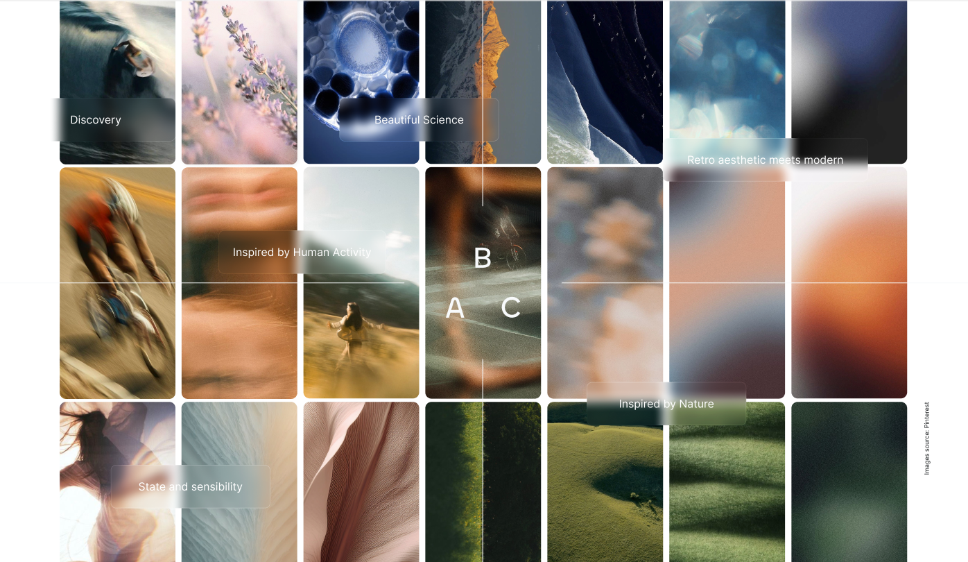
Our social media presence extends the Blue Age Club experience into everyday life. Each post, story, and campaign should express our tone, color, and mood with clarity and emotion. Visuals should feel consistent yet alive-reflecting our values of connection, longevity, and discovery. Every piece of content is an opportunity to inspire, engage, and invite others into the world of Blue Age Club.
Our social media presence extends the Blue Age Club experience into everyday life. Each post, story, and campaign should express our tone, color, and mood with clarity and emotion. Visuals should feel consistent yet alive-reflecting our values of connection, longevity, and discovery. Every piece of content is an opportunity to inspire, engage, and invite others into the world of Blue Age Club.
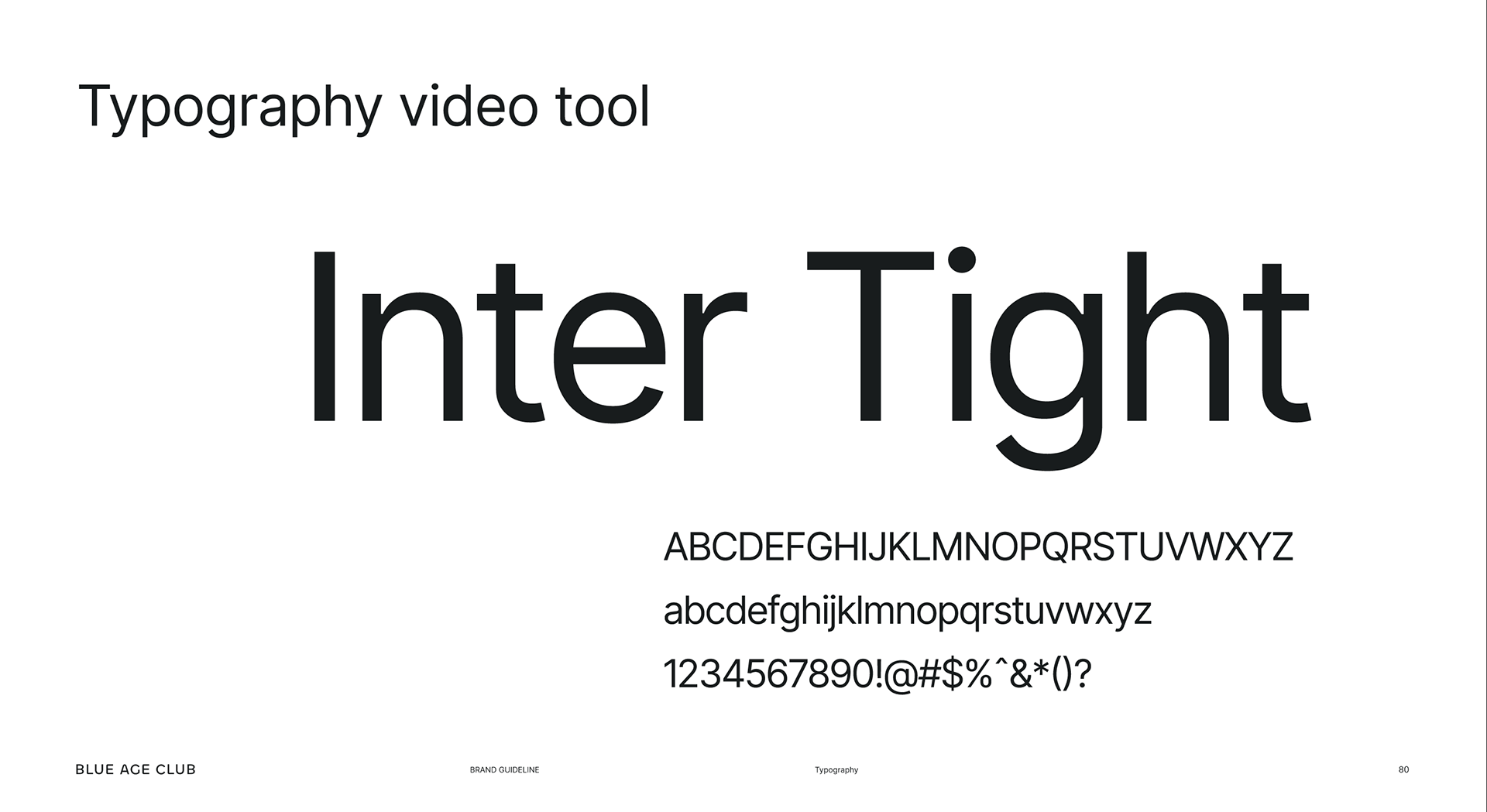
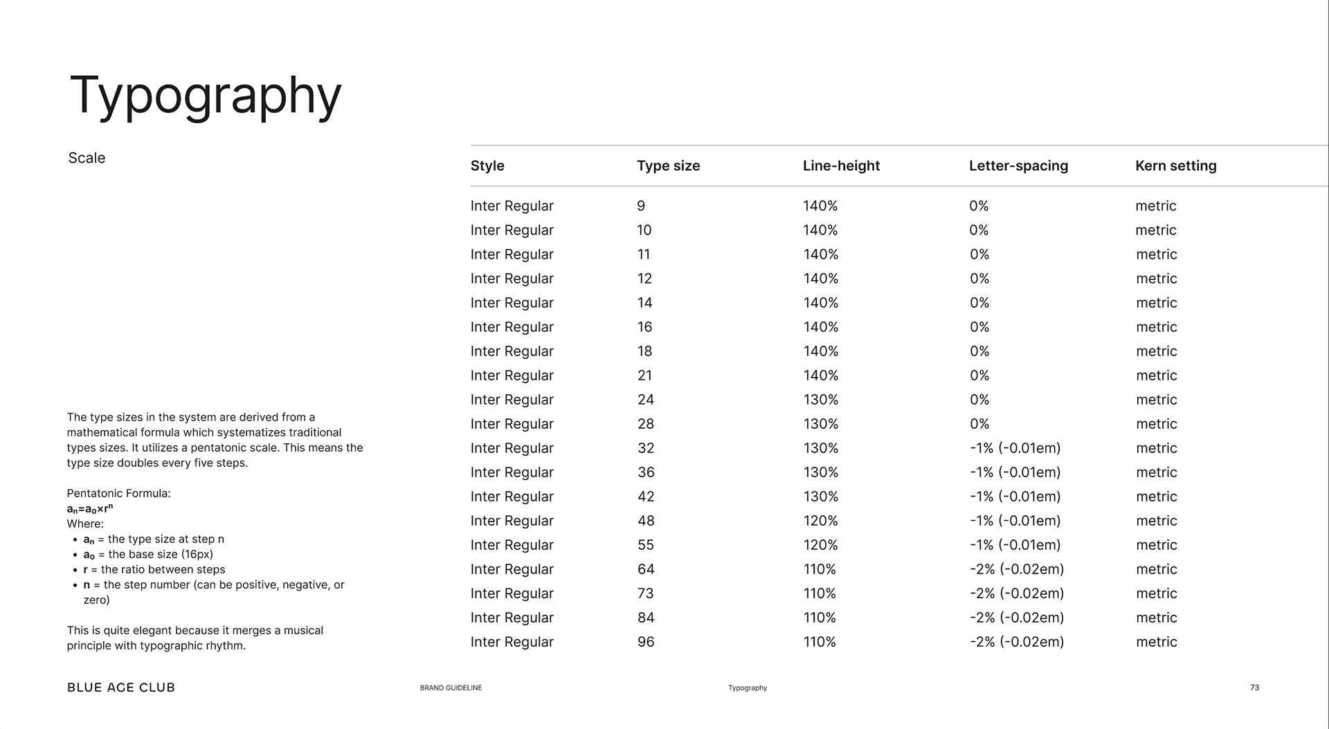
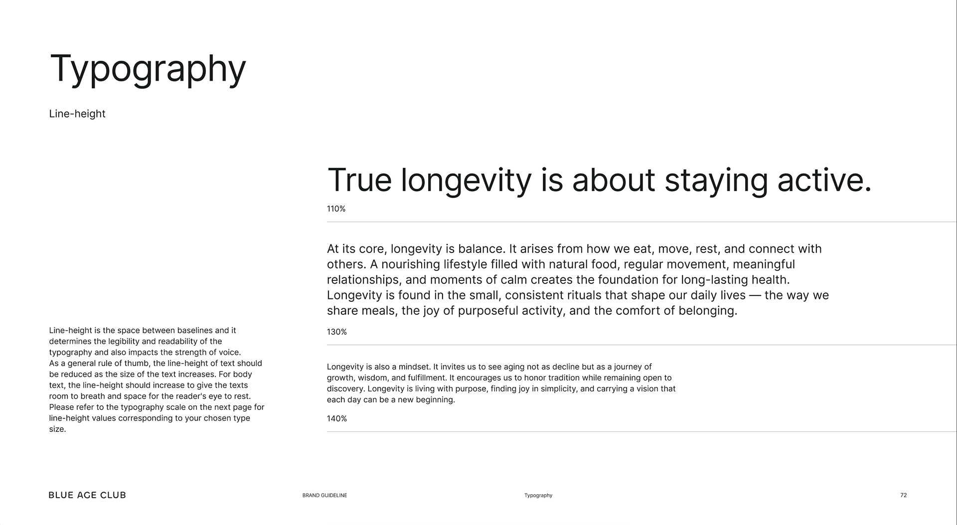
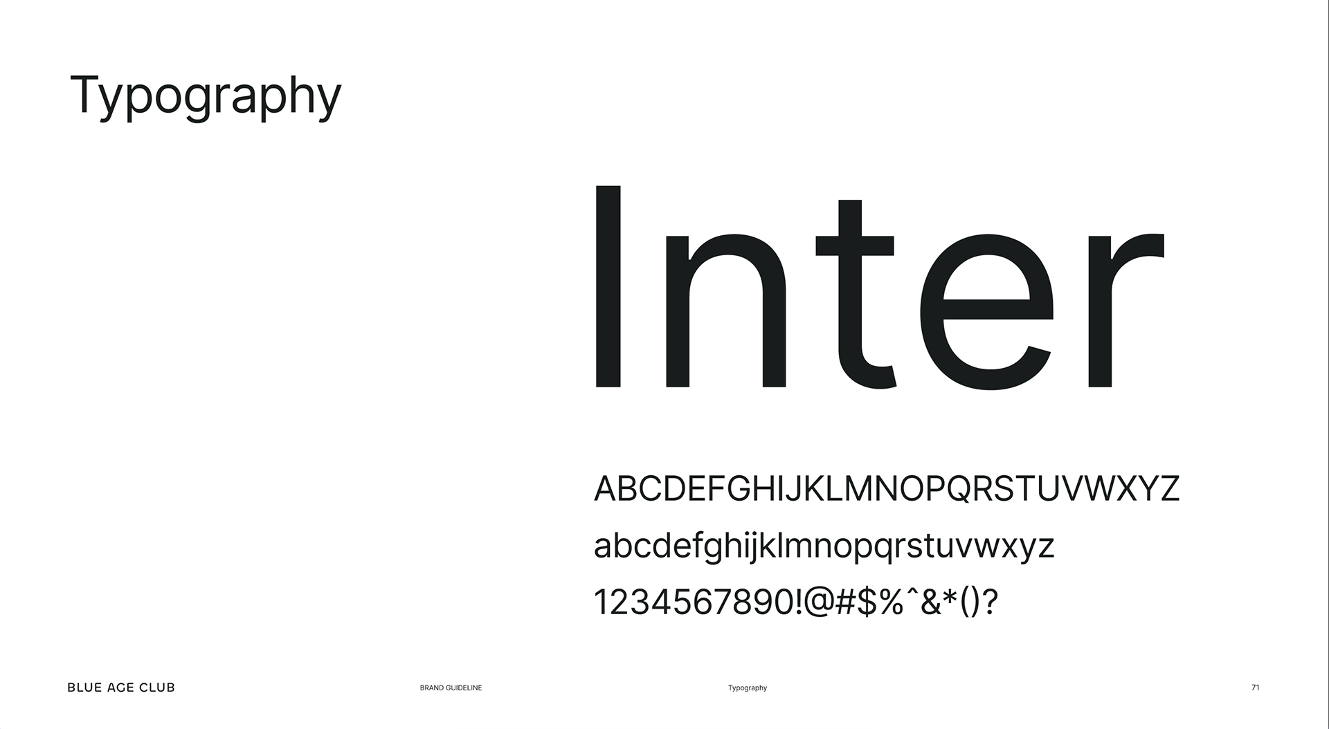
TYPOGRAPHY
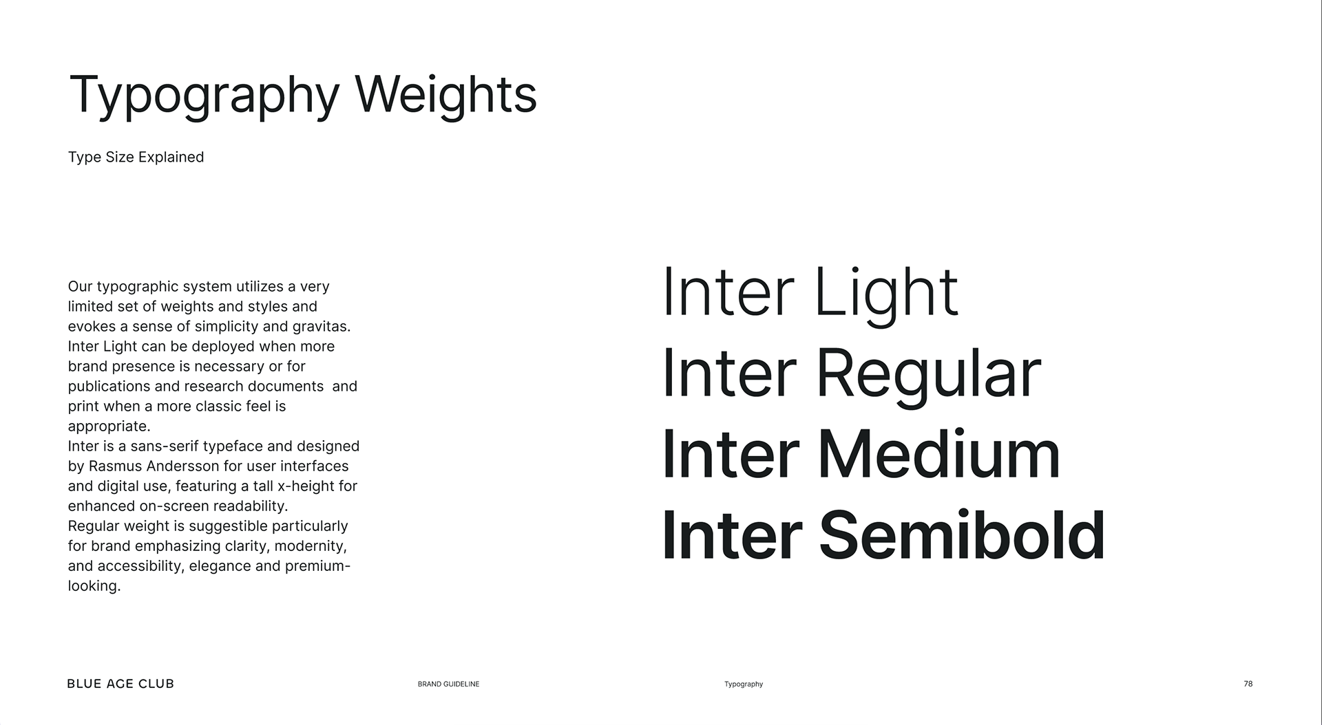
Inter Typeface. Chosen for Blue Age Club, Inter reflects our values of clarity, simplicity, and accessibility. It provides a neutral yet modern voice that supports our brand without overwhelming it, allowing our colors, images, and stories to take center stage. Versatile and reliable, Inter adapts seamlessly from headlines to body text, creating a cohesive and timeless typographic
Inter Typeface. Chosen for Blue Age Club, Inter reflects our values of clarity, simplicity, and accessibility. It provides a neutral yet modern voice that supports our brand without overwhelming it, allowing our colors, images, and stories to take center stage. Versatile and reliable, Inter adapts seamlessly from headlines to body text, creating a cohesive and timeless typographic

BRAND DNA
> Link to Brand Guideline
> Link to Brand Guideline