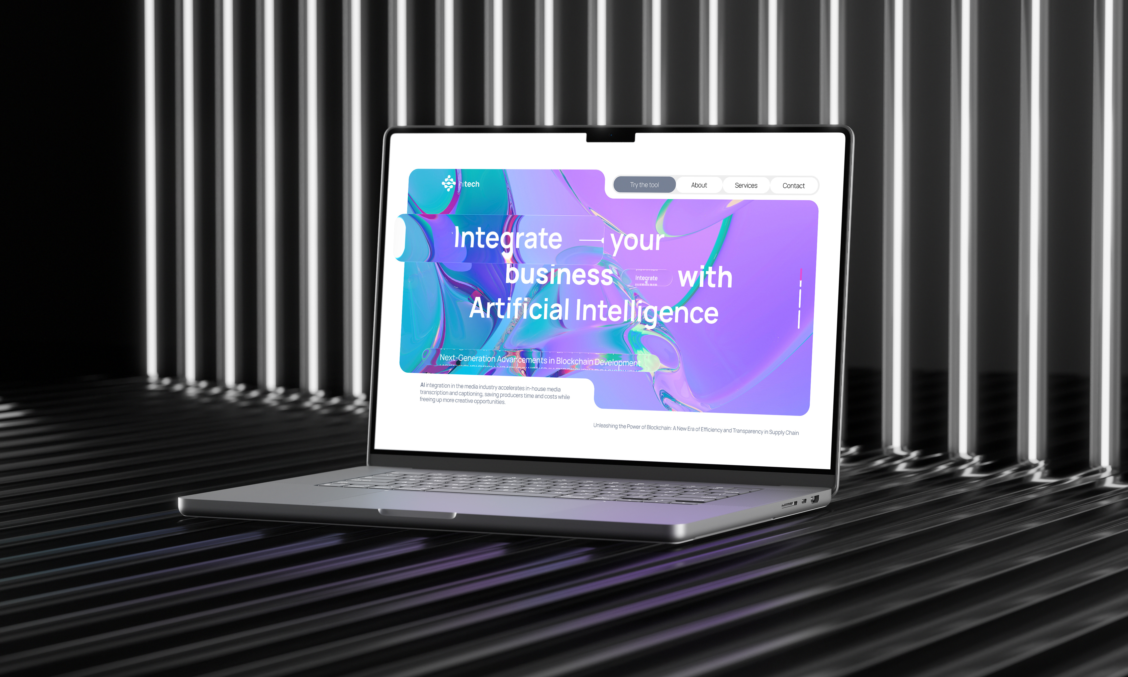
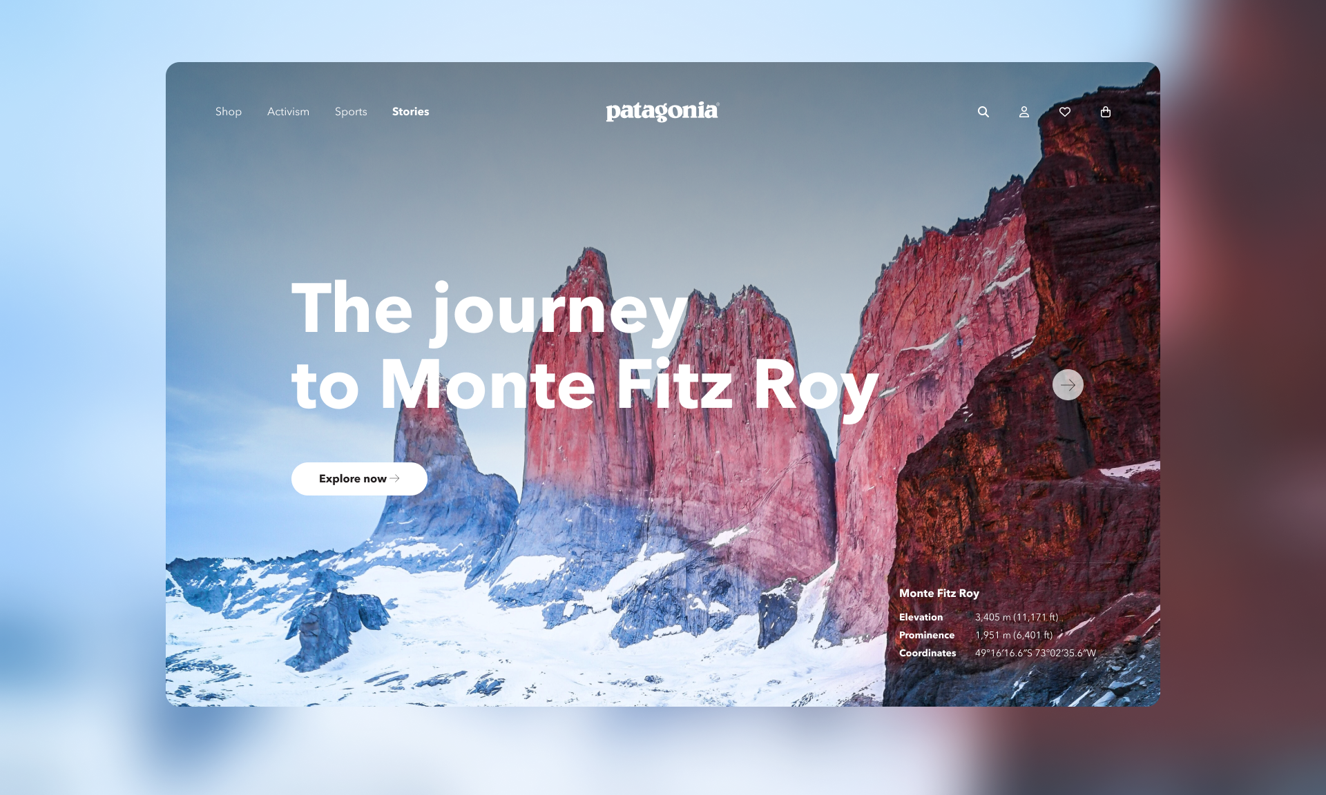
Deploy Your Website Automatically from Git
SKILLS
Web Design
User Interface (UI)
User Experience (UX)
Branding Enhancement
Visual Storytelling
Research & Project Management
Art Direction
Accessibility (Light/Dark mode)
AI
Web Design
User Interface (UI)
User Experience (UX)
Branding Enhancement
Visual Storytelling
Research & Project Management
Art Direction
Accessibility (Light/Dark mode)
AI
CATEGORY
Tool | SaaS
Tool | SaaS
PROBLEM
Bringing clarity, confidence, and a modern positioning to a trusted deployment platform.
Bringing clarity, confidence, and a modern positioning to a trusted deployment platform.
When I first looked at DeployHQ’s homepage, I saw a product with real developer appeal: approachable language, clear value, and simplicity at its core. But as DeployHQ matured, its positioning outgrew what the homepage was communicating. The product had evolved - faster deployments, deeper integrations, AI-assisted insights - but the landing page still felt like something from a previous era of SaaS.
So my challenge became clear: how do I honor the product’s personality while elevating its voice and visual structure for today’s teams?
CHALLENGE
1. Positioning Mismatch
1. Positioning Mismatch
The product had matured into a reliable deployment platform, but the homepage still communicated simplicity over capability. It felt helpful, but not authoritative.
2. Outdated SaaS Patterns
The structure followed a predictable template: hero, three steps, feature grid, testimonials. While functional, it lacked narrative flow and strategic hierarchy.
3. Feature Density Over Clarity
Too many feature cards created visual noise. Important differentiators like zero downtime and build pipelines were competing for attention instead of being highlighted intentionally.
4. Emotional Flatness
The copy explained what DeployHQ does, but did not fully capture the stress and risk developers associate with deployments. There was little tension, and therefore little emotional payoff.
5. Visual Weight Imbalance
Heavy purple dominance and dense content blocks reduced breathing space. The design felt safe and familiar, but not elevated.
6. Scaling Perception
While the tool works beautifully for individuals, it also supports serious production workflows. The homepage did not clearly signal scalability or infrastructure confidence.

GOAL
DeployHQ helps people move code - fast and safely - from Git repositories to live environments. That promise hasn’t changed, but the expectations of users have.
We wanted the homepage to:
• Position DeployHQ as a reliable platform for teams of all sizes, not just a clever deployment helper
• Deliver a clear narrative flow from problem → solution → trust → action
• Reduce noise and align visuals with modern SaaS conventions
• Maintain the friendly, human tone developers love
• Deliver a clear narrative flow from problem → solution → trust → action
• Reduce noise and align visuals with modern SaaS conventions
• Maintain the friendly, human tone developers love

PROCESS
The old homepage was undeniably clear, but it leaned heavily on classic SaaS patterns:
The old homepage was undeniably clear, but it leaned heavily on classic SaaS patterns:
• A primary hero with a wide interface mockup
• A three-step workflow section
• A grid of feature cards
• Testimonials, then pricing CTA
• A three-step workflow section
• A grid of feature cards
• Testimonials, then pricing CTA
All good - just a bit crowded and overly familiar.
From a UX standpoint, the content lacked hierarchy and emotional cadence. It told you what DeployHQ does, but not why it matters today.

STRATEGIC SHIFT
I centered the redesign around three principles:
I centered the redesign around three principles:
1. Lead With Confidence
Instead of joke-style headlines like “No PhD needed to write config files,” we anchored the story in an outcome people care about:
Deploy with speed. Deploy with certainty. DeployHQ takes care of the heavy lifting.
This sets the tone that DeployHQ is not just easy, it’s trusted and capable.
Deploy with speed. Deploy with certainty. DeployHQ takes care of the heavy lifting.
This sets the tone that DeployHQ is not just easy, it’s trusted and capable.
2. Tell a Story of Action
I moved away from isolated feature blocks toward a narrative arc:
Problem developers face → How DeployHQ solves it → Why it’s credible → Actions users can take now.
In practice this meant sharper sections like:
• Code to server in 3 clicks
• Zero downtime, instant rollback
• Integrations you already use
• Teams that rely on DeployHQ
• Zero downtime, instant rollback
• Integrations you already use
• Teams that rely on DeployHQ
Every section answers a key question in the user journey.
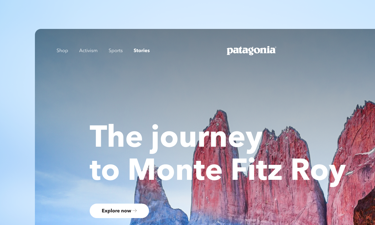
3. Simplify Visual Focus
Rather than a grid of small icons, the new homepage uses:
• Clear, spacious layouts
• High-contrast headlines
• Contextual visual cues
• Strategic whitespace
• High-contrast headlines
• Contextual visual cues
• Strategic whitespace
This helps the eye land where it should, reducing cognitive load and guiding attention.
4. AI & workflow
Leveraging AI for Precision Scaling In elevating DeployHQ's visual language, I integrated AI into my design system workflow. I took full creative ownership of the dark and light mode UI architecture, while using AI tools to quickly generate, compare, and audit mathematical typography scales and color tokens to comply with WCAG. This allowed me to focus heavily on the storytelling and spatial layout, leaving the repetitive accessibility checks and token verifications to an intelligent assistant.
VOICE & TONE
DeployHQ’s personality is part of its DNA — friendly, practical, grounded in developer reality. The new write-ups stay conversational but authoritative, for example:
DeployHQ’s personality is part of its DNA — friendly, practical, grounded in developer reality. The new write-ups stay conversational but authoritative, for example:
Instead of: “Deploy your code!”
We say: “Ship effortlessly, every time.”
We say: “Ship effortlessly, every time.”
Small shifts like this help the copy feel less like instructions and more like a partner speaking directly to you.
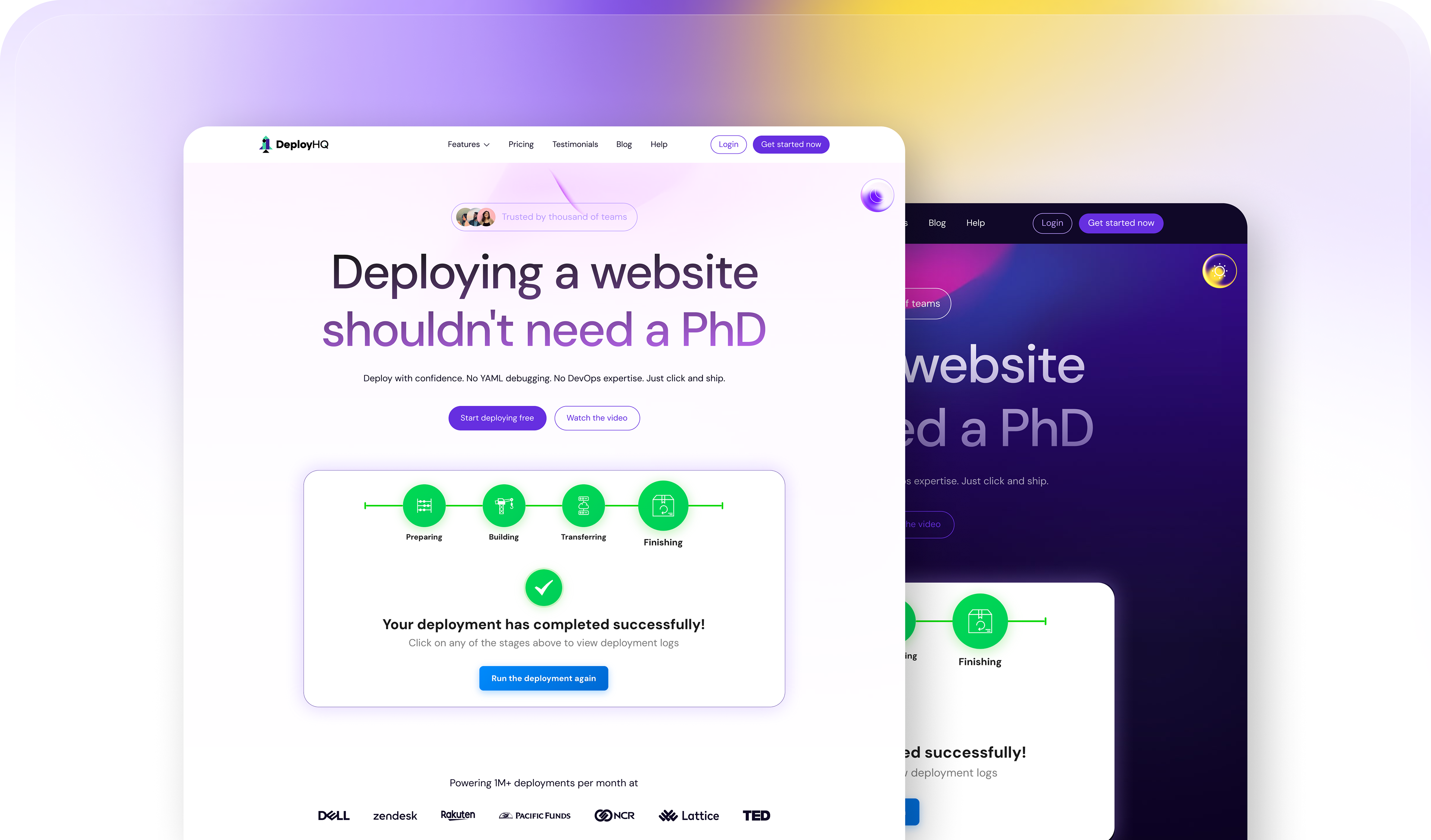
Visual System Evolution.
Color Palette:
DeployHQ has always owned purple. It is recognizable and distinctive. The challenge was not to replace it, but to refine it.
The previous homepage relied heavily on a saturated purple background across large areas. While bold, it reduced visual hierarchy and limited flexibility.
In the redesign, we introduced a more structured palette:
• A deep primary purple reserved for key brand moments
• Neutral grays to create breathing space
• A vibrant green used intentionally for action and success states
• Subtle gradients to add depth without visual noise
• Neutral grays to create breathing space
• A vibrant green used intentionally for action and success states
• Subtle gradients to add depth without visual noise
The result is a system that feels modern and confident while remaining unmistakably DeployHQ.
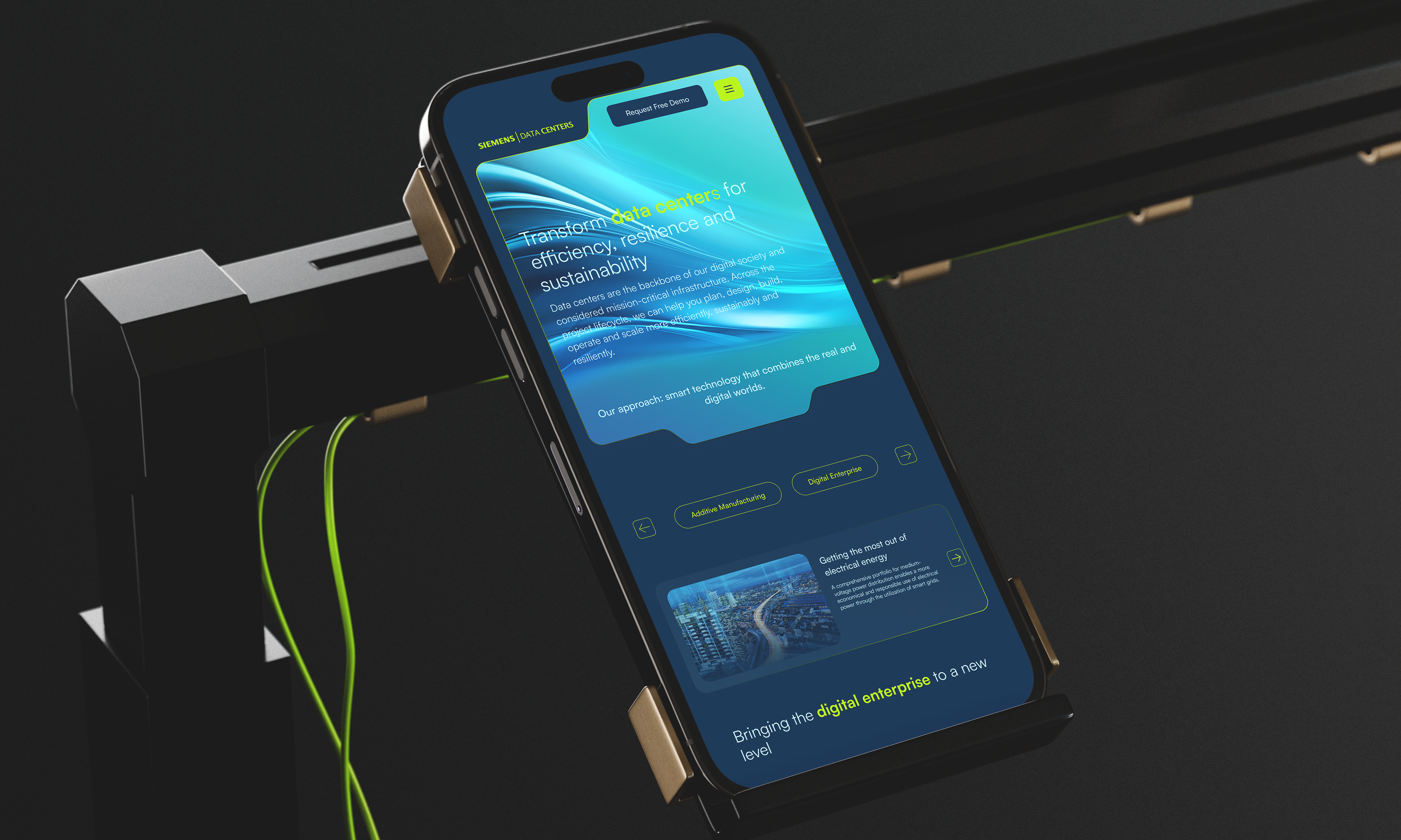
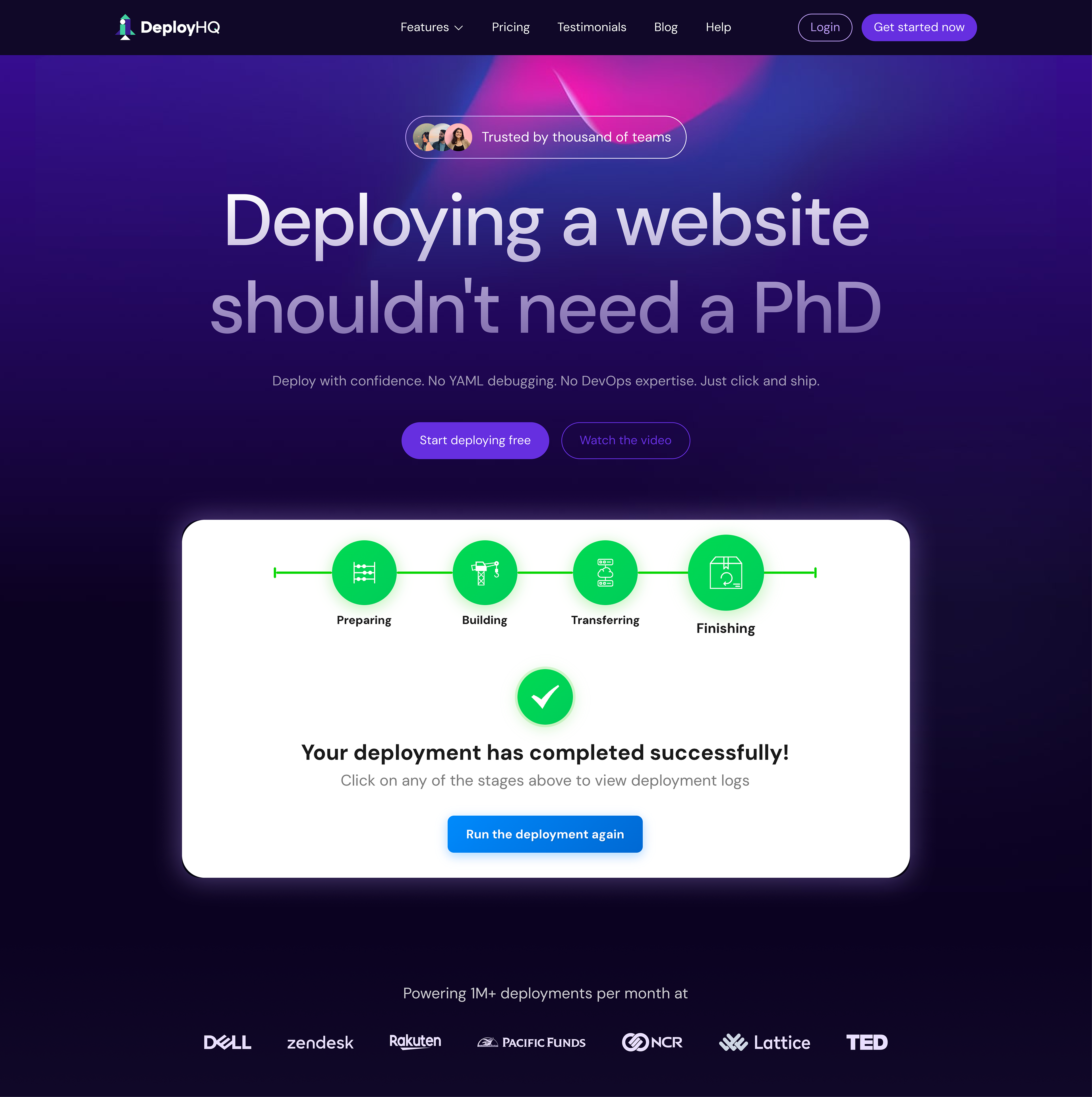
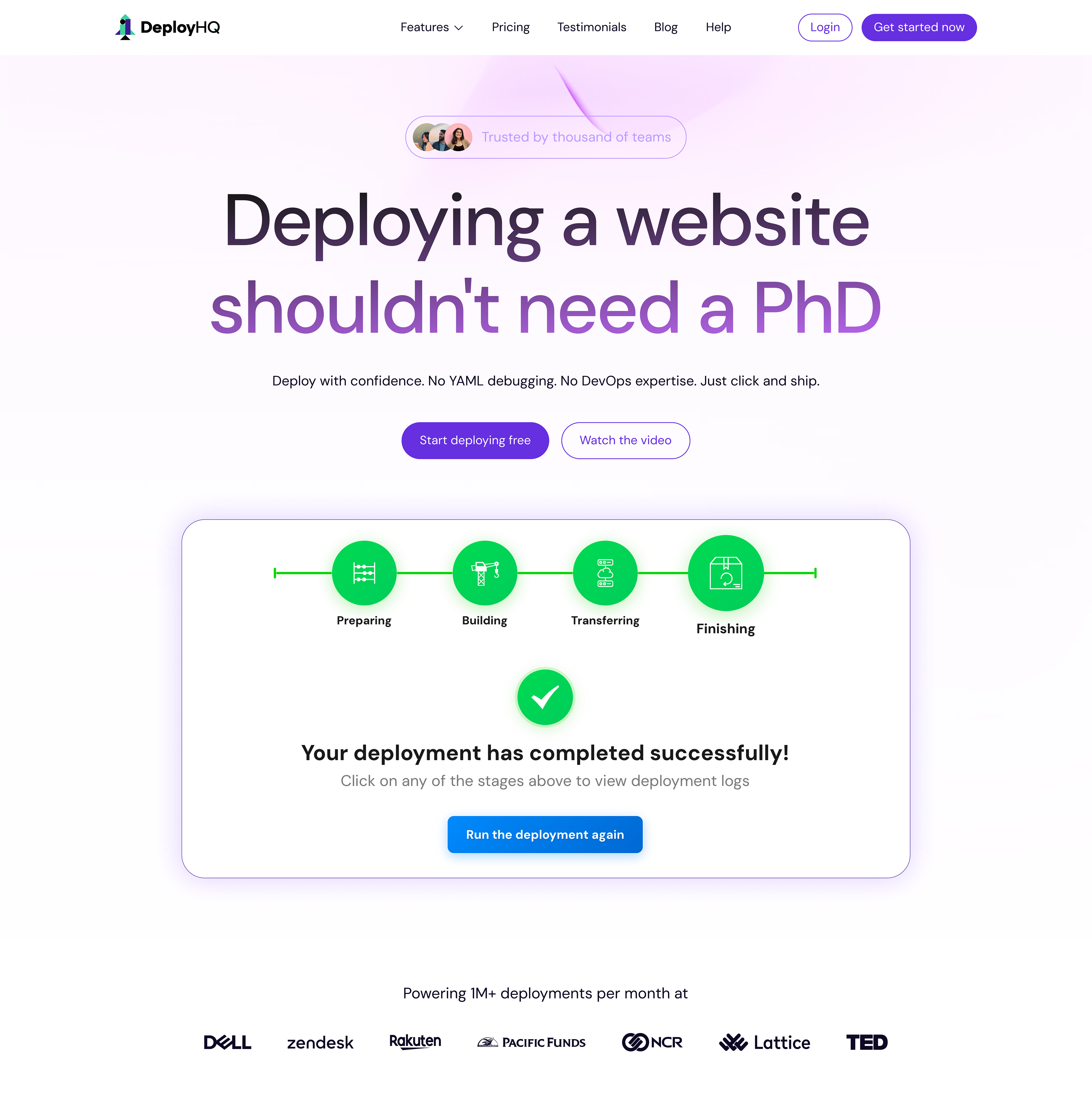
Dark and Light Mode
Instead of treating dark mode as an afterthought, I designed both themes as equal citizens from the beginning.
Light mode focuses on clarity, contrast, and approachability. It works beautifully for marketing pages and first time visitors.
Dark mode emphasizes focus and immersion. It mirrors the environment where developers actually work. Interface previews, deployment states, and logs feel more natural in this setting.
Both modes share the same spacing system, typography scale, and semantic color logic. This ensures consistency across the product and marketing surfaces.
The switch reinforces flexibility and technical maturity.
Typography Style
The old homepage used safe SaaS typography. Clean, readable, but not particularly expressive.
For the redesign, I refined the typographic hierarchy to communicate confidence and structure.
Headlines are:
• Bold and decisive
• Slightly tighter in spacing
• Short and outcome driven
• Slightly tighter in spacing
• Short and outcome driven
Body text is:
• Highly readable
• Comfortable line length
• Structured with clear vertical rhythm
• Comfortable line length
• Structured with clear vertical rhythm
I reduced unnecessary font weights and simplified the scale to strengthen consistency. This creates stronger contrast between headlines and supporting content, making scanning effortless. It guides attention and reinforces trust.
AESTHETIC DIRECTION
The new system embraces restraint: more white space, fewer decorative elements, stronger alignment, clearer content blocks.
Instead of competing visuals, each section has a purpose.
The design feels less like a collection of components and more like a cohesive platform.
The new system embraces restraint: more white space, fewer decorative elements, stronger alignment, clearer content blocks.
Instead of competing visuals, each section has a purpose.
The design feels less like a collection of components and more like a cohesive platform.

RESULT
Redesigning DeployHQ’s homepage was not about making it look different. It was about making it feel aligned with what the product had already become. The platform matured. The positioning needed to catch up.
Redesigning DeployHQ’s homepage was not about making it look different. It was about making it feel aligned with what the product had already become. The platform matured. The positioning needed to catch up.
By refining the visual system, strengthening hierarchy, and shifting from feature listing to narrative storytelling, the homepage now communicates confidence instead of convenience alone. It speaks not only to individual developers, but to teams shipping real production workloads.
Most importantly, the redesign respects DeployHQ’s roots. The friendly tone remains. The clarity remains. But everything is elevated. More structured. More intentional. More scalable.
•
Measurable Business Impact.
Key Milestone: DeployHQ UX/UI Refresh & Ecosystem Growth.
Key Milestone: DeployHQ UX/UI Refresh & Ecosystem Growth.
By closely aligning design, UX, and technical SEO, the site refresh quickly translated into direct performance gains and measurable organic growth, as documented across our internal tracking data after a couple of months after launch.
- Creative Leadership: Spearheaded the end-to-end design and UX strategy for the DeployHQ web refresh, delivering cross-functional alignment across design, web development, and SEO teams.
- System Architecture: Designed a comprehensive visual upgrade featuring scalable light and dark mode architectures, leveraging proper UX analysis to rethink core user flows.
- SEO & Visibility Architecture: Built layout structures that supported substantial performance gains, directly securing 375K Total Impressions and stabilizing the site's Average Position at 14.2.
- Future-Proof Discoverability: Optimized informational architecture layouts (/guides/), resulting in a noticeable upward trend in AI search ecosystems, maintaining an Average Cited Pages count of 50.
- Global Target Alignment: Captured high-value international intent, with the US and UK accounting for 29% of total post-refresh clicks.
NEXT STEP
The next phase focuses on research driven validation. I plan to conduct qualitative and quantitative research to better define:
The next phase focuses on research driven validation. I plan to conduct qualitative and quantitative research to better define:
• How different user segments perceive the new positioning
• What motivates first time visitors to convert
• Where friction still exists in the decision journey
• Which messages resonate most with teams versus individual developers
• How trust signals influence enterprise level adoption
• What motivates first time visitors to convert
• Where friction still exists in the decision journey
• Which messages resonate most with teams versus individual developers
• How trust signals influence enterprise level adoption
This research will help refine not only messaging and hierarchy, but also long term brand direction.